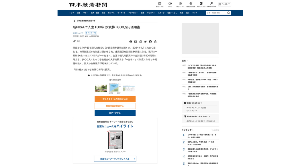
The Challenge
The Nikkei, published by Nikkei Inc., is one of the most widely read economic newspaper in Japan. The Nikkei offers its content through various devices, including the web and apps.
In 2023, Nikkei engaged Proximo, a UI/UX Design Consulting Firm to discovering improvement opportunities. Throughout the project, three challenges were identified:
1.Identification of Improvement Metrics from Vast Data
Proximo focused on aligning multiple hypotheses with Nikkei Online Edition reader data and the marketing strategy of the past three years.
This led to the identification of improvement metrics, particularly focusing on "engagement with content that resonates personally."
Additionally, considering various statuses of Nikkei members, the project targeted free and non-members.
Analysis of reader data categorized challenges for target users into multiple areas, with prioritized handling of issues related to information visibility and convenience.
2.Designing Value Delivered to Users
Proximo has focused on the differences in the features primarily being utilized between paid and free memberships and the usage patterns based on them. Paid members are primarily utilizing the function of the Electronic PDF version of the article/ news paper (paper viewer). They find value in understanding the currents of the world and being able to anticipate trends by using Nikkei.
On the other hand, among free members, the most utilized features are notifications from the app and Newsletters. Additionally, free members feel that it's difficult to find the right articles to read and comprehend them.
It is hypothesized that free and non-members may not recognize the benefits and value of subscribing to Nikkei's electronic edition on the conversion(CV) route from the article page because the advantages of subscribing to the Nikkei electronic edition were not clearly presented to readers.In other words, there is a possibility that features and value heavily utilized by paid members, such as the paper viewer, may not be adequately recognized.
3.Discovery of Functional Issues Hindering Value Delivery
To explore reasons why value was not reaching users, a heuristic analysis was conducted.
This analysis, based on empirical rules, evaluates usability and discovers UI issues.
Evaluation was carried out on the axes of “reliability”, “usability”, “convenience/utility”, and “ease of finding information”.
Results indicated four functional challenges, with difficulty in users finding articles they should read prioritized as a high-priority issue.
To ensure objectivity, reader data challenges were linked, aiding in identifying functional issues.
From these challenges, Proximo formulated hypotheses for target users, appealing points that could deliver value to users, and identified functional challenges in a hypothesis-based manner.
These aspects were validated through AB testing.


