


Data Studio:対話型データを可視化する

簡単に使えるスタジオで対話型の視覚化を強力に進め、データセットを活用できるようにする。
レッスンの概要

自分のストーリーを伝える可視化を構築する方法について学ぶ。
Data Studioは、さまざまなソースから取得したデータによってリアルタイムに更新される、対話型の可視化を構築するための強力なツールです。ジャーナリズムの分野では、Data Studioを使うとデータによってストーリーを伝えることができ、ストーリーの表現方法を自在に選択できます。これらの可視化により、ユーザーはさまざまな観点からストーリーと対話することができます。
- Google スプレッドシートをData Studioに接続する。
- データを編集する。
- 折れ線グラフを作成する。
- テーブルグラフを追加する。
- 可視化のデザインを変更する。
- 対話型の可視化を埋め込む。
その他のデータジャーナリズムのレッスンについては、次のURLをご覧ください。
https://newsinitiative.withgoogle.com/training/course/data-journalism
Google スプレッドシート をData Studioに接続する。
始める前に、訓練センターでのレッスン「Google スプレッドシート :インターネットからデータを収集する」、「Google スプレッドシート:データをクリーニングする」を完了していて、同じアカウントでログインしていることを確認してください。これらのレッスンで、Wikipediaの記事から作成したデータシートをこの可視化のレッスンで使います。
datastudio.google.com に移動して、+アイコンの付いた空の四角形をクリックして新しいレポートの作成を開始します。
Data Studioでは、可視化は「レポート」と呼ばれます。 Google Sheetをこのレポートに接続するには、右下から新しいデータソースの作成を選択します。
メニューがスライドアップして、データを取得できるサービスが表示されます。Google スプレッドシートまでスクロールして選択をクリックします。
検索ボックスに、Googleドライブアカウントに関連付けられているすべてのGoogle Sheetが表示されます。(Google Data Studioを初めて使う場合は、Google Driveアカウントへのアクセス許可を付与する必要があります)データが保存されているスプレッドシートとそれに関連付けられているワークシートを選択します。
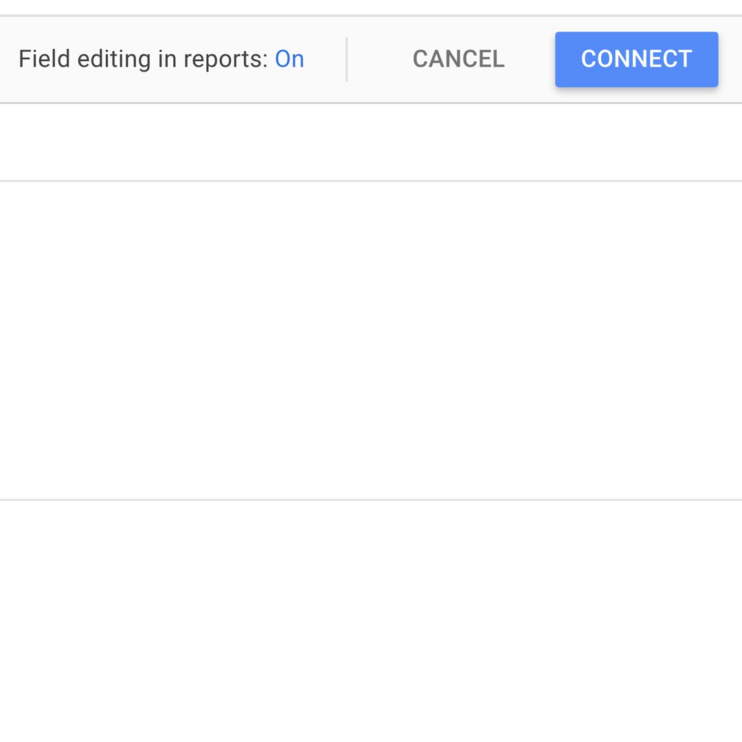
すべてのオプションボックスをチェックマークが付いていたままにして、接続をクリックします。
データを編集する。
Editing your data
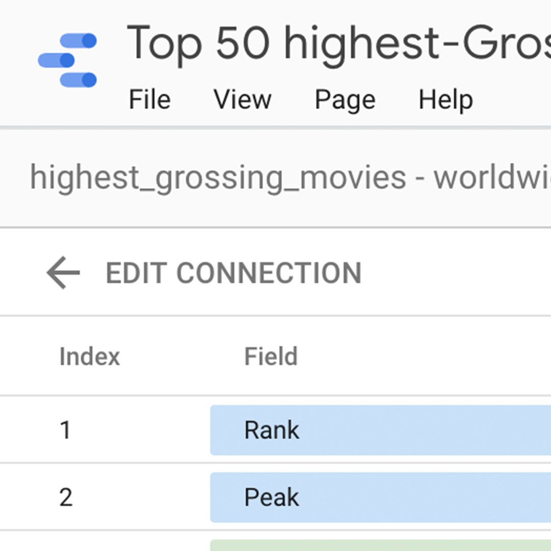
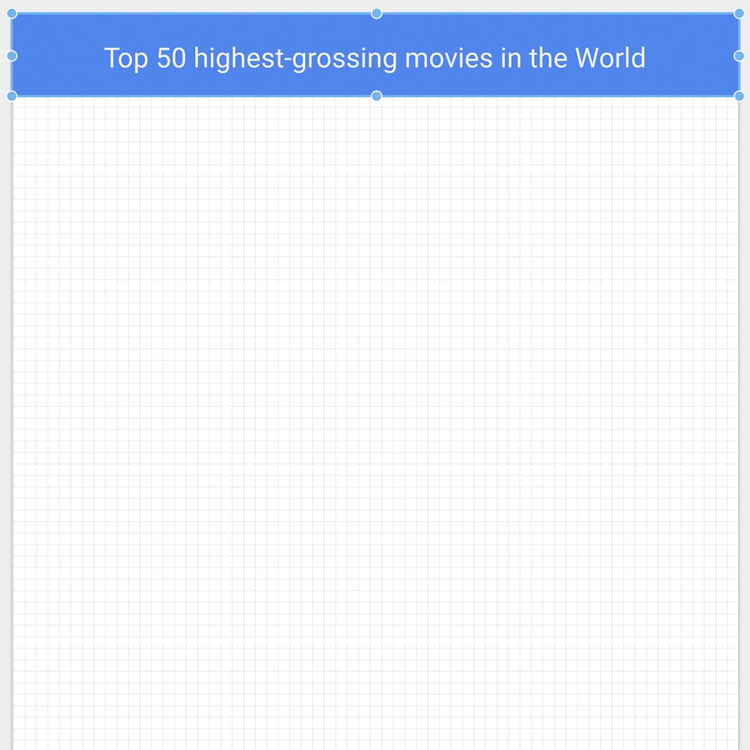
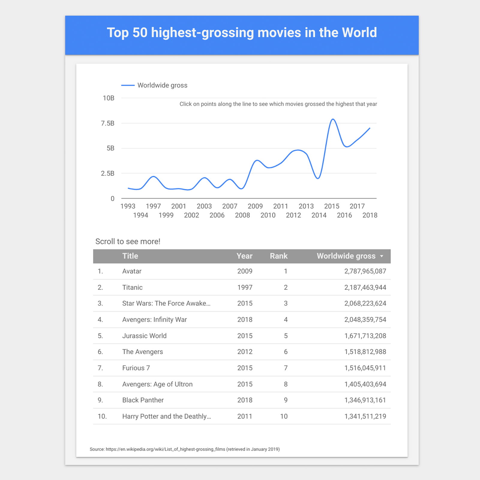
可視化の名前を変更しましょう。無題レポートと表示されている左上隅をクリックします。それに対して「世界で最も興行収益を上げている上位50の映画」という名前を付けましょう。
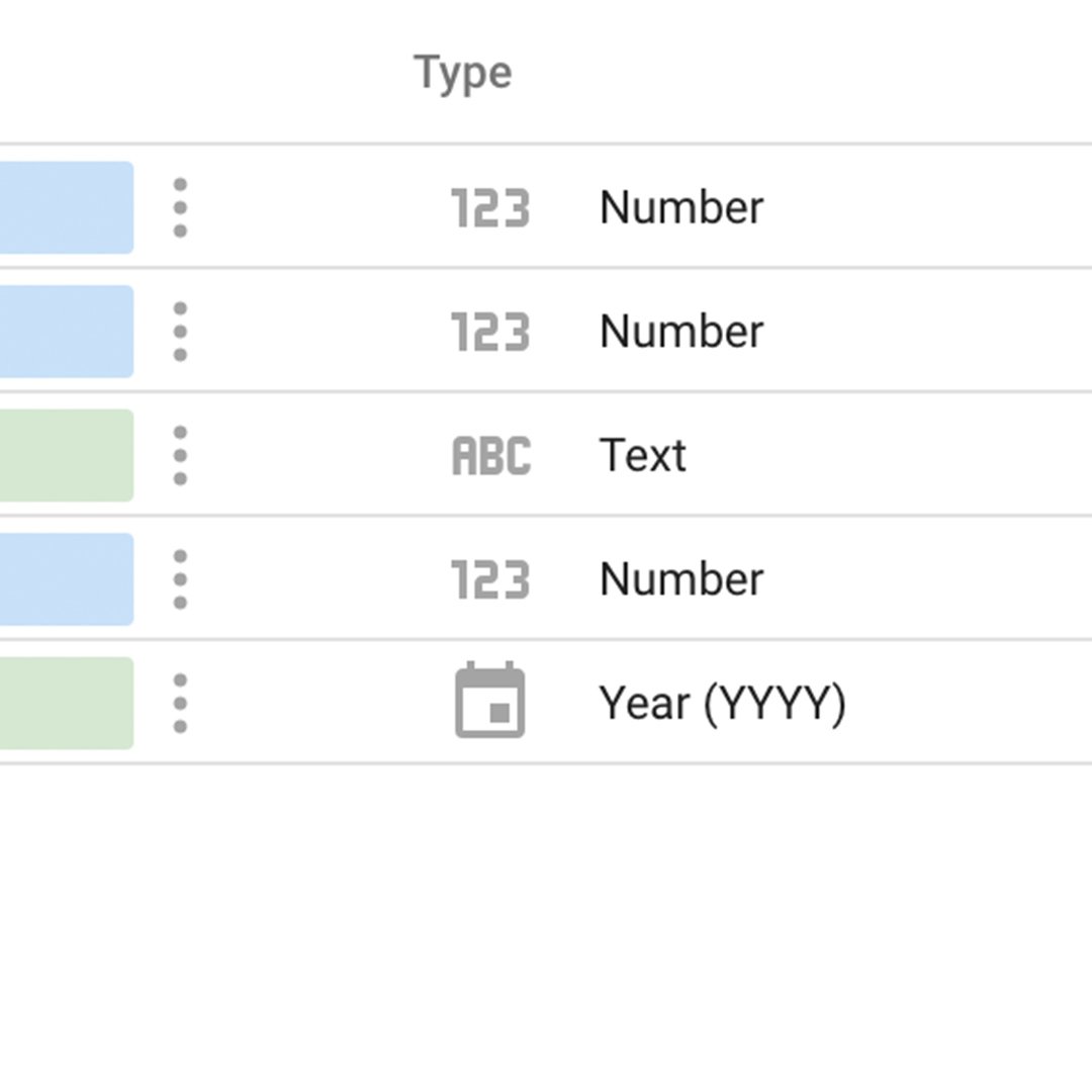
種類で、5行目のデータを数値から日付と時刻> 年(YYYY)に変更します。既に年(YYYY)に設定されている場合は、そのままにします。
右上の青いボタン、レポートに追加を選択します。ポップアップする同じオプションをもう一度クリックします。
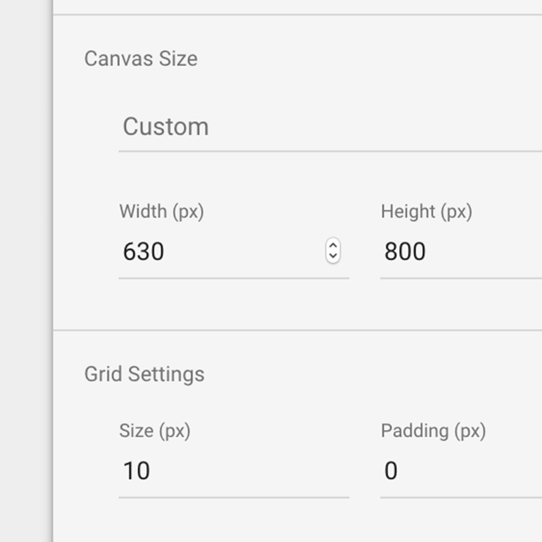
可視化を幅630ピクセル、高さ800ピクセルに設定しましょう。任意の場所をクリックして、キャンバスサイズセクションにこれらの数字を入力します。
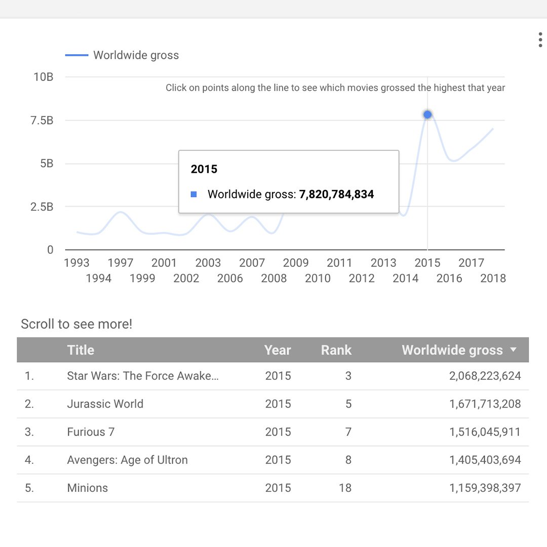
折れ線グラフを作成する。
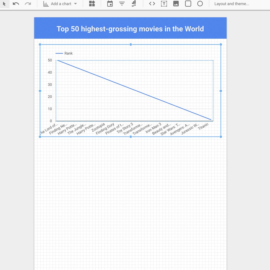
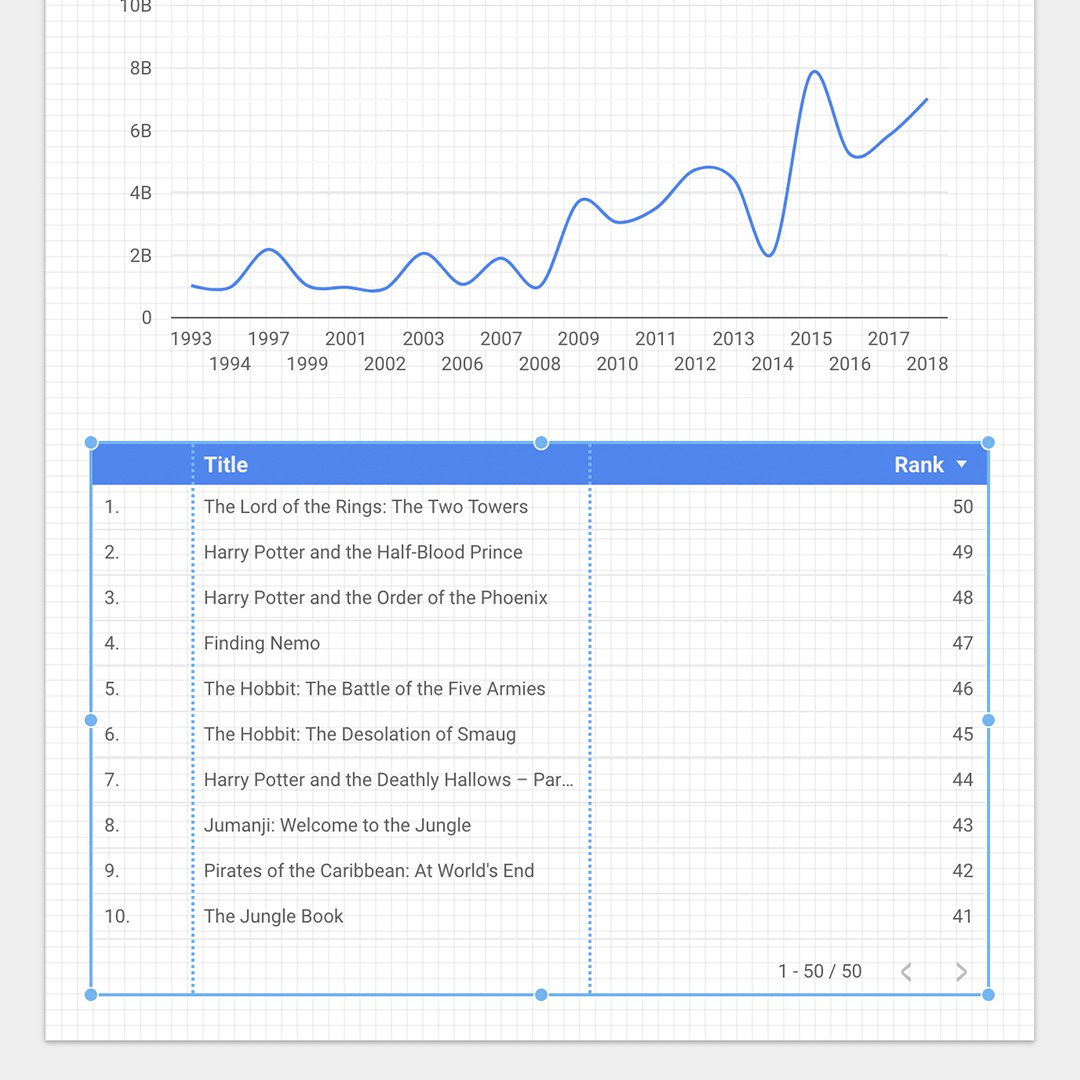
ある年の世界全体の総額を示す対話型折れ線グラフを追加します。折れ線上の任意の年をクリックすると、テーブルが表示され、最上位の映画を総収益額が最高のものから最低のものへの順に一覧で表示します。
まず、四角形ツールを選択して、キャンバス上部でマウスカーソルをドラッグします。テキストツールを使ってタイトルを追加します。右側のペインを使ってテキストの書式を設定します。
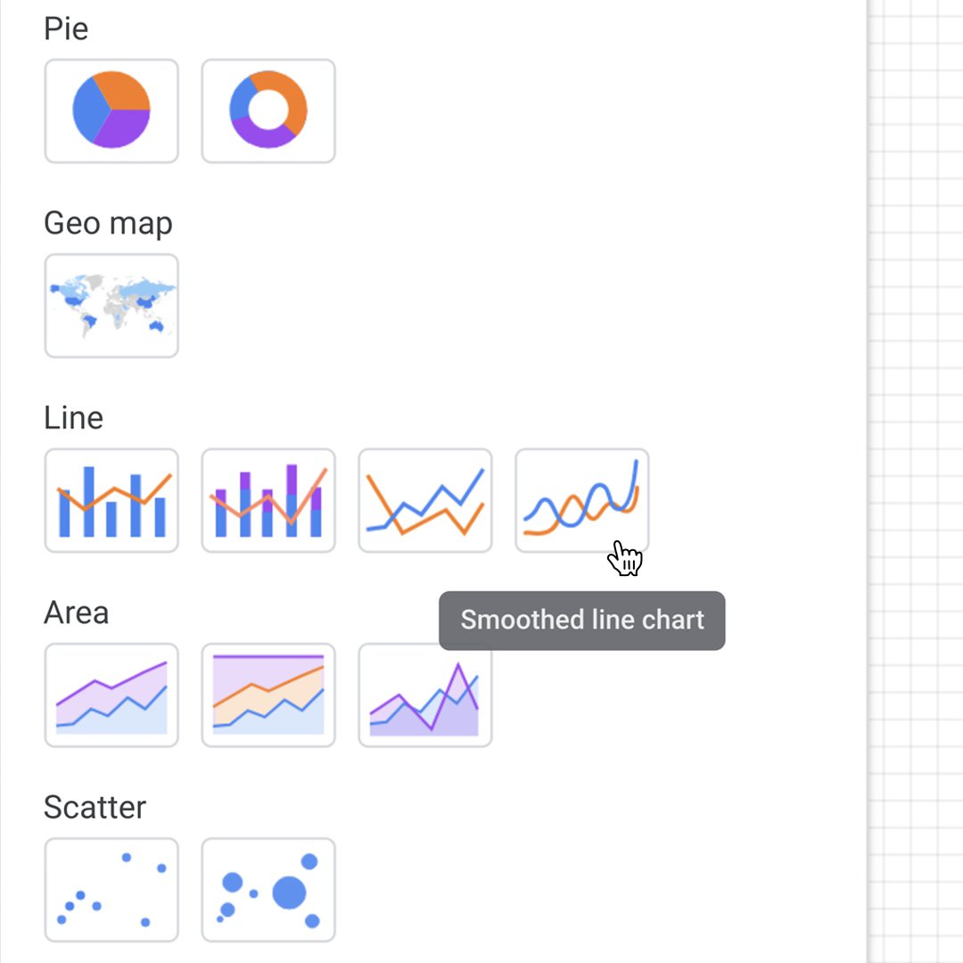
グラフの追加に移動して滑らかな折れ線グラフをクリックします。
タイトルの下にうまく収まるようにサイズを変更しますが、次のグラフ用にスペースを残しておきます。
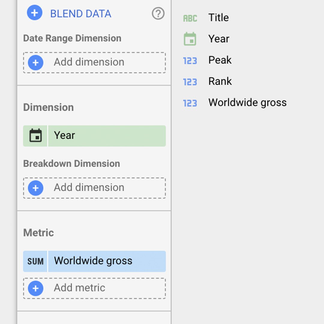
折れ線グラフのサイズ、メトリック、並び順を変更するには、そのグラフをダブルクリックします。サイズについては、年をドラッグアンドドロップしてタイトルと置き換えます。次に、メトリックを世界全体の総額に置き換えます。
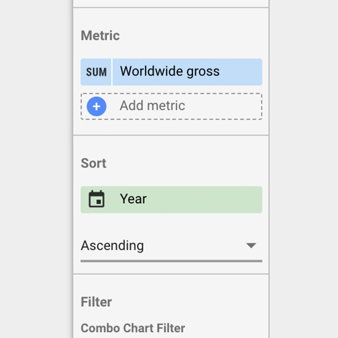
並べ替えで、世界全体の総額をクリックして、次に年をクリックします。
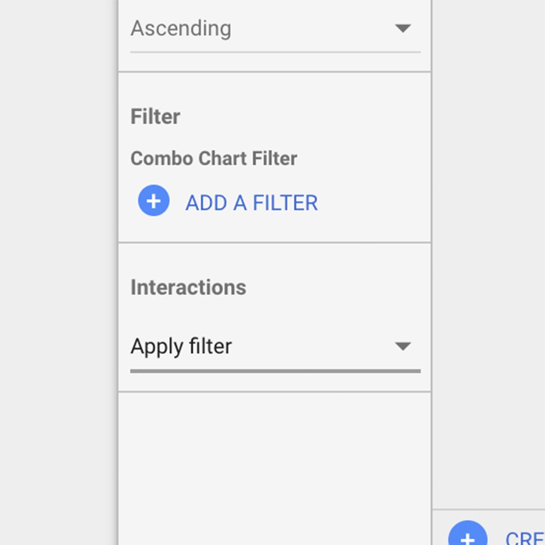
並べ替えオプションを昇順に変更します。下部に対話というセクションが表示されます。フィルターの適用を選択します。これにより、折れ線グラフをクリックするたびに、テーブルをフィルター処理するようになります。
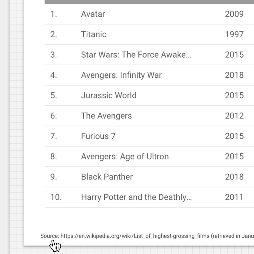
テーブルグラフを追加する。
Adding a table chart
グラフの追加> テーブルグラフの順に選択します。リストの最初の10行が表示されるようにサイズを変更します。
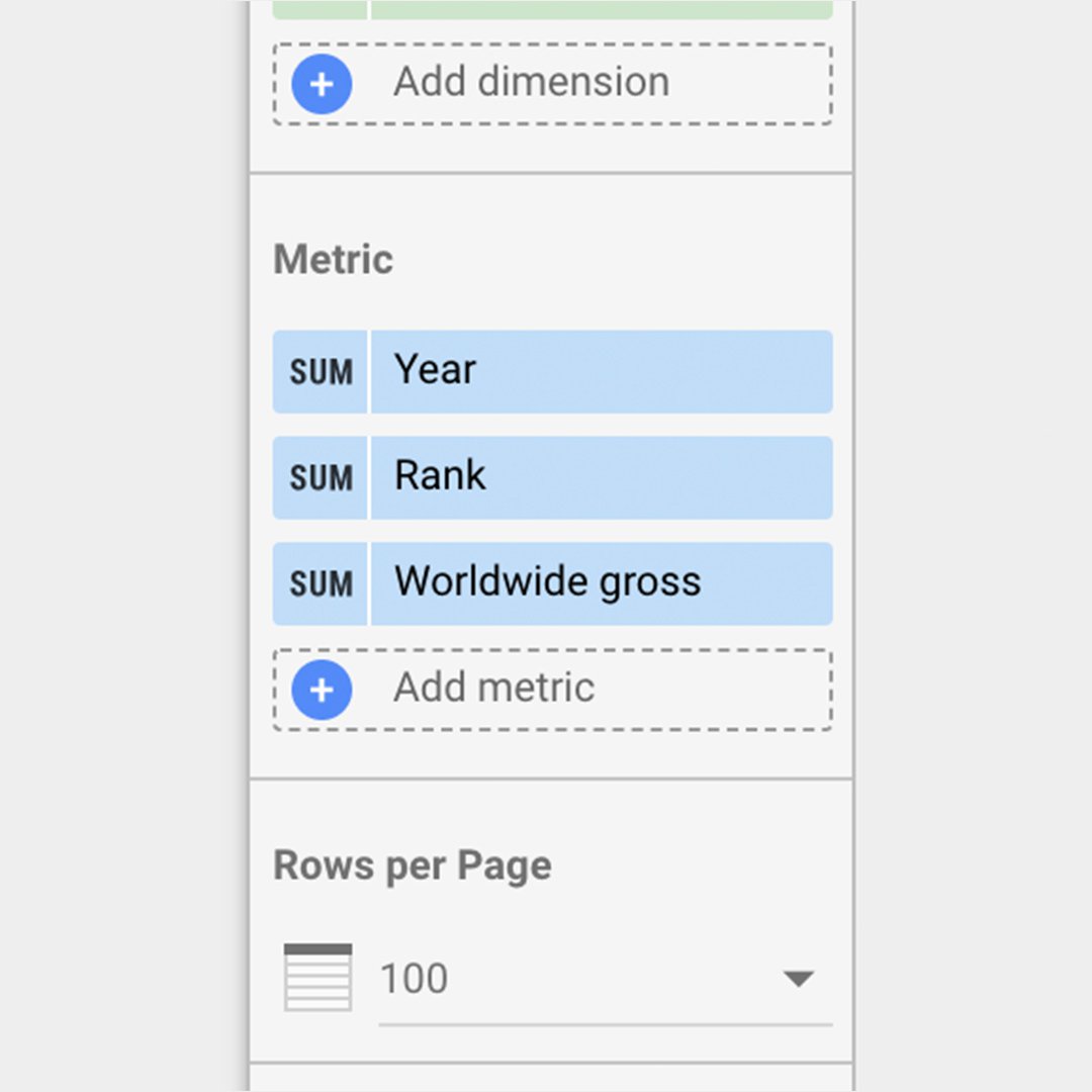
このテーブルに、3つのメトリックを次の順序で設定しましょう:年、ランク、世界全体の総額。メトリックに移動して、利用可能なフィールドからドラッグするか、メトリックの追加をクリックして、これらのフィールドを追加します。
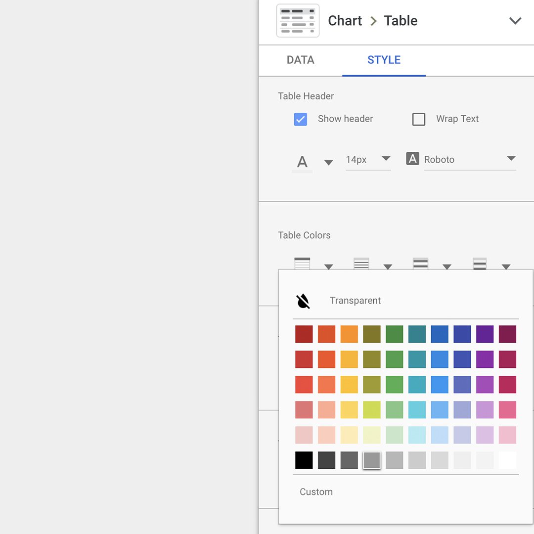
次に、スタイル>テーブルの色の順に移動して、ヘッダーの色を濃い灰色に変更します。
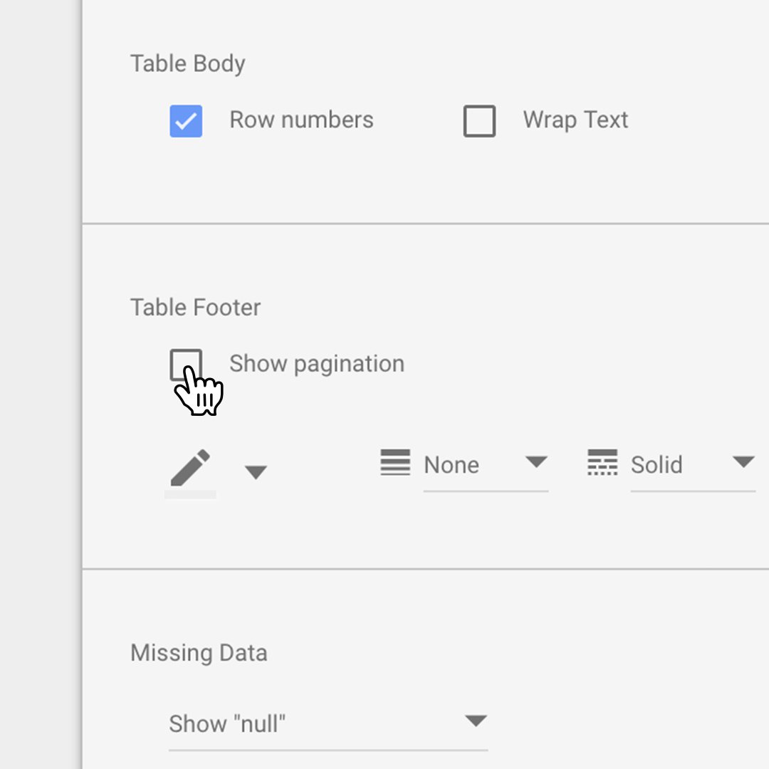
テーブルフッターに移動してページネーションの表示のチェックマークを外します。
これで、データソースを引用してグラフの使用方法を説明するテキストを追加できるようになりました。テキストを選択してテーブルの下部に追加します。
可視化のデザインを変更する。
可視化をカスタマイズするのに使用できるデザイン要素とテキストについて、いくつかの異なる種類を見てみましょう。
「詳細を見るにはスクロールしてください!」などの方向性のあるテキストを追加するには、テキストをクリックしてメッセージを入力します。
いつでも、表示をクリックして、可視化をプレビューできます。 表示モードと編集モードを切り替えるには、もう一度クリックするだけです。
表示モードになっているときは、以下の折れ線とテーブル内の任意のポイントをクリックすると、その年の上位50の映画が自動的に表示されます。
表示 モードでは、タイトル、折れ線グラフ、テーブルグラフなど、作成した可視化の全体を確認することもできます。
対話型の可視化を埋め込む。
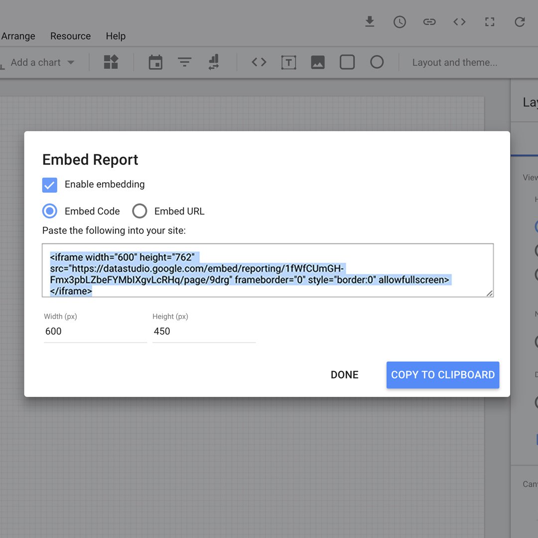
可視化を電子メールで、またはWebサイトに埋め込めることによって共有できます。
この可視化を他のGSuiteドキュメントと同じ方法で共有します。
この対話型の可視化をWebサイトに埋め込むには、ファイル>レポートの埋め込みの順にクリックします。埋め込みを有効にするボックスにチェックマークを入れ、ページでコードを使います。
おめでとうございます!
「Data Studio:対話型データの可視化を行う」を終了されました。
引き続きデジタルジャーナリズムのスキルを磨き、Google News Initiative認証に向けて勉強していただくには、トレーニングセンターのWebサイトに移動して、別のレッスンを受けてください。
その他のデータジャーナリズムのレッスンについては、次のURLをご覧ください。
https://newsinitiative.withgoogle.com/training/course/data-journalism