Refine your checkout flow
Recover revenue from potential subscribers

What is cart abandonment?

Cart abandonment or checkout abandonment is when a potential subscriber or donor starts to purchase a subscription or donate, but doesn’t complete the transaction.
Abandonment rate averages 70% across all industries (2023). In other words, for every 10 people who select a subscription, 7 will leave without purchasing.
Why do people abandon a subscription or donation?
Long checkout processes, site speed, unexpected costs, and lack of security are just a few reasons why people abandon a subscription or donation, after starting to checkout.
If you’re on your phone, you’re more likely to abandon checkout at the first sign of friction.
💡 Best practices to prevent cart abandonment
- Make subscribers feel secure
- Use fewer steps
- Show their progress

How do I track abandonment rate?

To calculate your news organization’s cart abandonment rate, use the following formula:
Cart abandonment = Incomplete Transactions ÷ Carts created
For example, if 100 people began the process of purchasing a subscription or making a donation and 40 people completed their purchase, then 60 people “abandoned” their cart.
0.6 = 60 incomplete purchases ÷ 100 carts created
Your cart abandonment rate is 0.60, or 60%.
💡 Best practice: Use an overlay when someone returns to the page, or when they are about to leave the page

Make subscribers feel secure
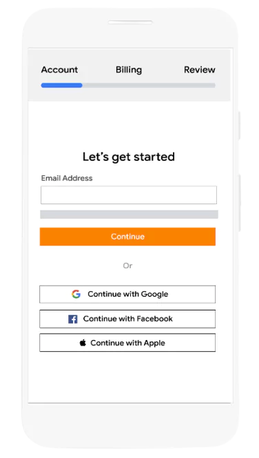
17% of people abandon carts because of lack of trust, like credit card theft or other security concerns.
💡Best practices to be transparent with data
- Ask for their e-mail first, so you can follow up
- Add a guarantee like “We will never share your data”
- Ask for essential fields only:
- Email address
- Password
- Credit card information
- Billing address
- Ask for first name, last name, and physical address only for print subscriptions
- Avoid asking for phone number or gender
- Add “Cancel Anytime” below the final purchase button

Use fewer steps
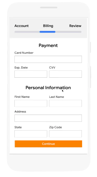
A 2019 study found that half of surveyed shoppers were less likely to complete their online purchase if the checkout process took more than 30 seconds.
💡Best practices for a faster checkout flow
- Limit checkout to a maximum of three steps, like Account, Billing, and Review.
- Enable social login. This allows your audience to sign-in or register with one-click using an existing social media account.
- Enable autofill
- Enable the number keyboard on mobile for easier selection
- Enable third-party payment options like PayPal or Amazon Pay
- Display checkout as one page

Show their progress
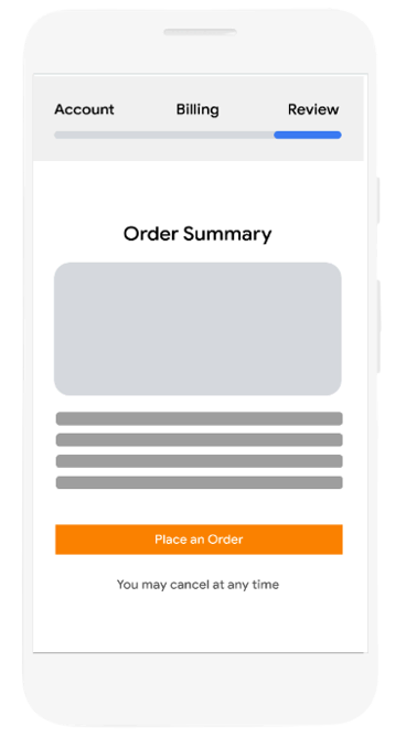
21% of people abandon carts because of complicated or lengthy checkout experiences.
A clear and simple checkout page reduces confusion, keeps potential subscribers and donors informed throughout the journey, and allows for purchases to be completed with ease.
💡Best practices to simplify your checkout
- Display an anchored progress bar
- List steps, such as “1 of 3”
- Anchor an itemized order summary to the page


-
-
Build your audience with Google's analytics tools
AulaMake better decisions based on your audiences’ data -
Subscribe with Google
ProdutoOptimize the subscription funnel by making it easy for readers to subscribe and enjoy their subscription content everywhere


