- chevron_left 所有訓練課程
Lesson Overview
How to make a good Web Story
Good Web Stories are visually appealing and move users frictionlessly through content, helping creators forgo the process of introing and closing a longform article while delighting users at the same. They’re easier to create than other formats and deliver a higher return on investment. Plus, Web Stories position creators who lean into the format as innovators in their subject matter.
There are some simple things to know about Web Stories in order to begin creating and innovating right away, which we’ll walk you through now.
What you’ll see in this Lesson:
- Learning the terminology of Web Stories
- Crafting your story to make the information flow
- Ensuring that your story is universally eye-catching
- Using video to create a story that gets real traction

Learning the terminology of Web Stories

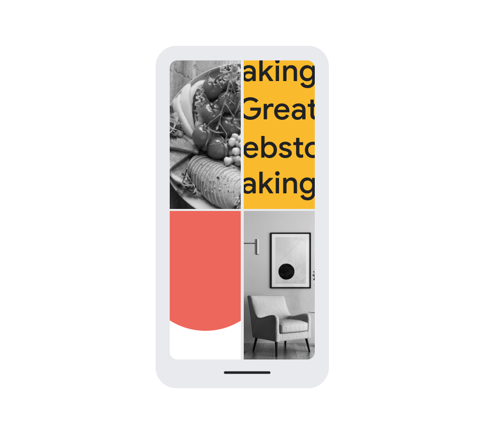
As with all new formats, there are some key pieces of terminology to learn in order to get started. One of the first things to know when creating a Web Story is the difference between a poster and a cover. The poster is the chosen thumbnail that surfaces in search results, where the cover is the opening frame of the Web Story itself.
Covers are an opportunity to brand the content from the start, leaving an impression. Posters should be compelling and explanatory of the content a user is about to see if they are to click. Google will automatically add your logo to the poster, but how it appears on the cover is up to you.
Pages are exactly what they sound like: the frames of content that make up your story. Pages can contain all types of media, with some being more video or motion-driven and others being more text-driven. Typical Web Stories last between 9 and 15 pages, but you can test out all sorts of approaches to see what works best for your unique audience.
Both WordPress and makestories.io have unique dashboards and backends to work from, each with their own terminology, but each is easy to learn on the fly.

Crafting your story to make the information flow
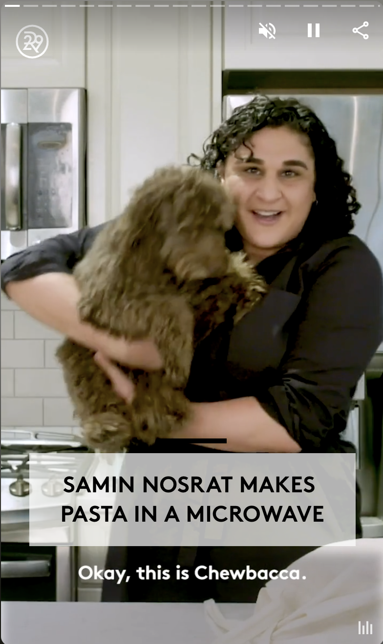
Web Stories do some of the work for you, due to the engaging nature of the format, but there are always ways to improve on your content by following best practices or experimenting with new ones of your own. Entice users with a clear and compelling poster that will catch eyes in search, once they’ve clicked, ensure that they land on a beautiful cover that opens the story in a way that sets the tone.
If you’ve already done the work of crafting a story in vertical video on a social platform, you can simply export it to a Web Story for use on your site, then choose poster imagery and text to make your story pop in search results.
There are numerous approaches that creators are employing already, including: How-Tos, Listicles, Slideshows, Interviews, Editorials, Breaking News and more across tons of content categories. It’s paramount to create a Web Story that has a discernible opening and closing, and we currently recommend these stories to be between 9 and 15 pages in total.
Breaking out information into logical chunks that feel distinct improves the user experience. Also, try to use text as a tool for clarification as opposed to positioning it as the primary subject matter. You can always use the closing of a story to drive to a longer-form article using a CTA such as ‘View the Full Story.’

-
-
open_in_new
-
Google Alerts: Stay in the know.
課程Follow the breaking stories that are important to you.從帳戶中移除儲存到你的帳戶None


