


Visualizing elections
Bring elections to life with interactive visualizations
Lesson overview

Visualizations can help your audience to quickly digest polls
How to bring election results and polls to life by creating interactive visuals.
- Build candidate profile cards
- Quick visualizations with Data GIF Maker
Building candidate profiles in Flourish

In this section, we’ll use Flourish to display key information about political candidates. As well as going through Flourish’s card templates, we’ll think about the best way to show different kinds of data.
Head to Flourish to start the training.
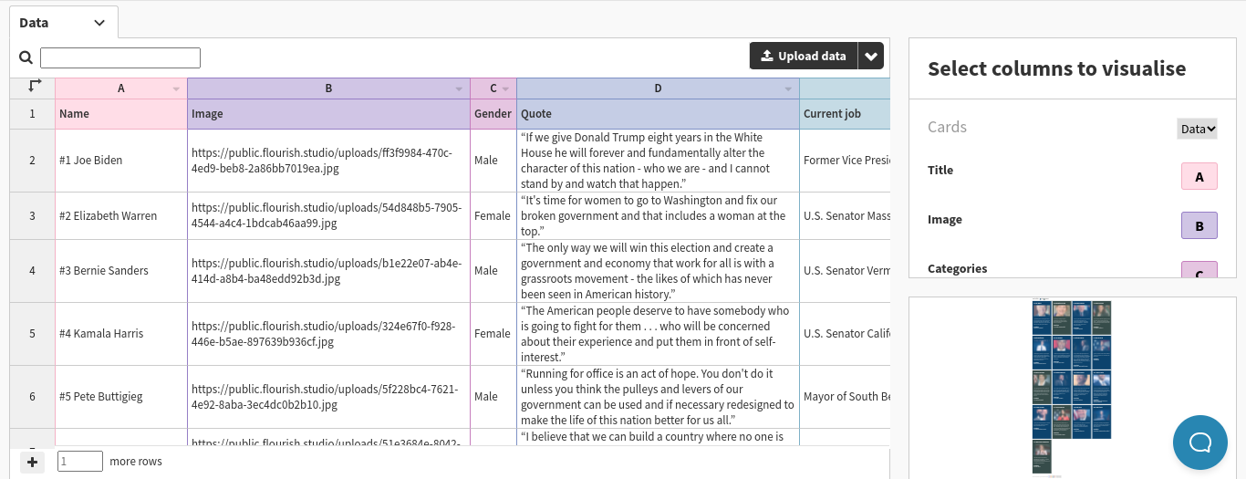
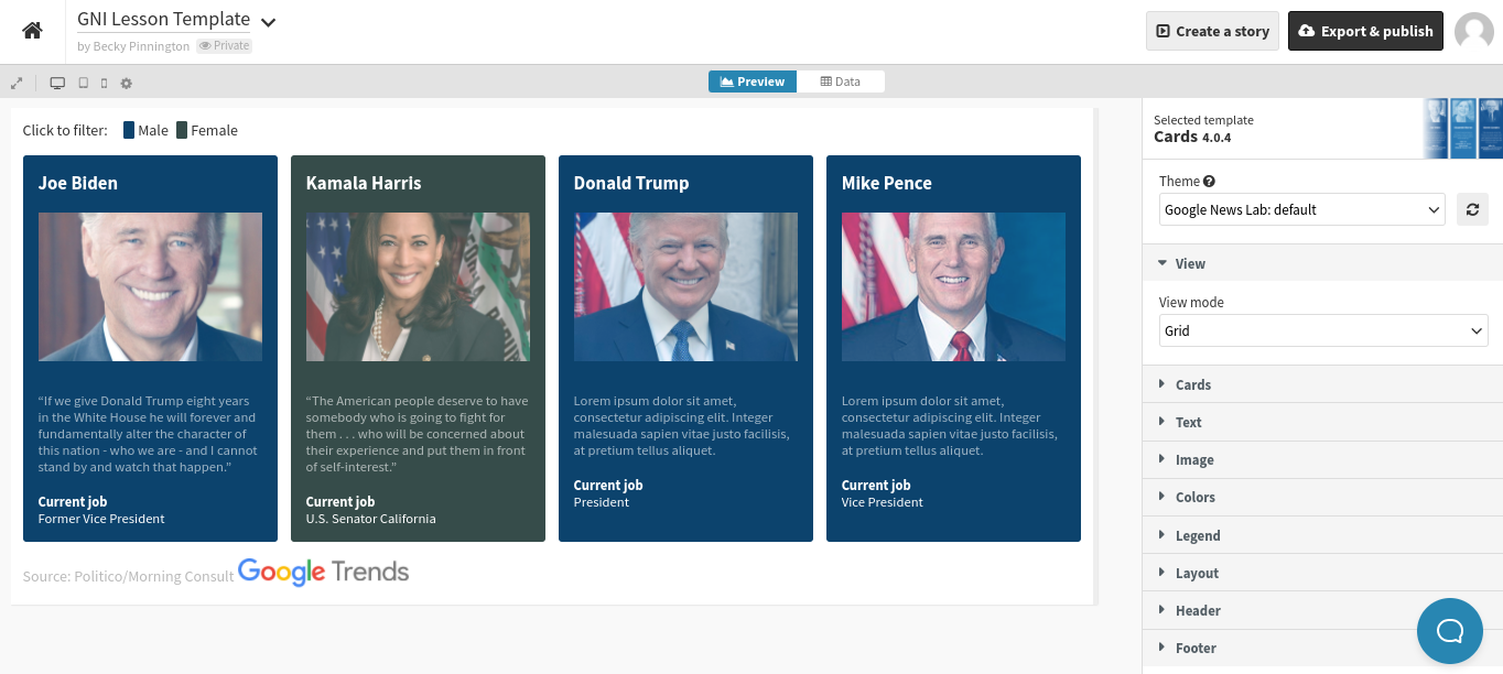
Go to your Flourish library and click “new visualization” to browse the menu of templates. Scroll down to view the card templates. Select “profiles”, although you can experiment with any of the default visuals.
Above the visual, toggle from “preview” to “data”. Instead of looking at the dataset, focus on the right side of the screen, where it says “select columns to visualize”.This visualization lets you choose a title, an image, a card category, a subtitle, and some additional text.
To understand how this column selector works, and how it displays the data look at which columns are being selected, and compare this to what you can see in the visualization.
Remove all of the candidates except for Joe Biden and Kamala Harris, then add Donald Trump and Mike Pence. Your visual should now look something like this.
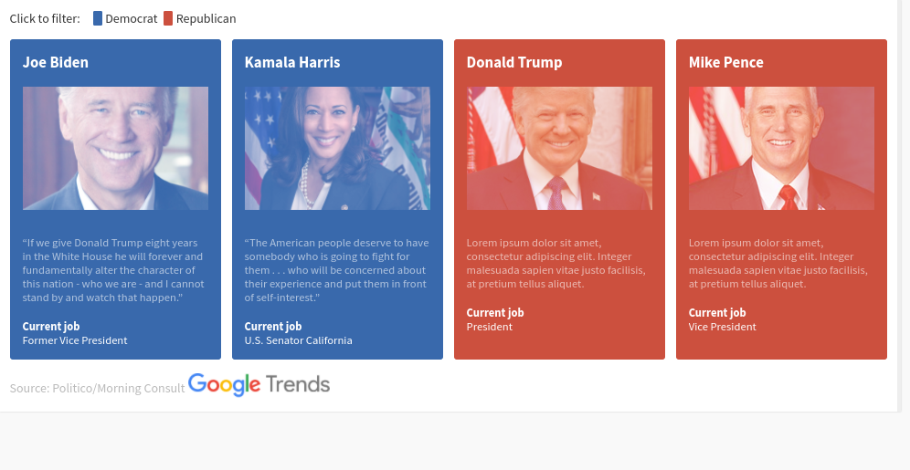
Column C, which corresponds to the card’s category according to the data panel, is currently set to gender. Let’s change this to represent a candidate’s political party. Biden and Harris are Democrats, while Trump and Pence are Republicans.We can then switch to preview, and change the category colours to red for Republicans, and blue for Democrats.
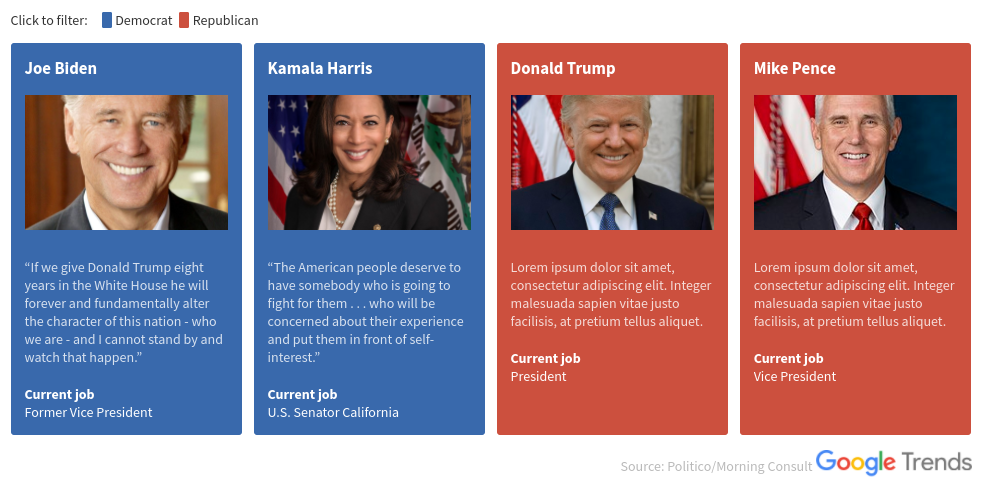
That visual doesn’t look quite right - stay in preview mode and have a look at your options to make more changes.Here I have set my image blend mode to “normal”, increased the font size of my body text and my subtitle, and aligned my footer to the right of the visualisation.
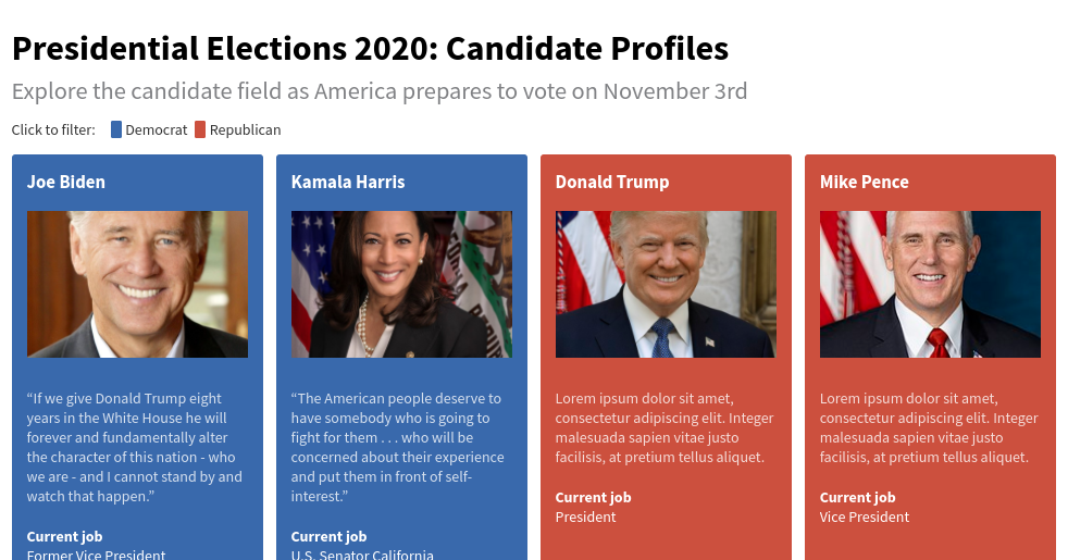
Our final step is to add a title to our visual. Once you are happy, you can click “publish” above the visualization editor, and either send your visual by direct link or get code to embed it on your website.
-
How to add them to your site
LessonThere are two ways to add Web Stories to your site, regardless of the CMS you use to maintain it. Each approach is simple, intuitive, and poised to make Web Stories a vital part of your content strategy going forward. -
![GlobalFishingWatch_MonitorFishingFleetsAndVessels]()
Global Fishing Watch: Monitor fishing fleets and vessels
LessonA guide to using Global Fishing Watch’s mapping tool to track global fishing activity. -
![GoogleTrends_AccessAWorldOfData]()
Public Data Explorer: Access a world of data.
LessonUse high-quality data sets to create compelling visuals.