


Google Sheets: Visualizing data

Learn to build visualizations that help you interpret the data and tell data-driven stories.
Lesson overview
Learn to build a data visualization in Google Sheets.
In the previous lesson, Google Sheets: Cleaning data, we learned how to clean the table we imported from Wikipedia using importHTML. Now, we will use Google Sheets to produce visualizations that show readers what the data means.
- Creating a horizontal bar chart.
- Adding a title to your chart.
- Resizing a chart.
- Creating highlights.
- Improving legibility.
- Publishing your interactive data visualization.
For more Data Journalism lessons, visit:
newsinitiative.withgoogle.com/training/course/data-journalism
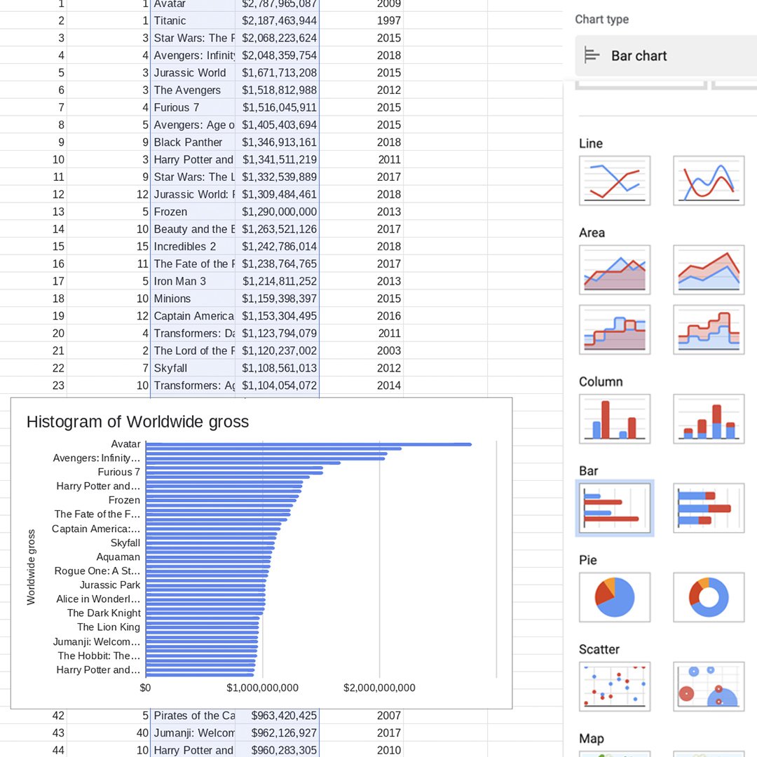
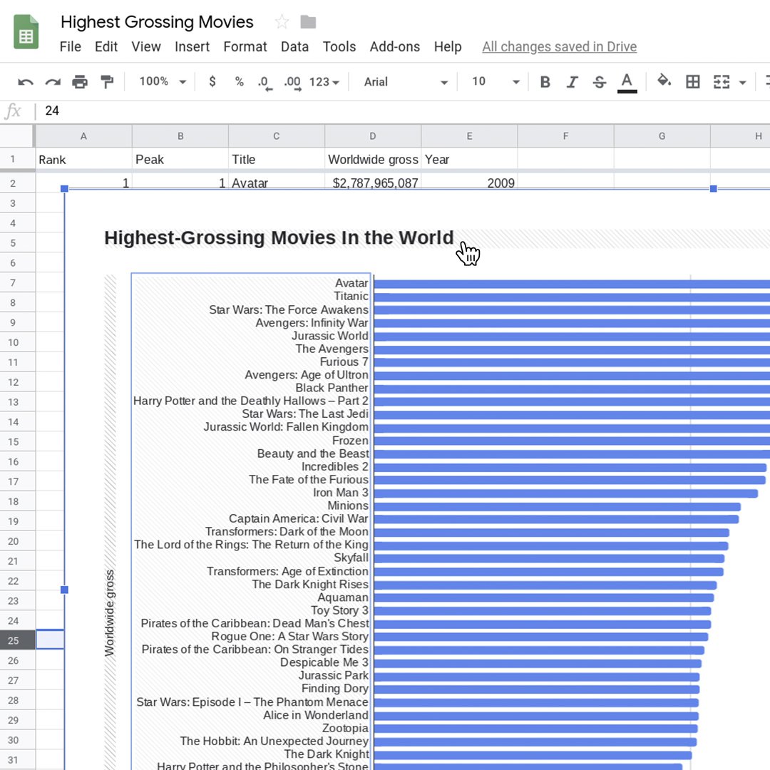
Creating a horizontal bar chart.
Bar charts are very useful for numerical comparisons. Our first visualization will be a bar chart showing which movies made more money and how far the highest grossing movies are from the lowest ones.
Select C1, hold shift and select D51, highlighting the two columns we will use for the chart. Click Insert > Chart.
In the Chart editor, select Chart type > Bar chart.
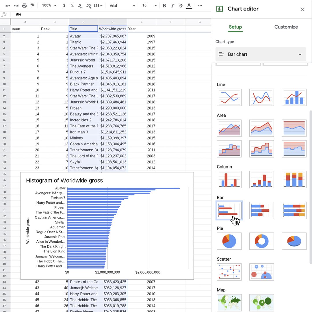
Adding a title to your chart.
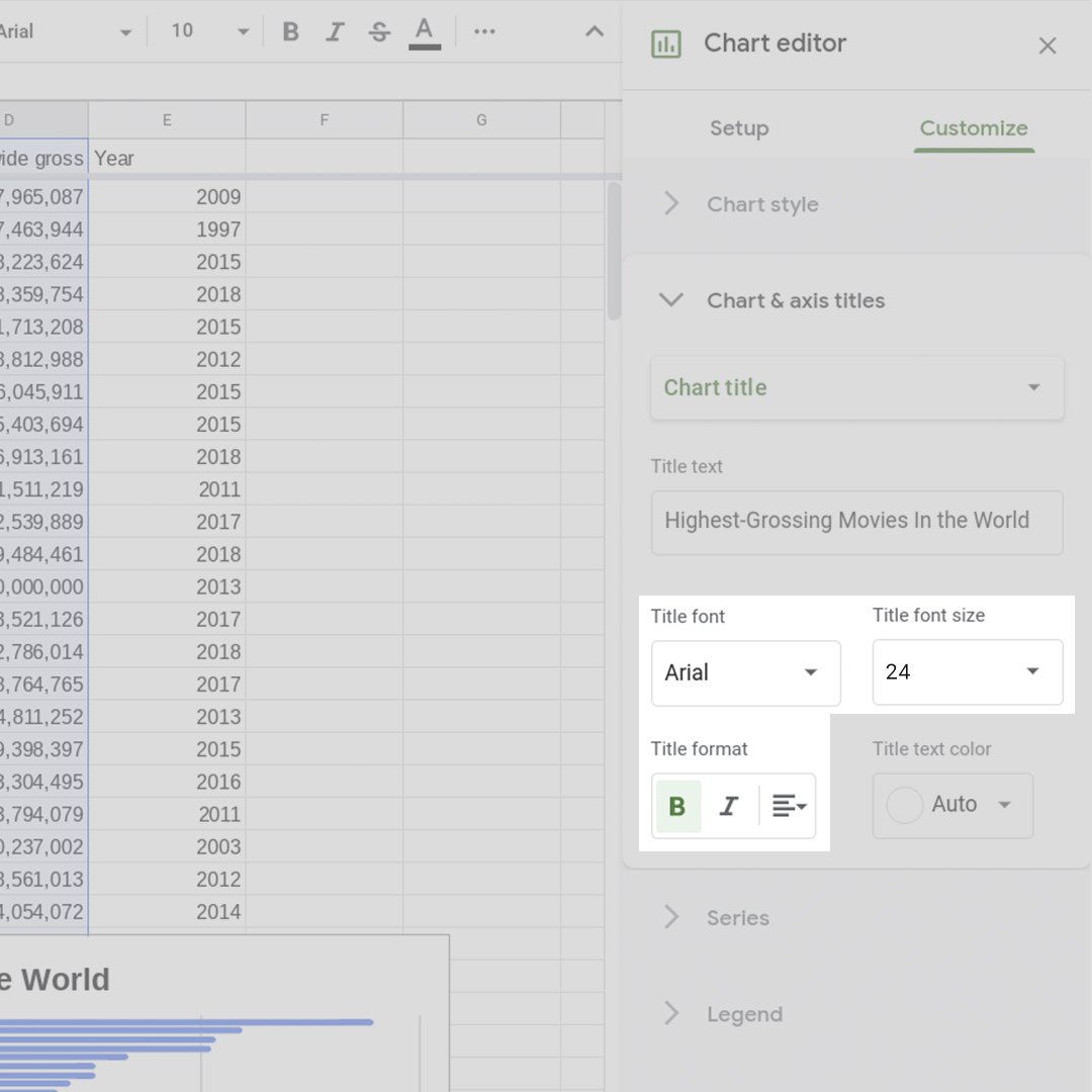
Now that you’ve made a basic chart, let’s enhance it and make it more readable.
First, let’s change the title. In the Chart editor, select Customize > Chart & axis titles. Change the title to “Highest-grossing Movies in the World."
Set Title font to Arial and Font size to 24. Make it bold.
Resizing a chart.
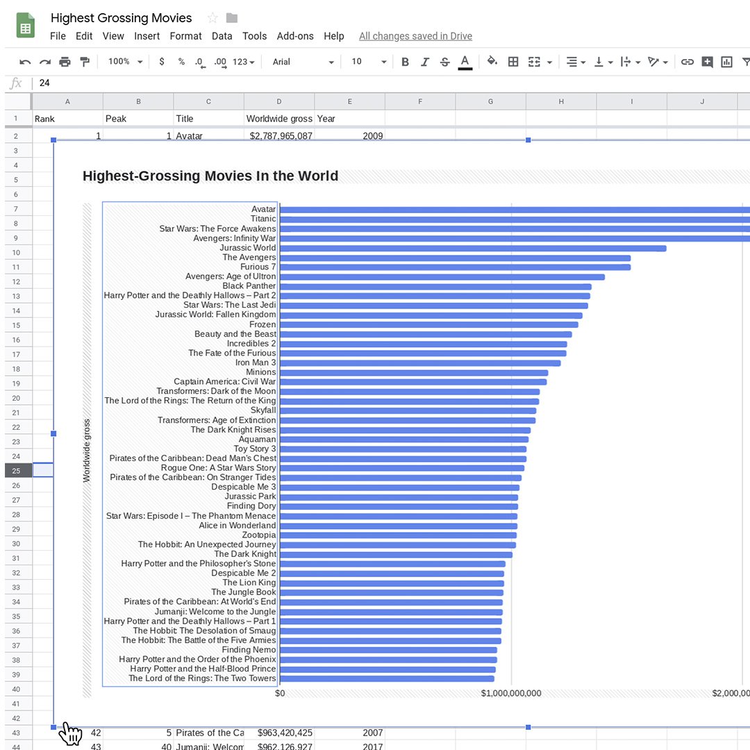
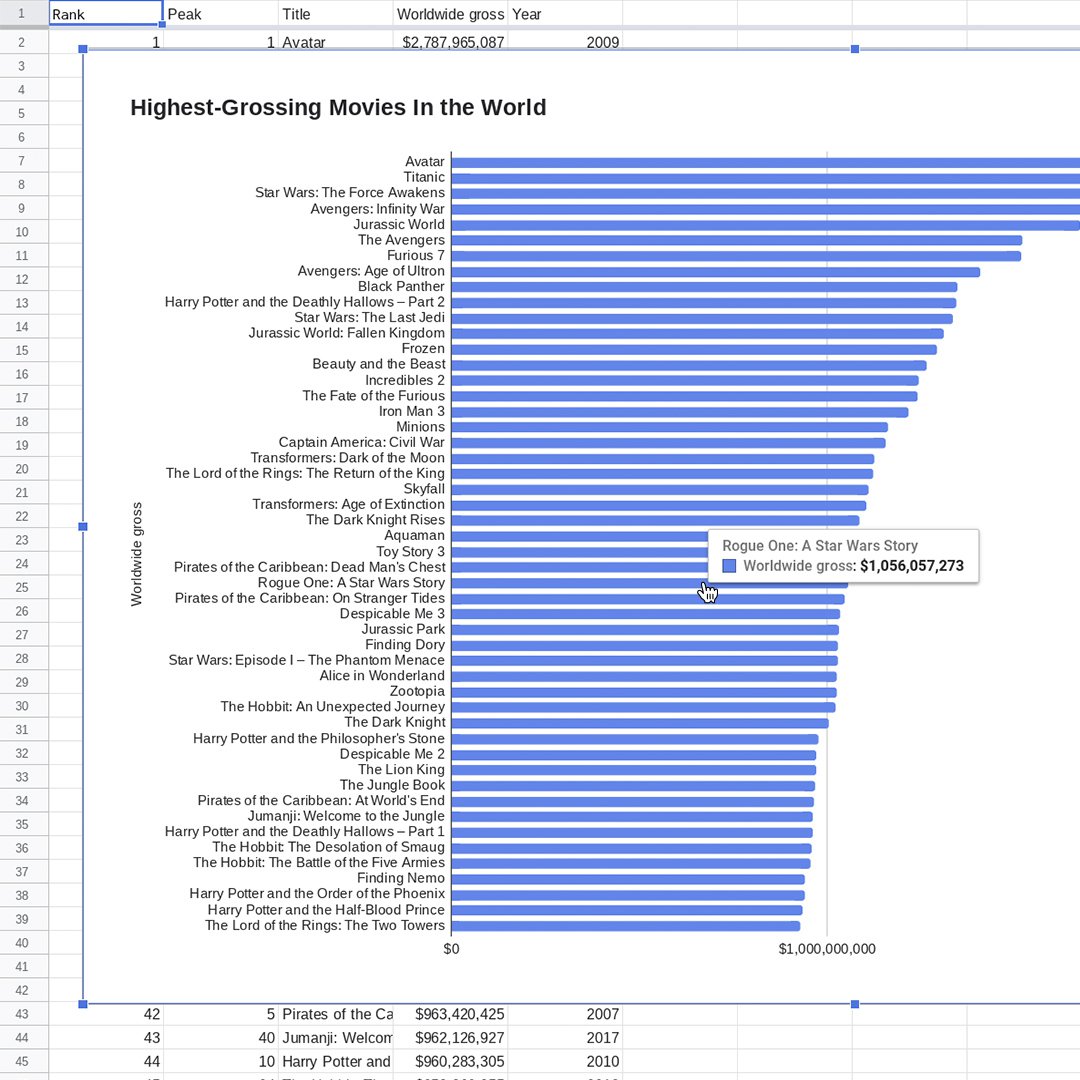
To make the chart legible, we need to resize it.
Click on the chart. Drag the bounding boxes, especially horizontally.
Click anywhere on top of the movie titles and hover the mouse around the vertical edges until bounding boxes fade in. Drag the box until there’s enough space for the longest title to be read in full.
Notice that there are 50 bars in the chart, but not 50 film titles. That’s because Google Sheets automatically distributes the names in the list, omitting some of them, to improve legibility. Hover the cursor on top of any bar and a tooltip box will appear showing the name and value of that bar.
Creating highlights.
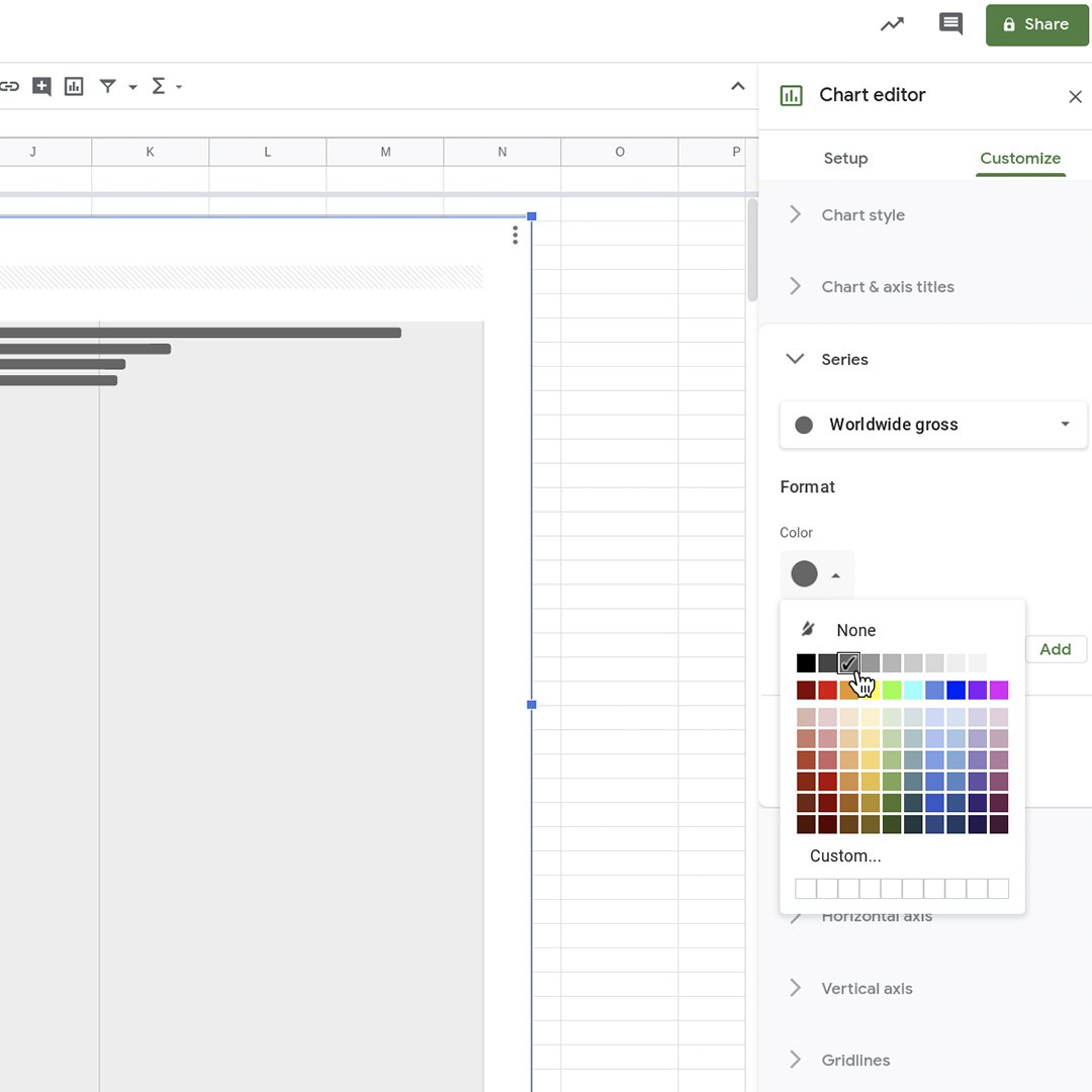
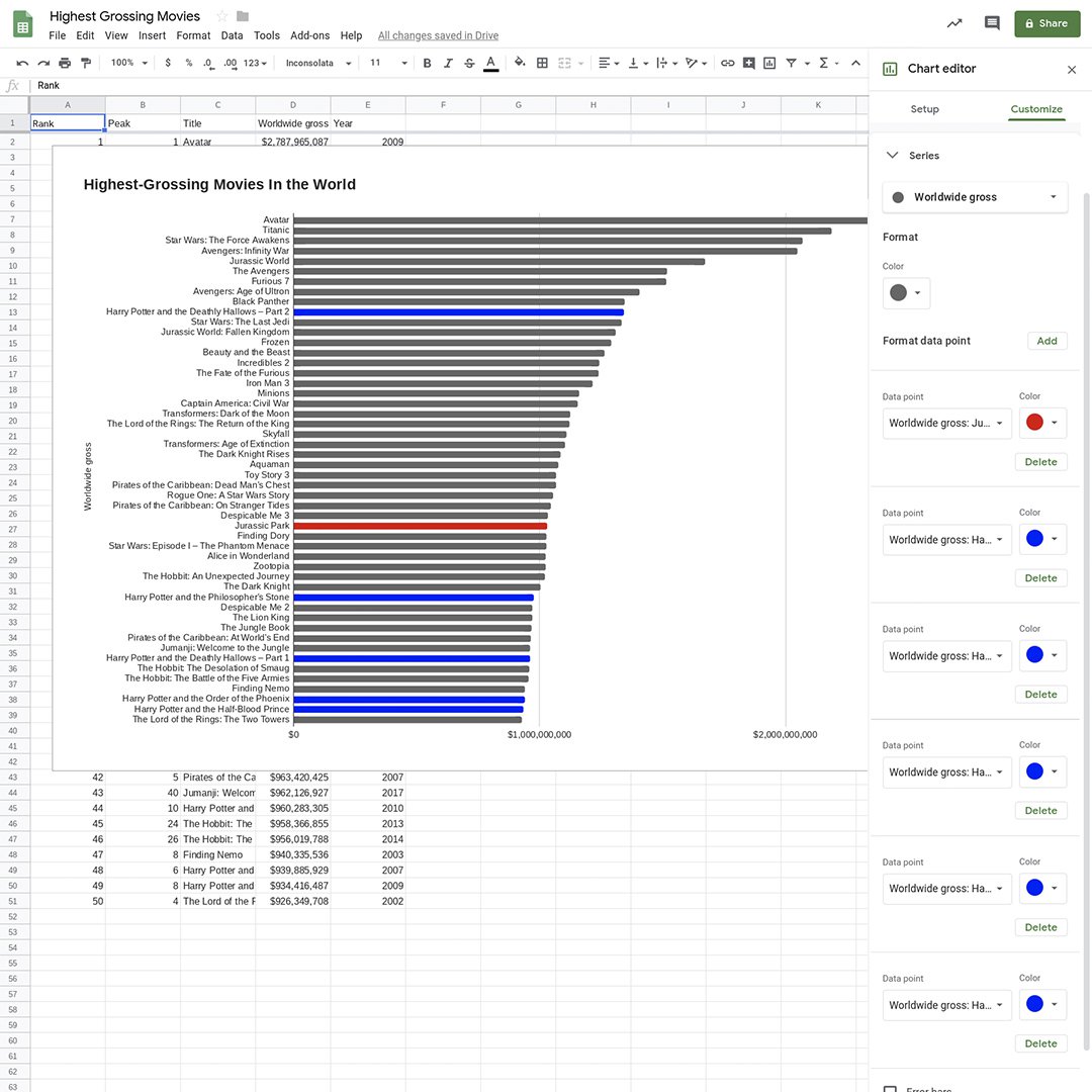
Let’s make highlights in the chart to draw attention to specific elements for our users.
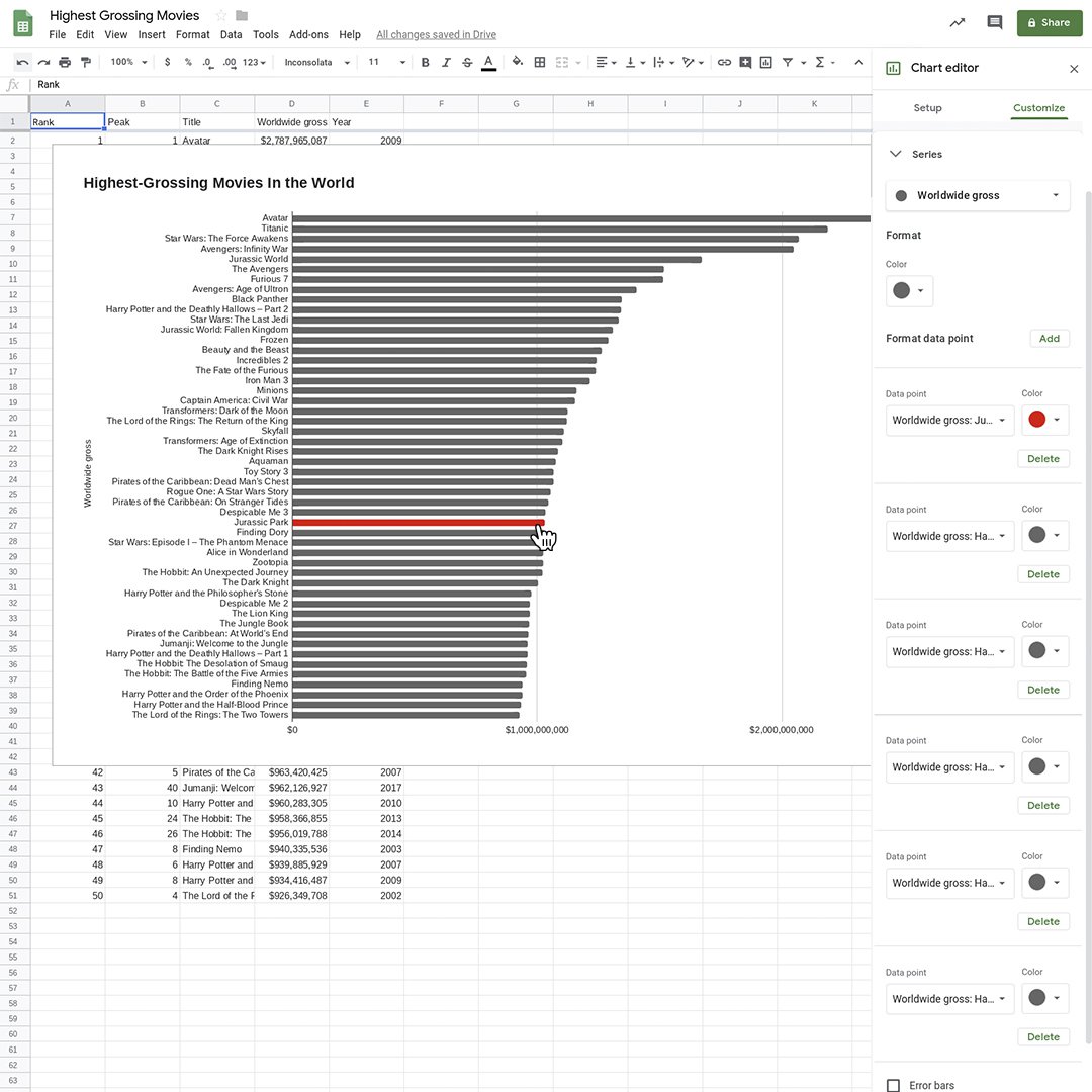
Change the color of all the bars to gray. In the Chart editor, select Customize > Series and select a dark gray shade for Worldwide Gross.
Let’s highlight the movie Jurassic Park, the oldest movie in the list (1993). Go to Format data point and click Add. Select Worldwide gross: Jurassic Park and click OK. Choose the color red.
Let’s do the same thing to highlight all five Harry Potter movies in blue.
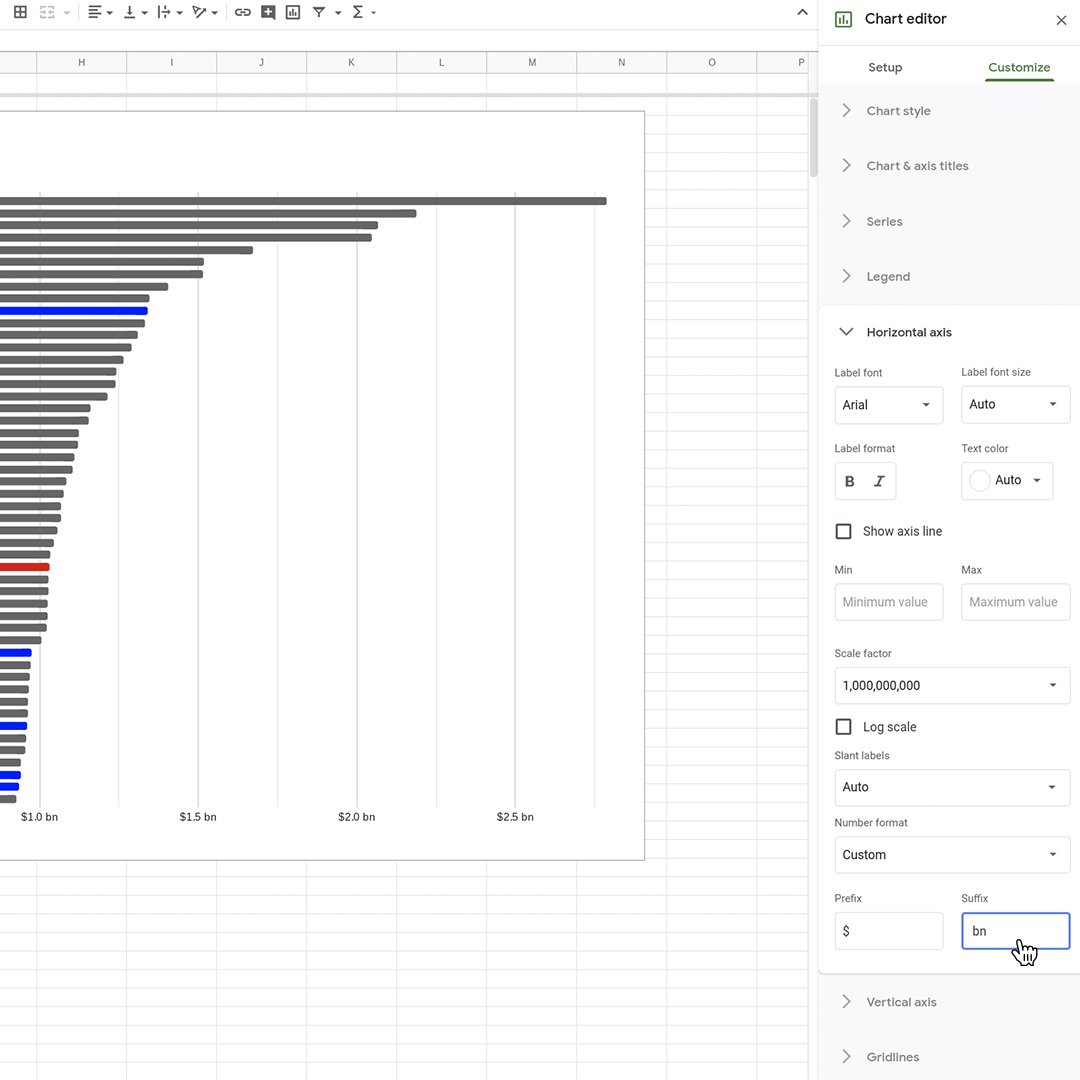
Improving legibility.
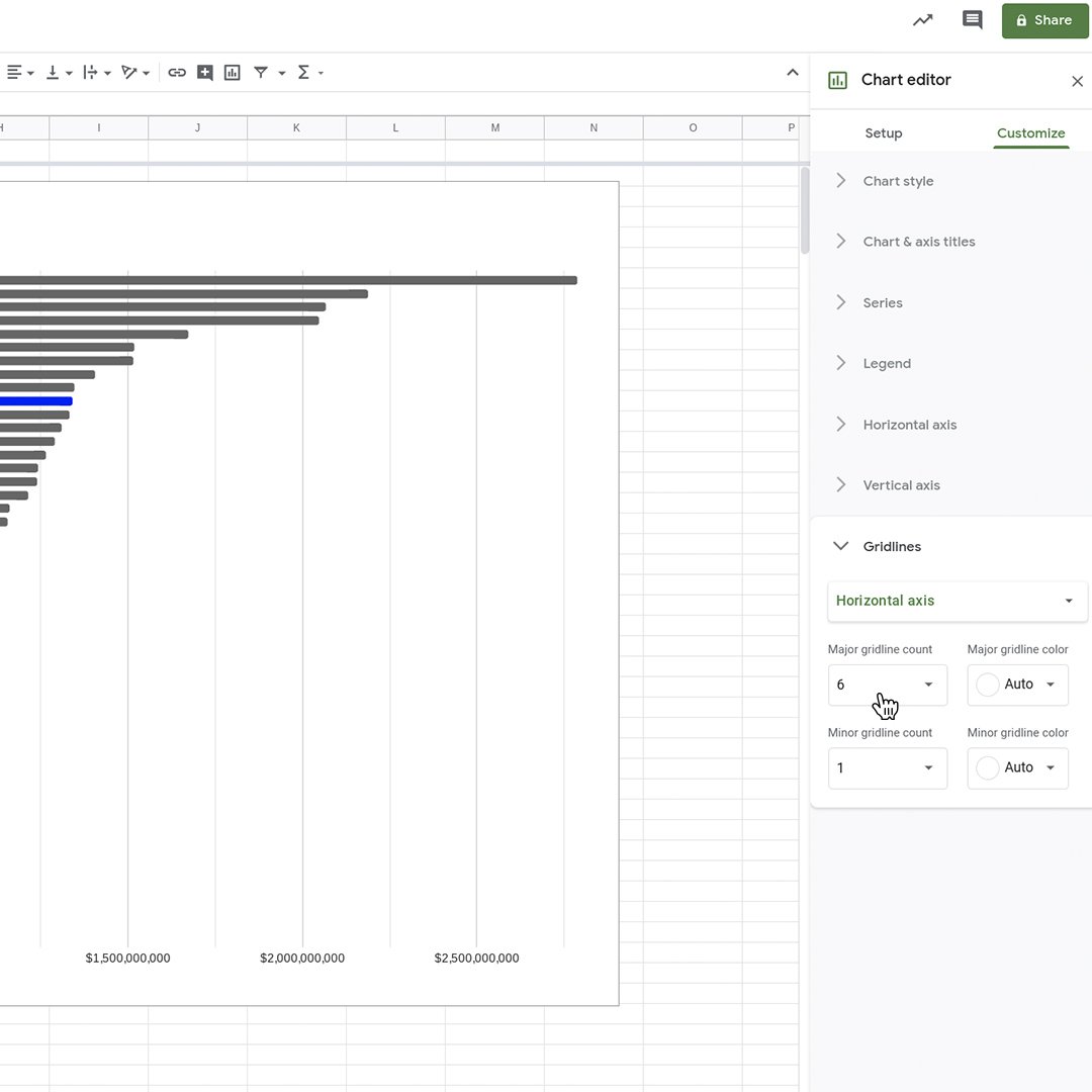
We can further improve the design of our chart by adding gridlines.
In the Chart editor, select Customize > Gridlines. In the Horizontal axis, increase the Major gridline count to 6 and Minor gridline count to 1.
Go back to Customize > Horizontal axis. In Scale factor, select 1,000,000,000. In Number format, select Custom. For Prefix, type $. For Suffix, type “ bn” without quotes, and including the leading space.
Publishing your interactive data visualization.
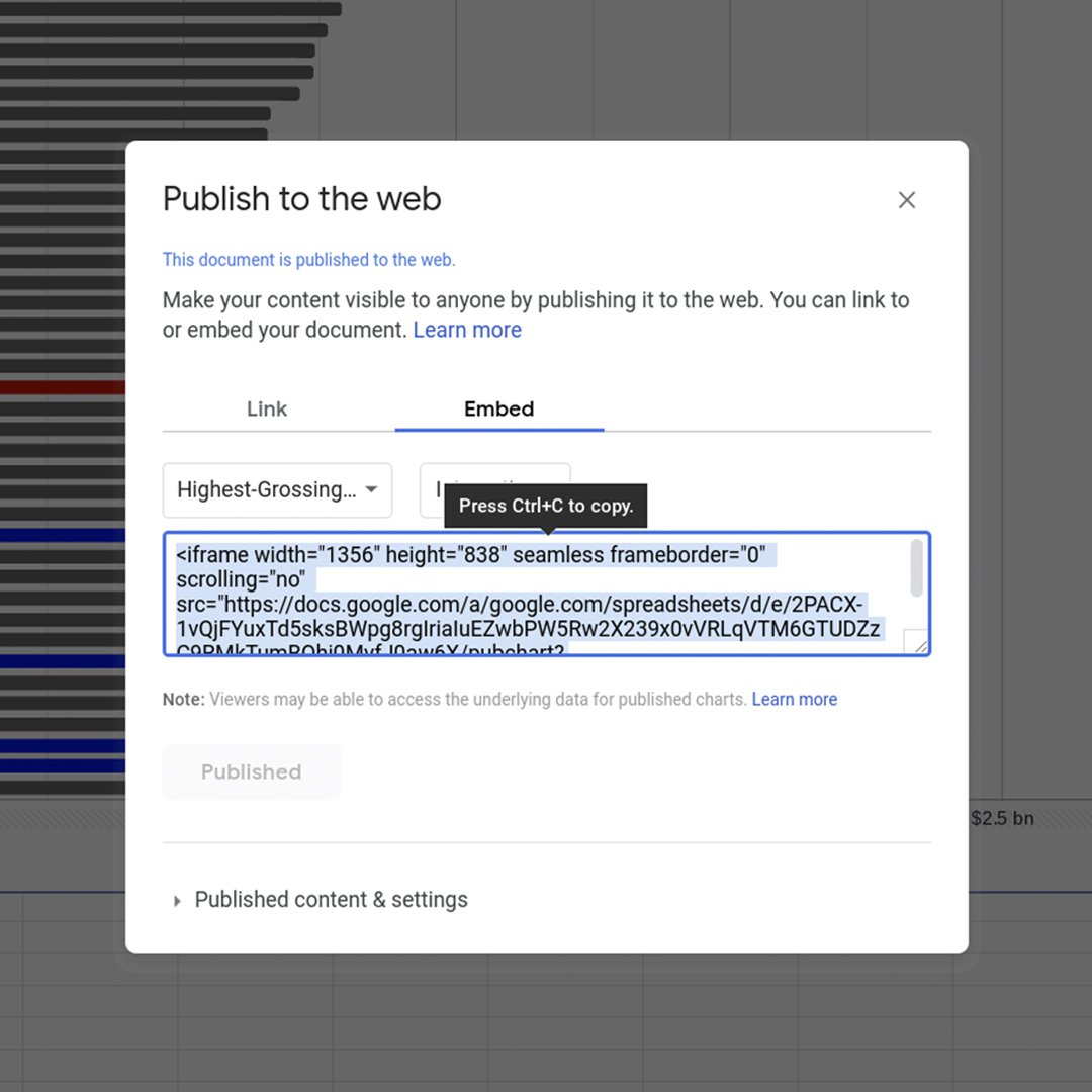
When you are satisfied with the accuracy, legibility and design of your chart, it’s time to publish it.
Hover your mouse in the top left corner of the chart and click on the three-dotted icon. Select Publish chart > Publish.
You should now have an embed code that you can use on your publication. Any changes will be automatically republished when made.
Congratulations!
You completed “Google Sheets: Visualizing data.”
To continue building your digital journalism skills and work toward Google News Initiative certification, go to our Training Center website and take another lesson:
For more Data Journalism lessons, visit:
newsinitiative.withgoogle.com/training/course/data-journalism
-
![image23_2_o9fybYX.png]()
Investigating stories with Machine Learning
LessonHow you can use Machine Learning in your reporting -
![gni_business_lesson_play_18]()
-