


Storytelling with Google Trends
Learn ways to contextualize Google Trends data and integrate it into your reporting.
Lesson overview

How Trends can support journalism
Google Trends is a useful tool for monitoring what audiences are interested in. Trends data can also be used in storytelling. This lesson will take you through ways to find and make sense of Trends stories, and how to report the data.
- Finding stories with Trends Explore
- Making sense of Google Trends data
- Embed charts from Google Trends
- Download data from Google Trends
- How to talk about Google Trends
Finding stories with Trends Explore
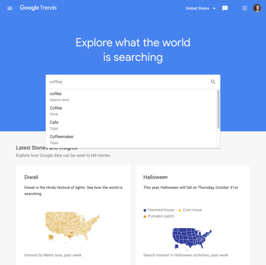
If you want to tell a story with Google Trends data, how can you find a good one? We’ll take you through some suggested use cases.
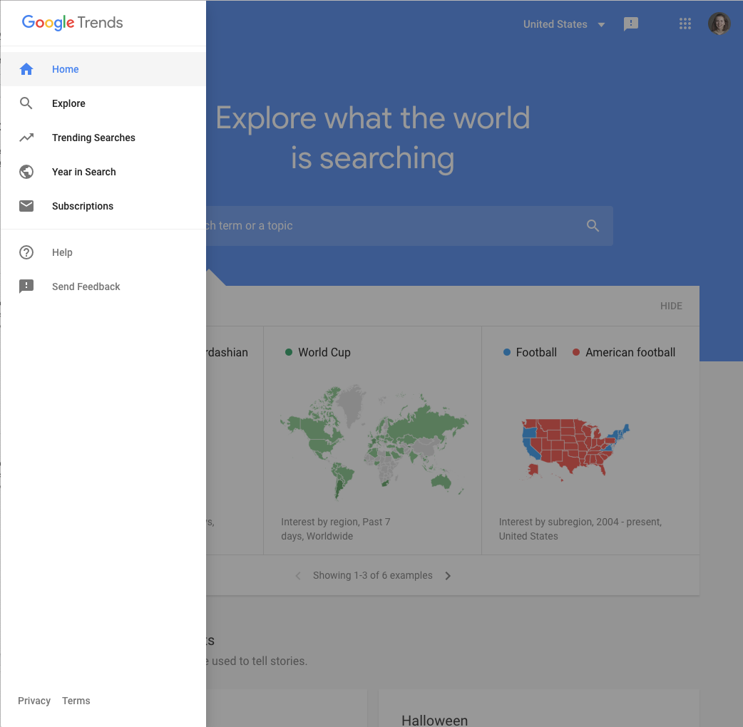
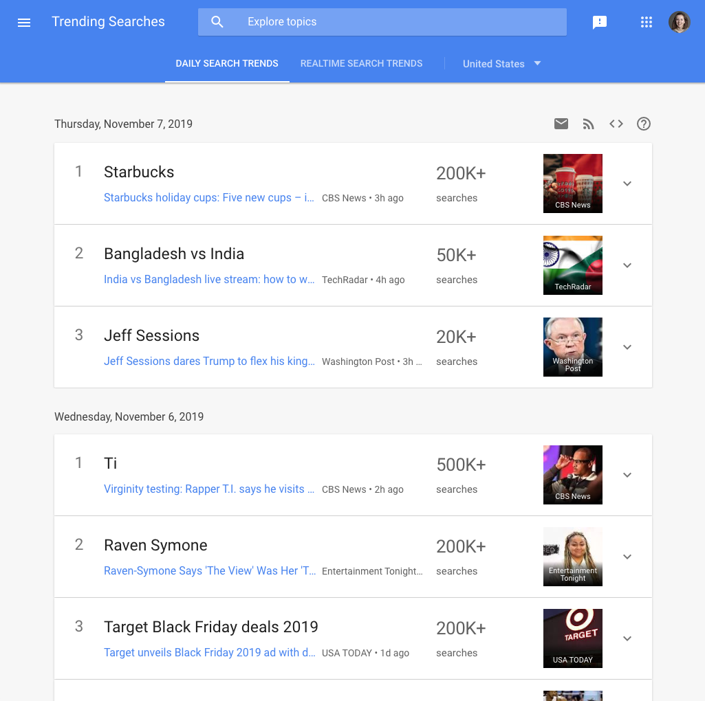
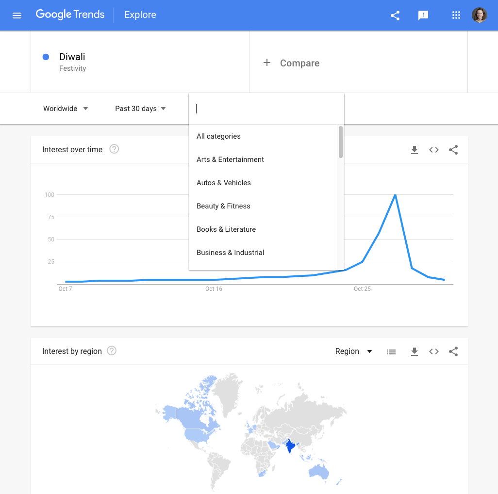
If you want to know what’s being searched right now, start with Trending Searches. From any page in the Trends Explore site, click the menu button in the top left and select Trending Searches.
Trending Searches shows the top-searched news stories each day in your location. You can also see realtime search trends, showing the biggest spikes of the past 24 hours.If you are looking to cover the news stories Google users are most interested in, this is the place to find out which stories to prioritise.
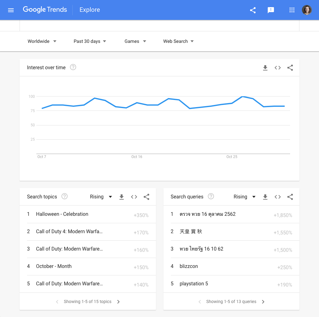
To surface longer term trends, use the Explore tool.First, perform your search. On the results page, select Categories.
Once you have selected a category, remove the search term or topic you entered. You will now be able to view general data about that category. The best place to look for stories here is among the rising searches.
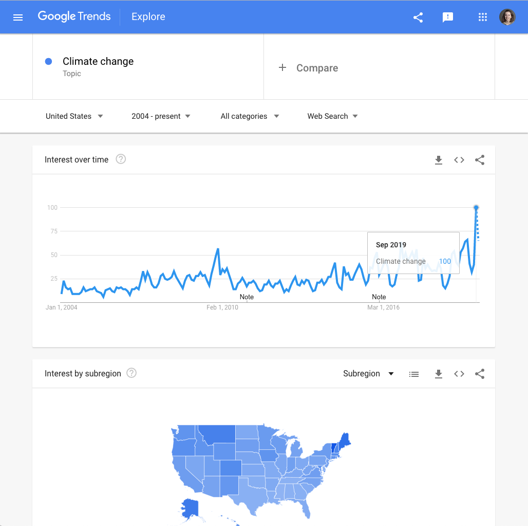
You can also use Google Trends to support a story you are already reporting. Let’s say you’re writing about US citizens’ shifting sentiment toward climate change.Use Trends Explore to look up climate change in the US since 2004. We can see that search interest in climate change reached its highest point yet in September 2019. You could use this statistic to support your story.
Making sense of Google Trends data

Because Google Trends data is presented as an index, one of our frequently asked questions is, “How important is this?” In this section, we will explore how to understand and contextualize trending searches, which can then form the basis of a news story.
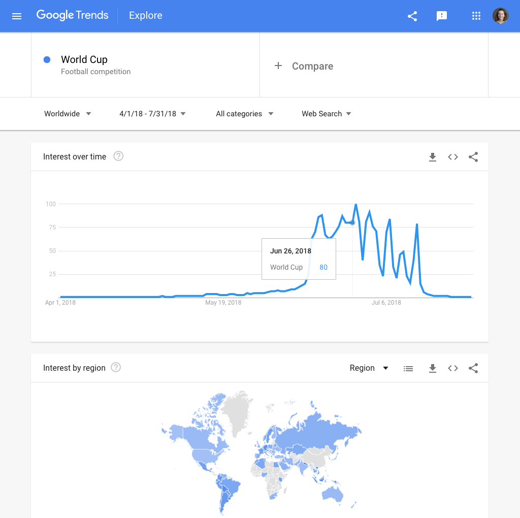
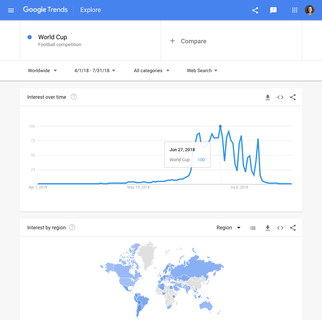
One of the easiest ways to make sense of Google Trends data is to find “spikes” in search. This is a sudden acceleration of search interest in a topic, compared to usual search volume.Here is a spike in search interest in the men’s football World Cup, at the time of the tournament in 2018. We call it a spike because of the sharp upward movement of the search interest graph.
Let’s examine the numbers on this time series graph. Search interest peaks on June 27, 2018, and reaches the maximum search interest value of 100. A month earlier, on May 27, search interest was 4.When we calculate the difference between these two values, this is a percentage increase of 2,400%. But what does this spike really mean?
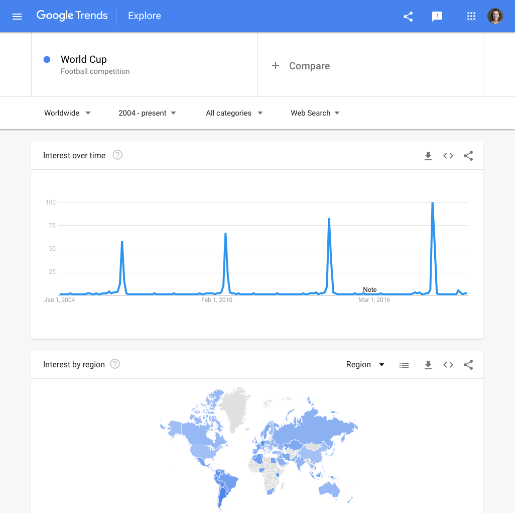
Above the time series graph, change the time range of the data. Look at search interest in the World Cup back to 2004. We can now see that the World Cup in 2018 was more highly-searched than any of the previous tournaments covered by the data.
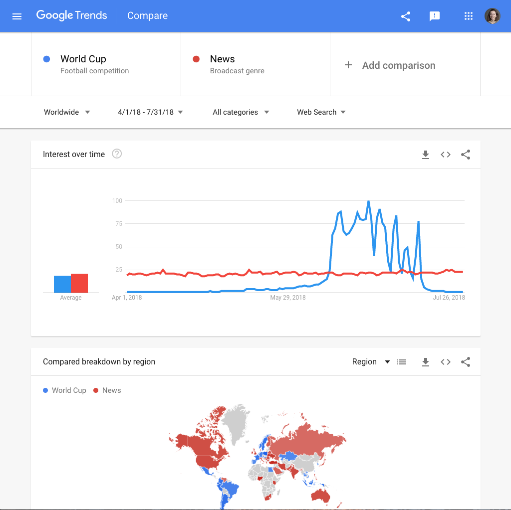
Let’s return to our original search. Now we know the size of the spike, and we know this is the most highly searched World Cup since 2004. But when we see a topic is spiking, this doesn’t always mean it is very highly searched.We can add a second topic to sense-check this. We will now compare the World Cup to the news, a consistently highly-searched topic. We can see the World Cup actually spiked above the news in 2018.
When we need to contextualise spikes in search interest -- or the general level of searches for any topic -- it can be really useful to compare them to topics with a consistently high level of search interest.These topics vary by country, but common highly-searched topics include the news, the weather, leading politicians, and recipes.
Embed charts from Google Trends

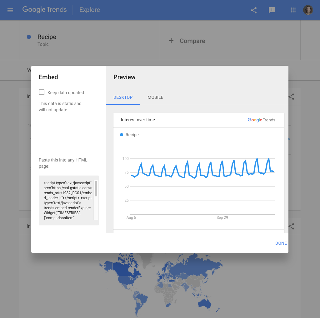
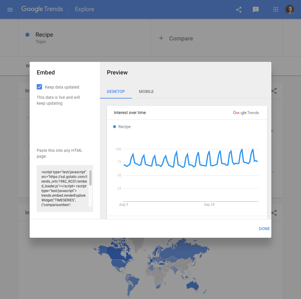
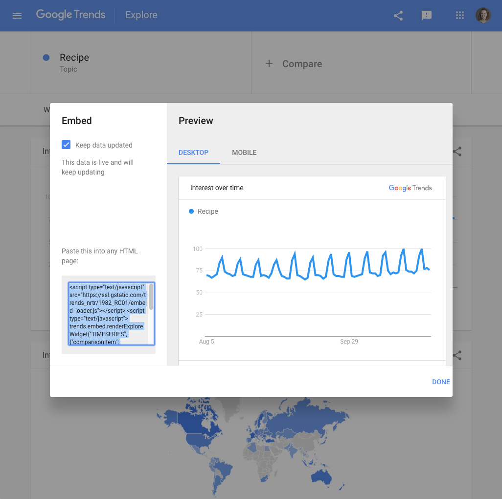
When you find a story in Google Trends data, you will probably want to include visuals in your work. You can embed charts directly from Google Trends by following these steps.
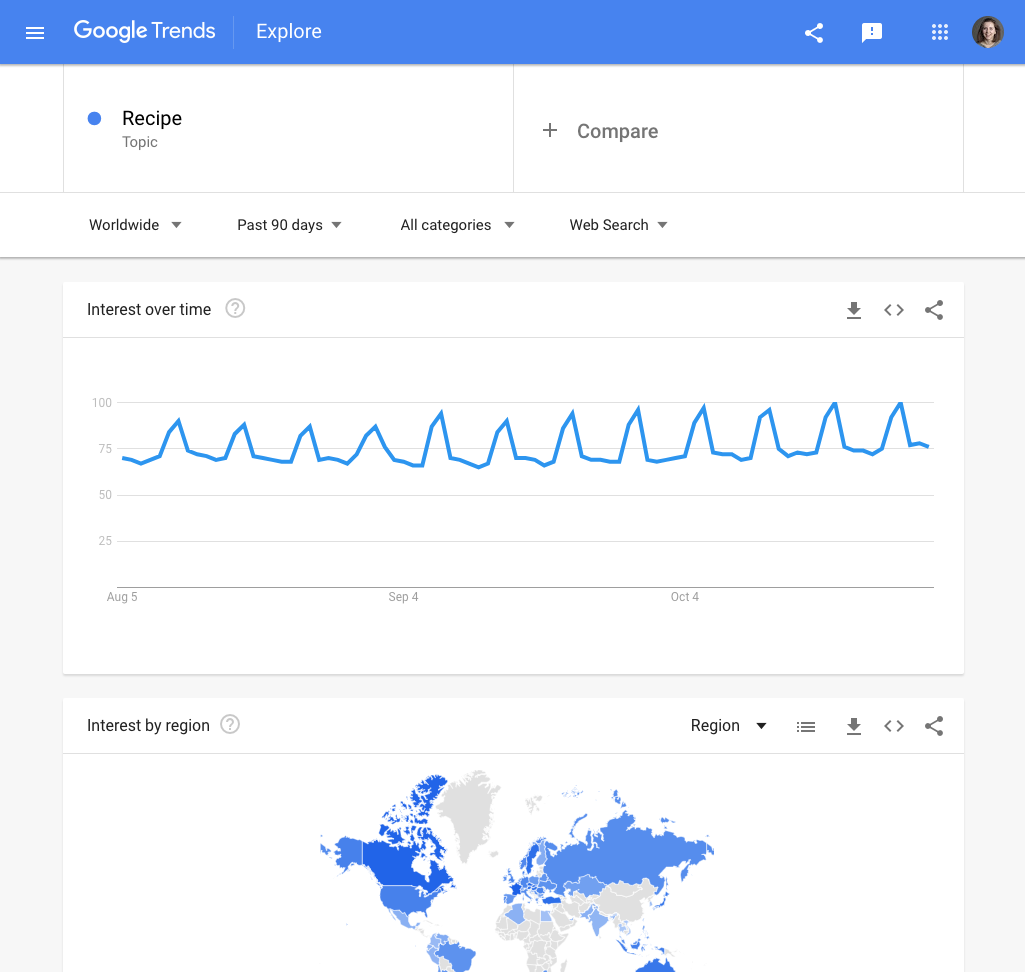
You can choose any topic in order to work through this tutorial. Our example looks at search interest in recipes from the past 90 days, worldwide.
In the top right of any chart on Trends Explore, you’ll see an embed symbol which looks like two triangular brackets: <>.
Click the embed symbol. Click Desktop or Mobile for a preview of how the chart will display.
If you chart includes the present time period and you want it to automatically update, select Keep data updated. If you are looking at a time period that has already ended, this option will not be available.
On the bottom left, you will see a text box with an embed code. Copy and paste it into any HTML page to embed your Google Trends chart.
Download data from Google Trends

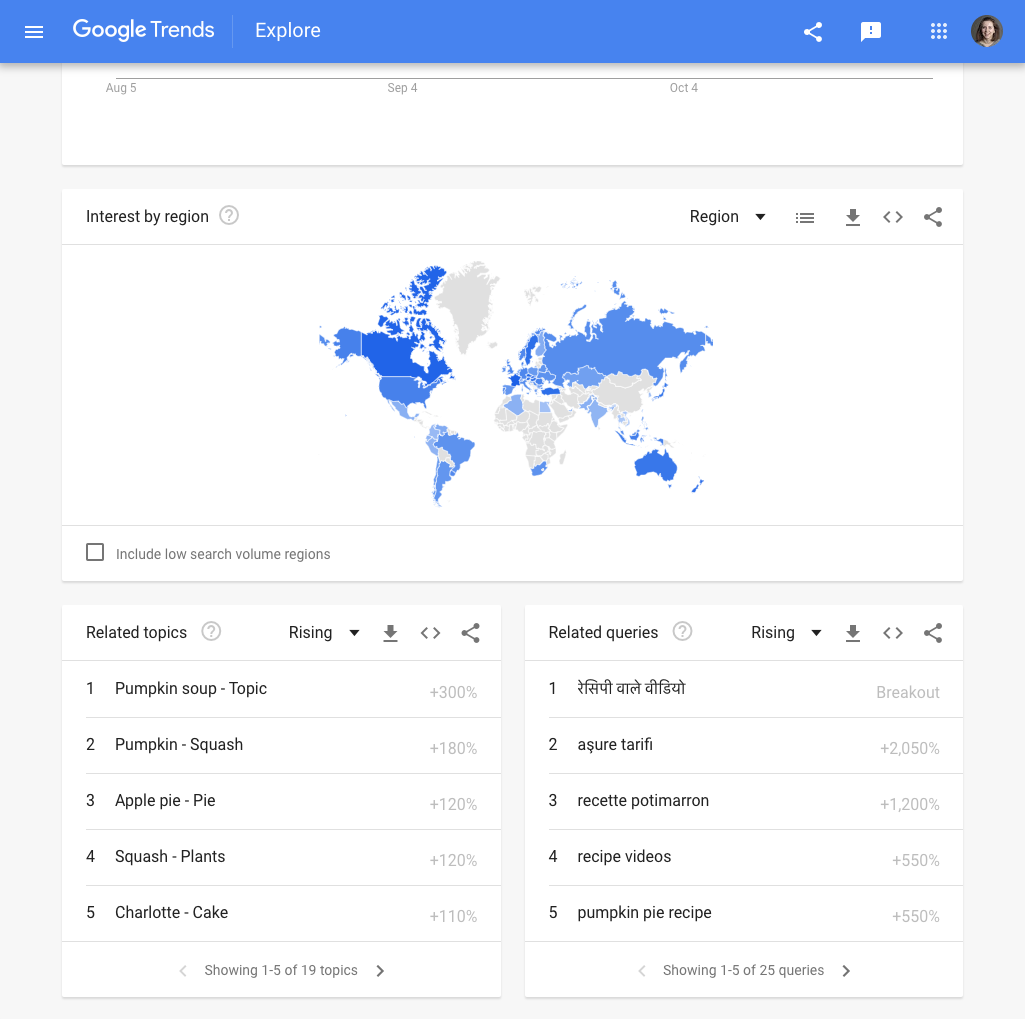

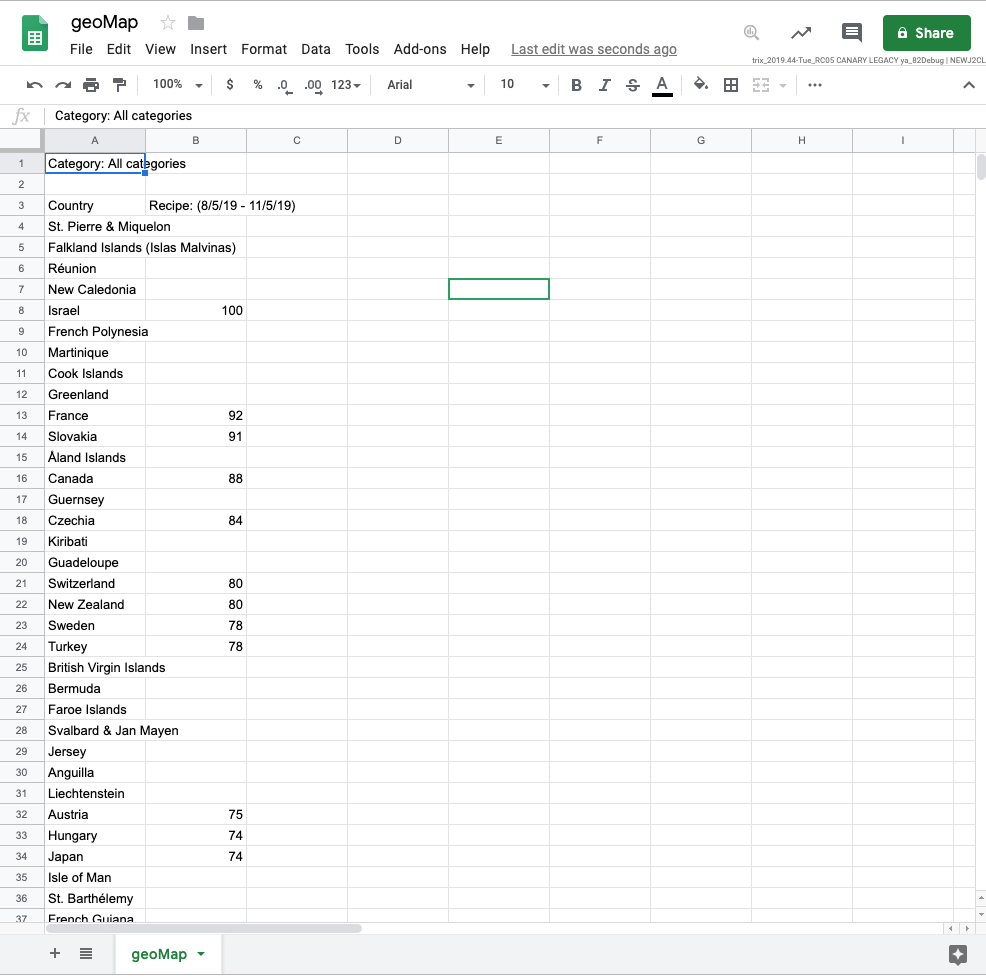

You can create bespoke visualizations using Google Trends data rather than embedding from Trends Explore. We will now explain how to download Google Trends data so you can make your own maps and charts.
Choose any topic to work through this tutorial. Our example looks at search interest in recipes from the past 90 days, worldwide.
In the top right of any widget, you will see an arrow pointing downward to a horizontal line. This download symbol lets you access the data behind that chart.
For this example, download all of the data for related topics, terms, searches by region, and searches over time.
Open the csv files. How do they look? If you are working in Google Sheets, they should display properly. However, in some spreadsheet software, csv files may display irregularities in column alignment, special characters, etc.
You can now clean the data and visualize it using free tools such as Flourish.Note that the geoMap file will leave blank cells in the search interest value column, for countries where search volume was not high enough to allocate an index value.
How to talk about Google Trends
Now that you can integrate Google Trends data into your journalism, how do you ensure you represent it accurately?
When writing about a trend, make sure you include the search term or topic, location, and time frame. If you have used categories or filtered by search type, you should mention this, too.
You should also ensure you have accurately represented the numbers. You should describe spikes as an increase in “search interest,” rather than “searches.” You should also know the difference between top searches and rising or “trending” searches. For more information on this, see “Basics of Google Trends”.
It’s also important to remember that Google Trends data is completely anonymous. Your writing should reflect this -- don’t make assumptions about who is searching for a topic, or why they are searching.
Finally, please credit the data source as Google Trends.
-
![gni_business_lesson_play_25]()
Understand Ad Sizes and Formats
LessonUnderstand how ad sizes and formats affect pricing and revenue -
![Verification_ChromePluginsAndExtensions]()
Verification: Chrome Plugins and Extensions
LessonHow to speed up the verification process using Google Chrome. -
![5.4_9oVu9sc.jpg]()