


Data Studio: Make interactive data visualizations

Give life to your datasets by creating powerful interactive visualizations with an easy-to-use studio.
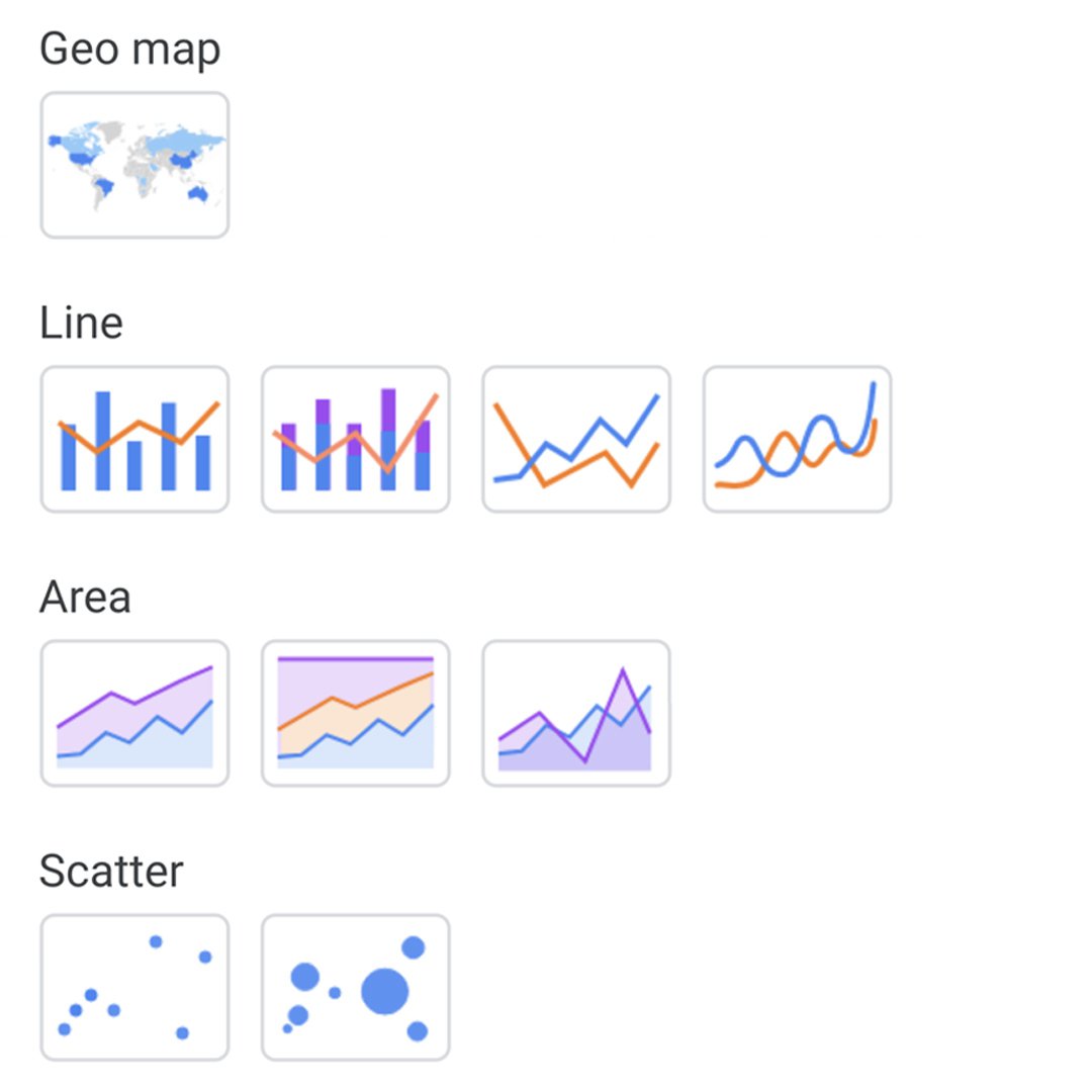
Lesson overview

Learn to build visualizations that tell your story.
Data Studio is a powerful tool to build interactive visualizations that update in real time with data from a variety of sources. In journalism, Data Studio enables you to tell stories with data and gives you freedom in how to present them. These visualizations let users interact with stories from different perspectives.
- Connecting Google Sheets with Data Studio.
- Editing your data.
- Creating a line chart.
- Adding a table chart.
- Making design changes in your visualization.
- Embedding your interactive visualization.
For more Data Journalism lessons, visit:
https://newsinitiative.withgoogle.com/training/course/data-journalism
Connecting Google Sheets with Data Studio.
Before you begin, make sure you’ve completed our Training Center lessons, Google Sheets: Scraping data from the internet and Google Sheets: Cleaning data, and that you’re logged in with the same account. We’ll be using the data sheet we created from the Wikipedia article in those lessons for this visualization.
Go to datastudio.google.com and begin a new report by clicking the blank square with the + icon.
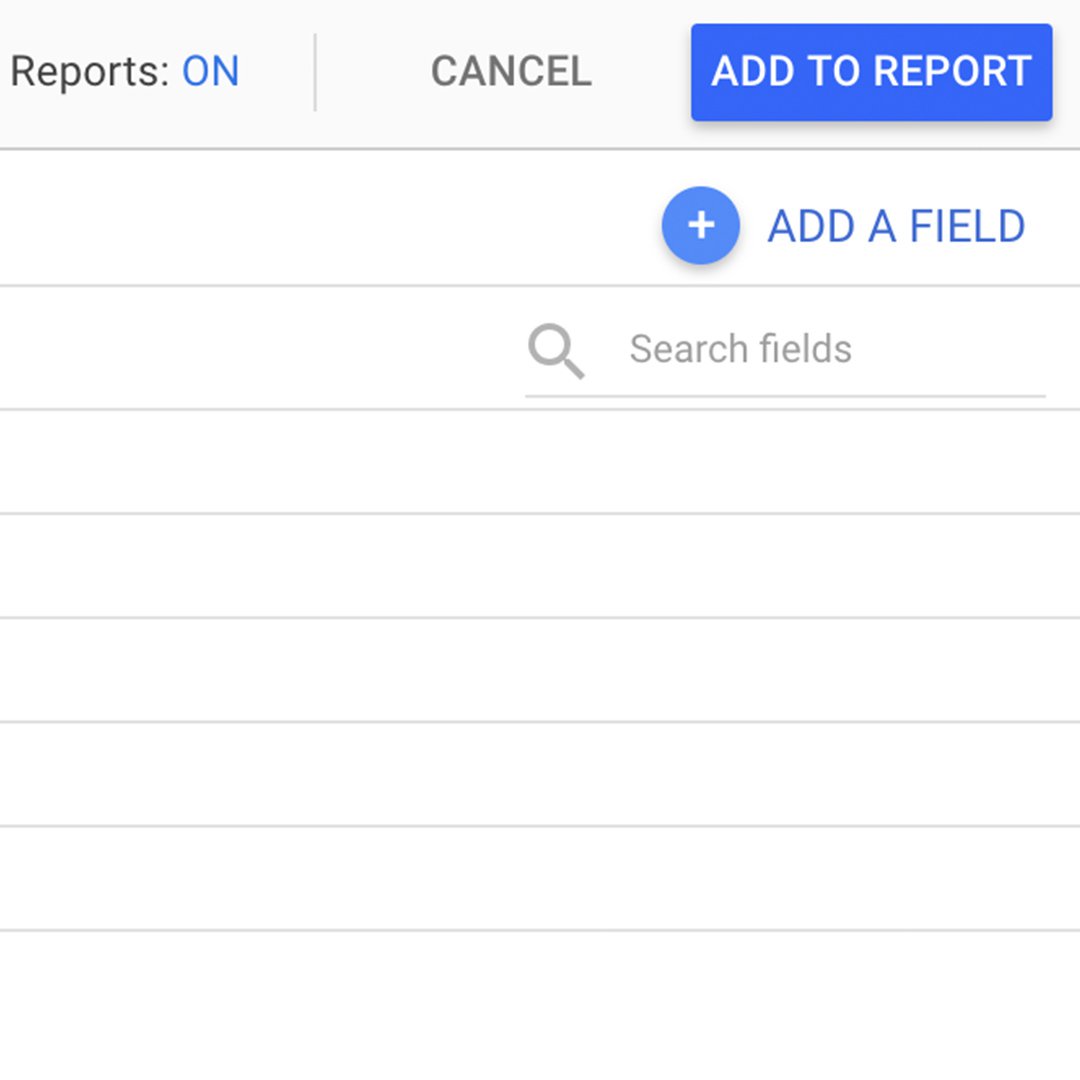
In Data Studio, visualizations are called "reports." To connect our Google Sheet to this report, select Create a New Data Source from the bottom right.
A menu will slide up showing the services we can pull our data from. Scroll to Google Sheets and click SELECT.
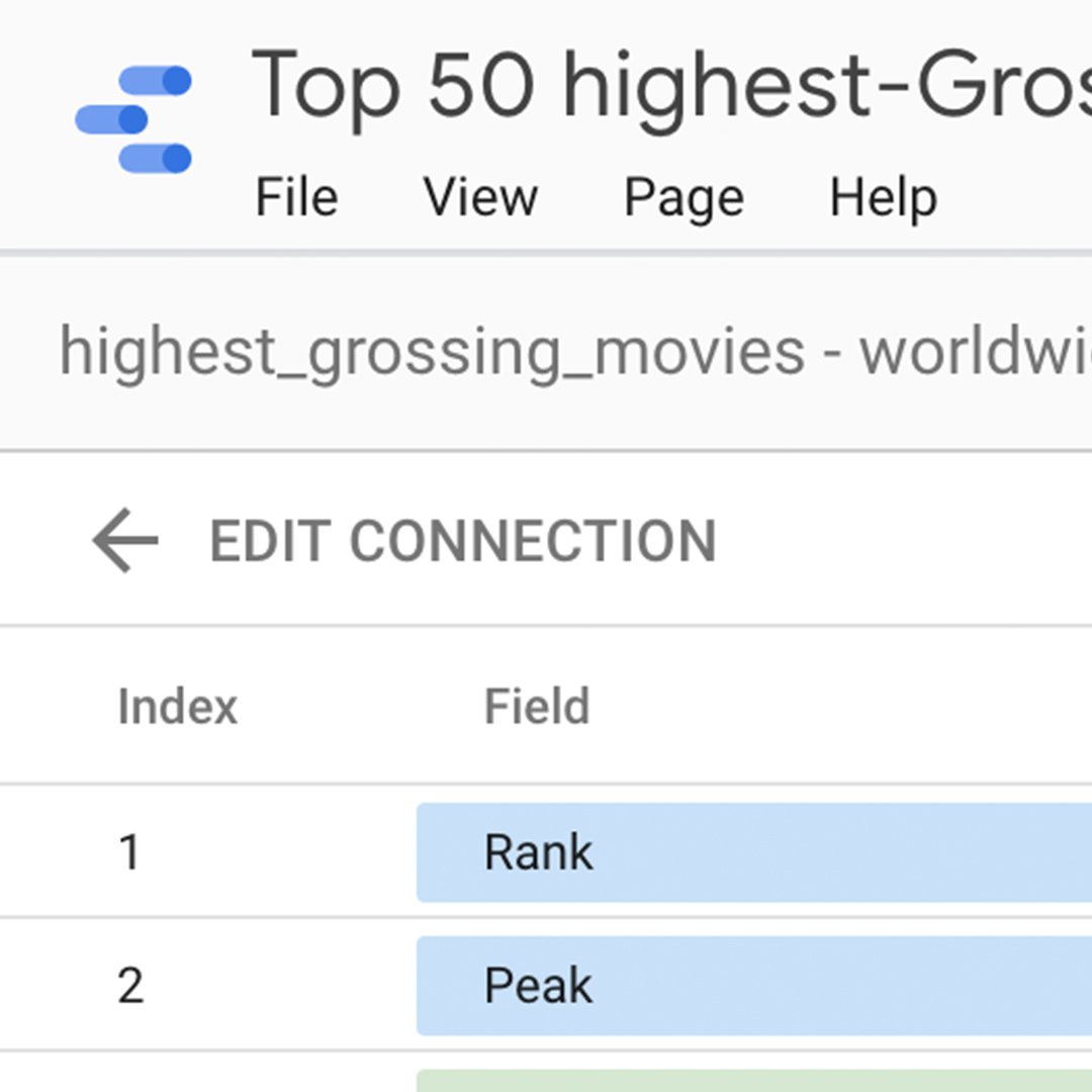
In the search box, you’ll see all the Google Sheet files associated with your Google Drive account. (If this is your first time using Google Data Studio, you may need to grant permission to access your Drive account.) Select the spreadsheet and its associated worksheet where the data is stored.
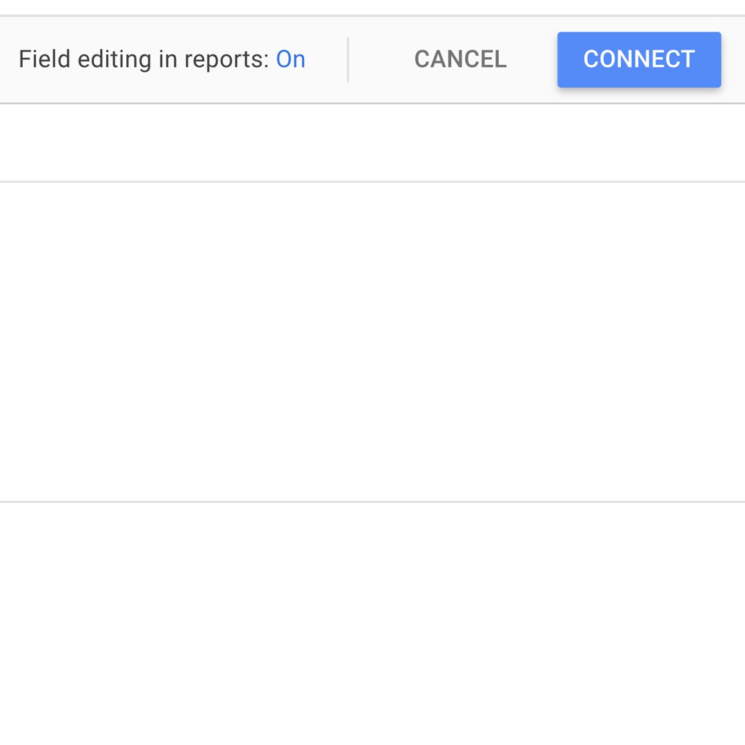
Leave all the Options boxes checked and click Connect.
Editing your data.
Editing your data
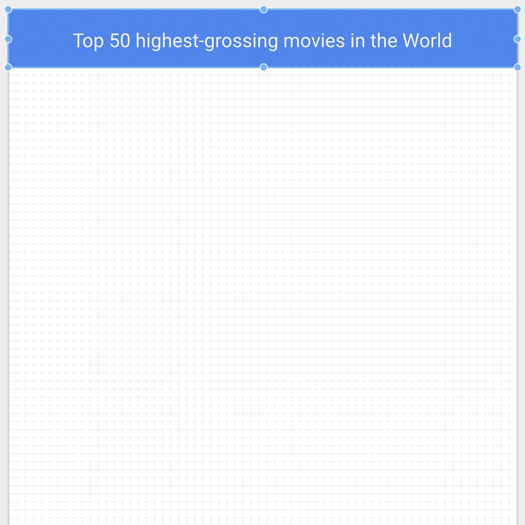
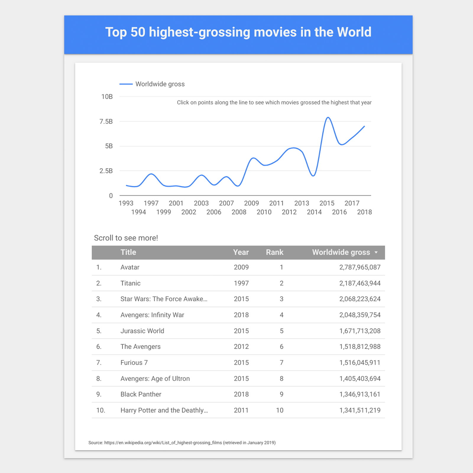
Let’s rename the visualization. Click on the top left corner where it says Untitled report. Let's call it “Top 50 Highest Grossing Movies in the World.”
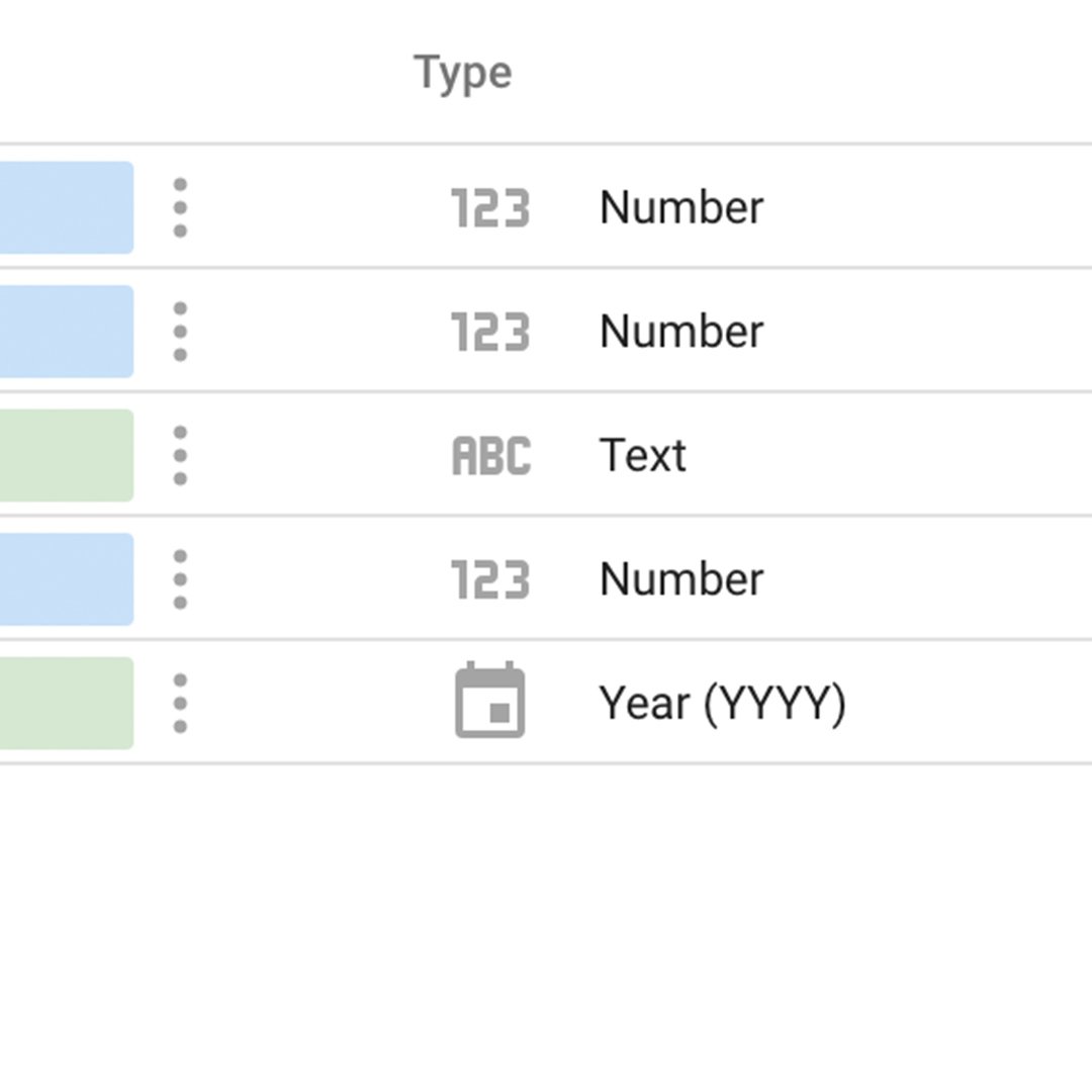
Under Type, change the data in row 5 from Number to Date & Time > Year (YYYY). If it's already set as Year (YYYY), leave it.
Select Add to Report, the blue button on the top right. Click again on the same option that will pop up.
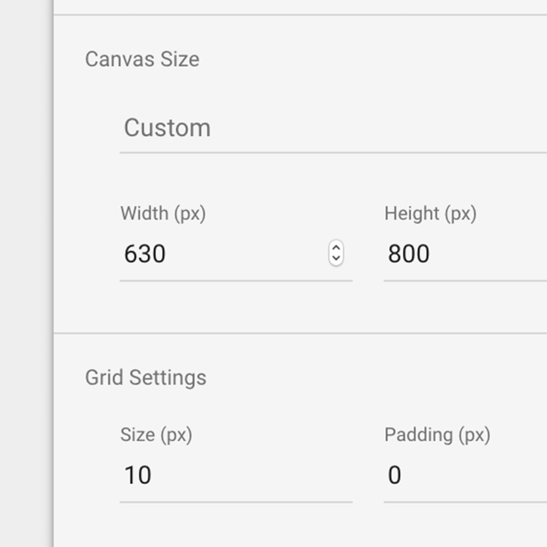
Let's make the visualization 630 pixels in width and 800 pixels in height. Click anywhere and type the numbers in the Canvas Size section.
Creating a line chart.
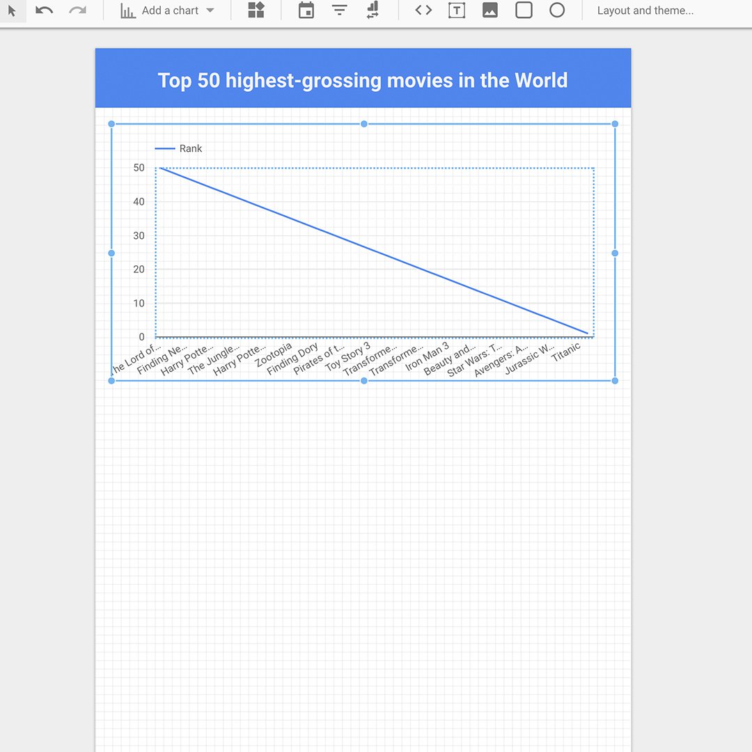
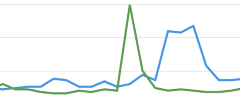
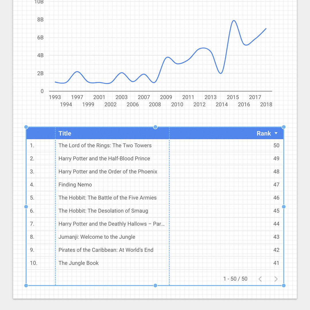
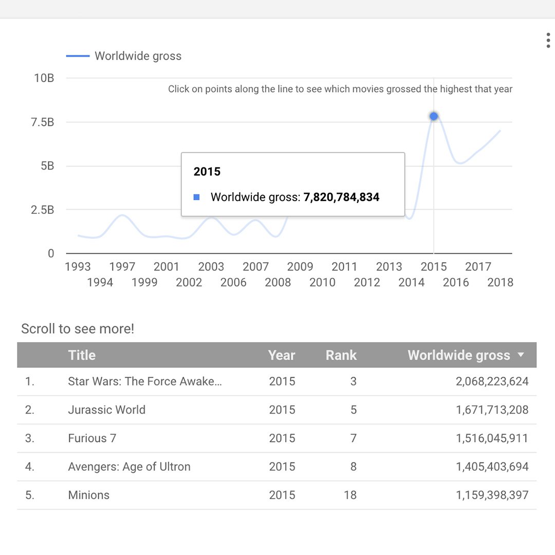
We're going to add an interactive line chart showing the worldwide gross for a given year. When you click on any year along the line, a table will appear, listing the top films, from highest to lowest grossing.
First, select the rectangle tool and drag the mouse cursor across the top of the canvas. Use the text tool to add a title. Use the right pane to format the text.
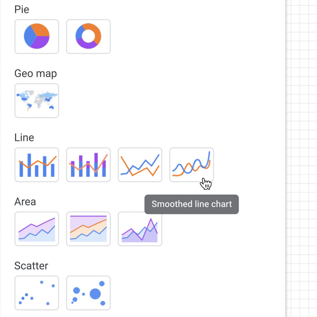
Go to Add a Chart and click Smoothed line chart.
Resize it to fit nicely below the title, but leave space for the next chart.
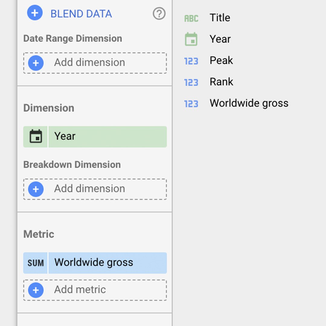
To change the dimension, metric and sort for the line chart, double click it. For Dimension, drag and drop Year to replace Title. Next, replace Metric with Worldwide gross.
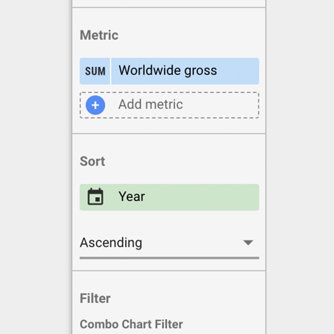
Under Sort, click Worldwide gross, then click Year.
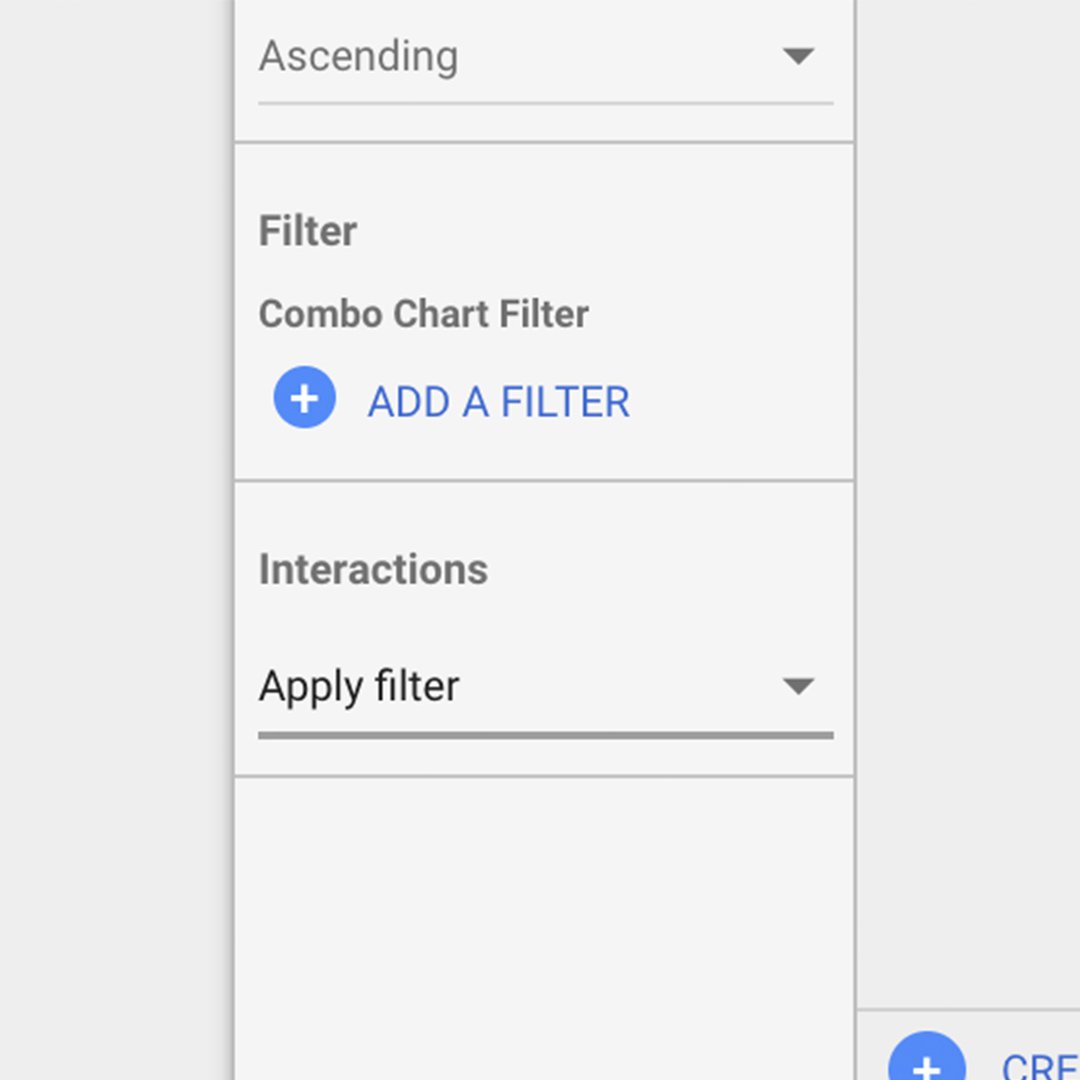
Change the sort option to Ascending. At the bottom you will see a section called Interactions. Select Apply filter. This will make every click on the line chart an action to filter the table.
Adding a table chart.
Adding a table chart
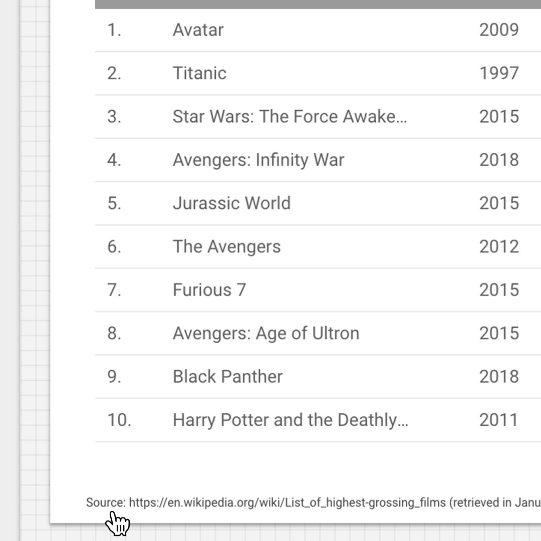
Choose Add a chart > Table chart. Resize it to show the first 10 rows in the list.
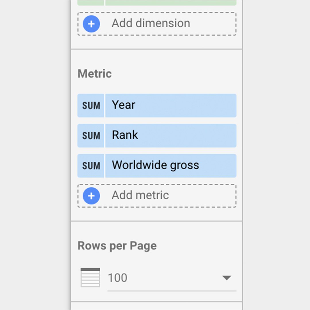
Let’s set up this table with three metrics in this order: Year, Rank and Worldwide gross. Go to Metrics and add these fields, either by dragging from Available Fields or clicking Add metric.
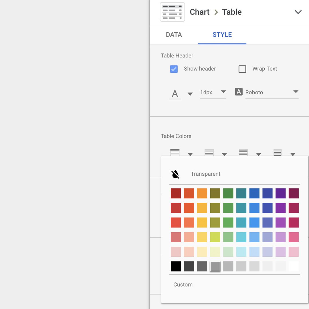
Next, go to Style > Table Colors to change the color of the header to dark gray.
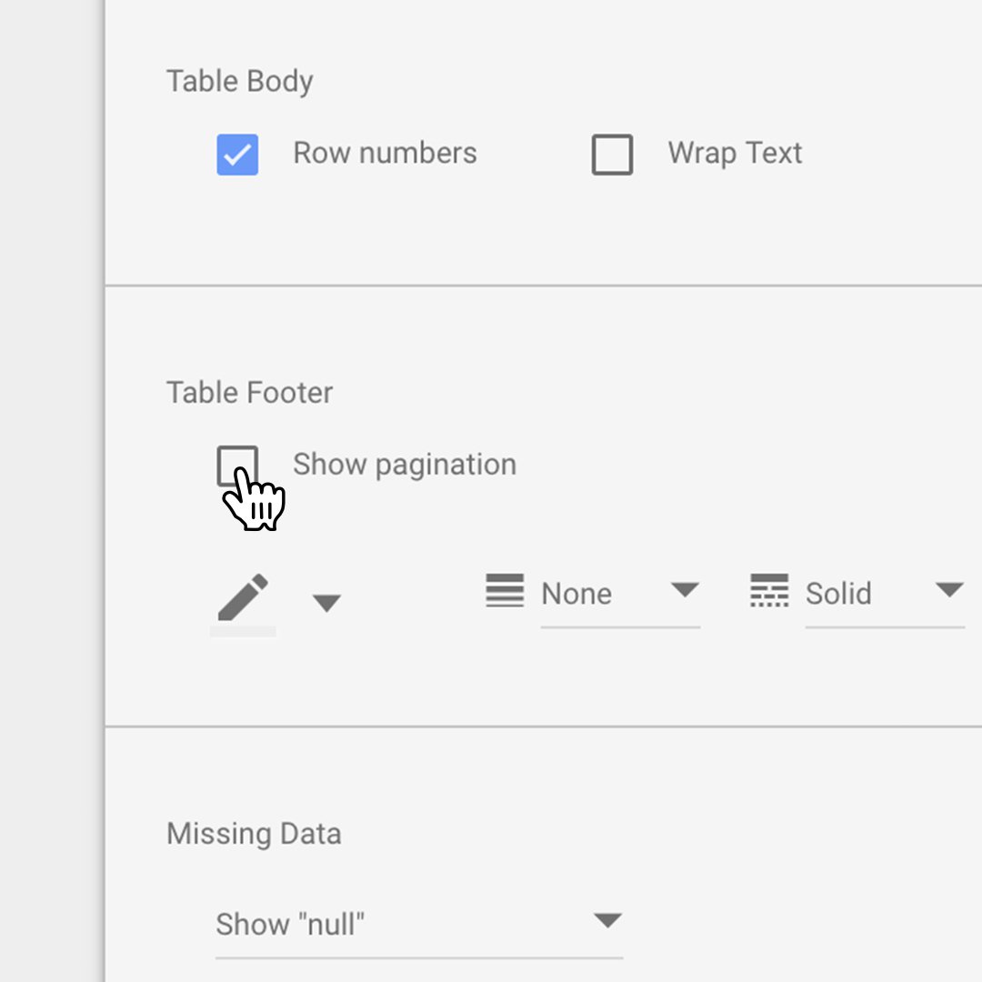
Go to Table Footer and uncheck Show pagination.
Now, you can add text citing your data source and offering instructions for using the chart. Select Text and add it to the bottom of the table.
Making design changes in your visualization.
Let’s explore some different types of design elements and text you can use to customize your visualization.
To add directional text, such as “Scroll to see more!”, click Text and type your message.
At any time, you can preview your visualization by clicking View. To toggle back and forth between View mode and Edit mode, simply click again.
When you're in View mode, you can click on any point in the line and the table below will automatically display the top 50 movies from that year.
View mode also lets you see the complete visualization you’ve created, including the title, line chart and table chart.
Embedding your interactive visualization.
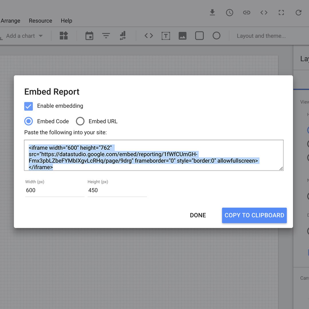
You can share your visualization via email or by embedding it on your website.
Share this visualization the same way you'd share any other GSuite document.
To embed this interactive visualization on your website, click File > Embed report. Check the Enable embedding box and use the code on your page.
Congratulations!
You completed “Data Studio: Make interactive data visualizations.”
To continue building your digital journalism skills and work toward Google News Initiative certification, go to our Training Center website and take another lesson.
For more Data Journalism lessons, visit:
https://newsinitiative.withgoogle.com/training/course/data-journalism
-
![gni_business_lesson_play_27]()
Grow Digital Ad Revenue with Google Ad Manager
LessonGet started with Google Ad Manager to increase digital ad revenue -
![BasicsOfGoogleTrends]()
Basics of Google Trends
LessonThis beginner’s course will teach you the basics of Google Trends, using the free Trends Explore tool. -
![gni_business_lesson_play_11]()