


Google Trends: Understanding the data.
How to interpret Trends results.
Sourcing Google Trends data.
Google Trends analyses a sample of Google web searches to determine how many searches were done over a certain period of time.
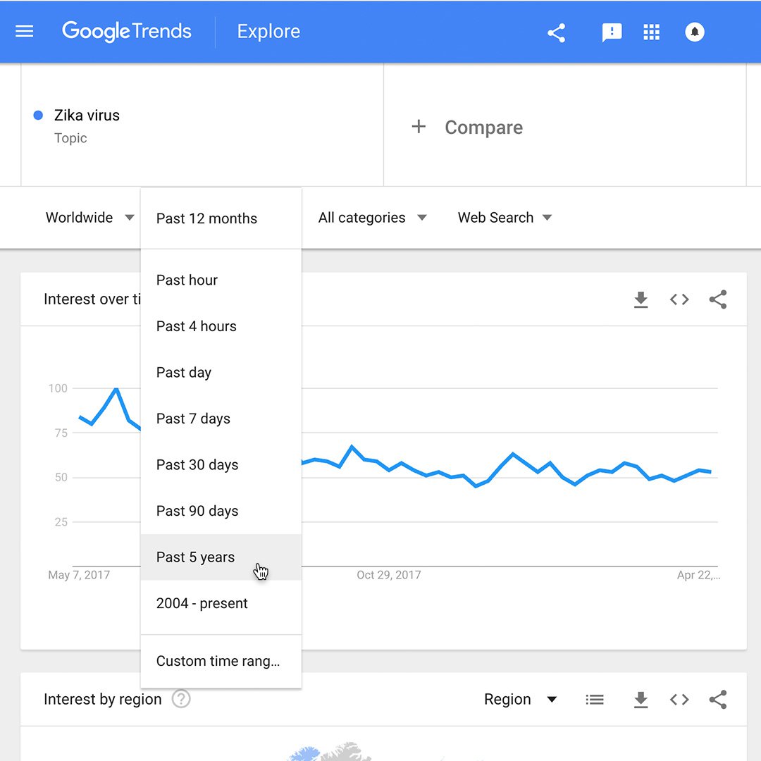
For example, if you’re doing a story about the Zika virus and you want to see if there was a recent uptick in searches on the topic, select Past 90 days. Trends analyses a sample of all searches for Zika virus within those parameters.
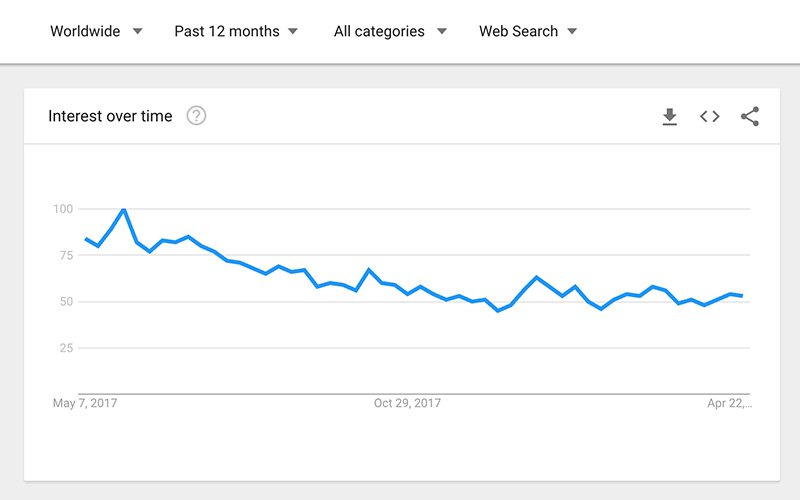
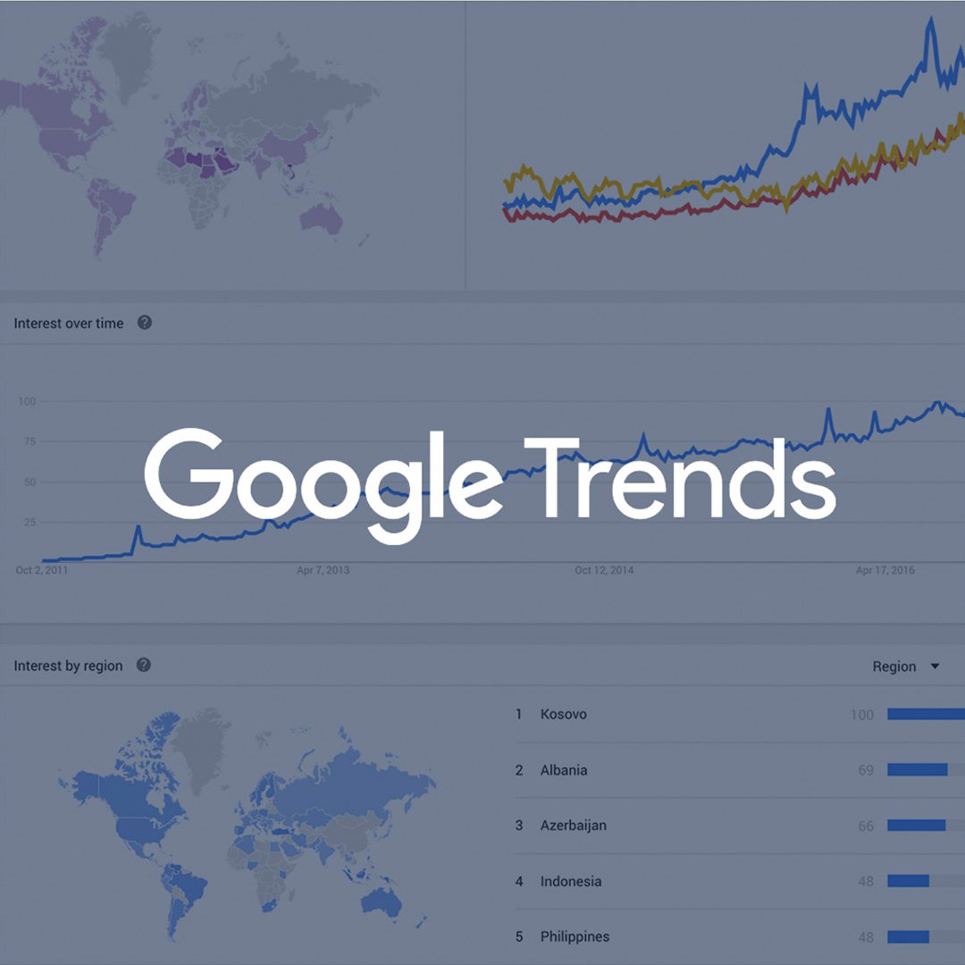
Reading the Interest Over Time graph.
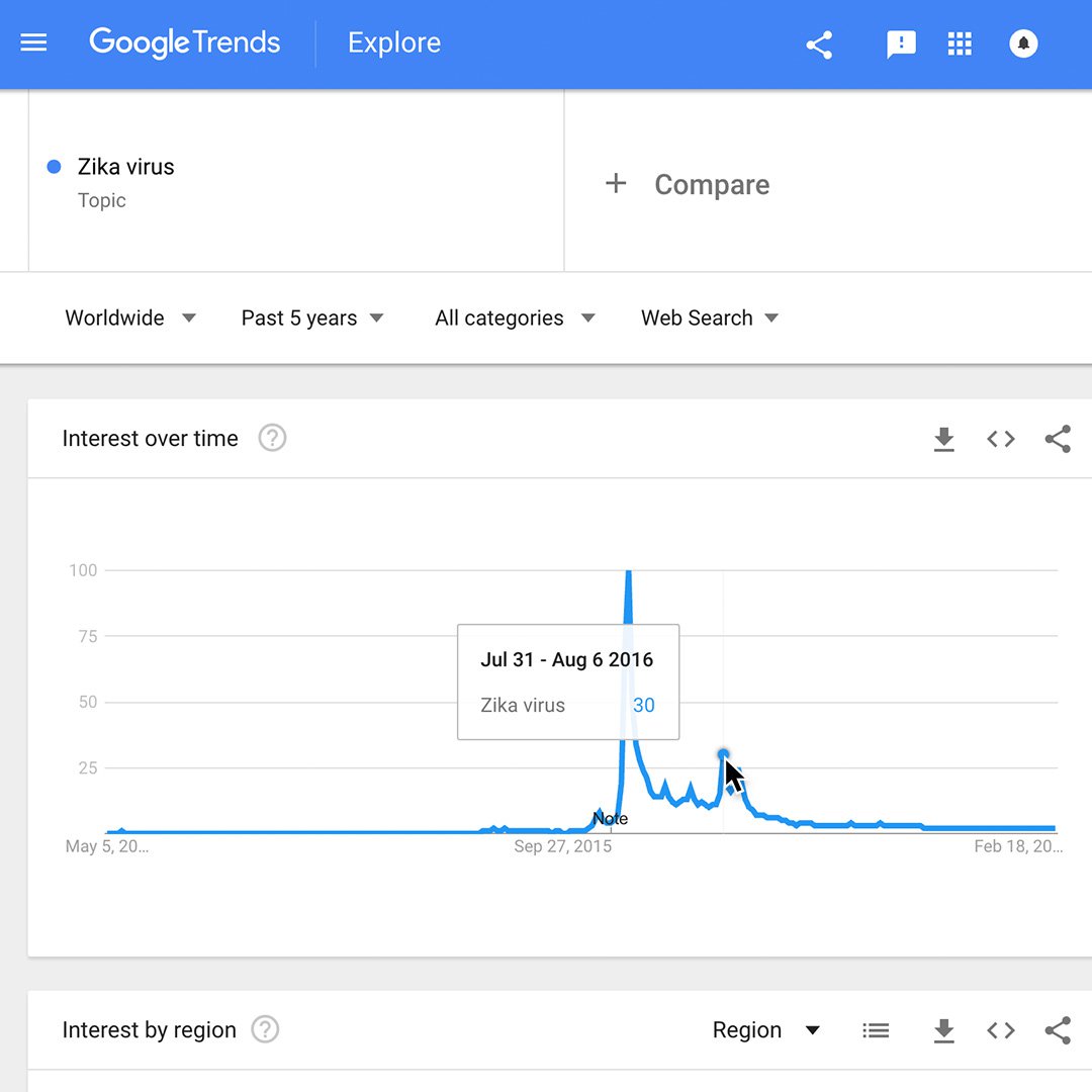
When you search for a term on Trends, you’ll see a graph showing the term’s popularity over time in (nearly) real time. Hovering your mouse over the graph reveals a number, which reflects how many searches have been done for the particular term relative to the total number of searches done on Google.
Numbers on the graph don't represent absolute search volume numbers, because the data is normalised and presented on a scale from 0-100, where each point on the graph is divided by the highest point, or 100. The numbers next to the search terms at the top of the graph are sums, or totals.
A line trending downward means that a search term's relative popularity is decreasing—not necessarily that the total number of searches for that term is decreasing, but that its popularity compared to other searches is shrinking.
Finding the most searched topic in every region or country.
When you search for multiple terms on Trends, you’ll see a comparative map showing which term or topic is most searched in each region.
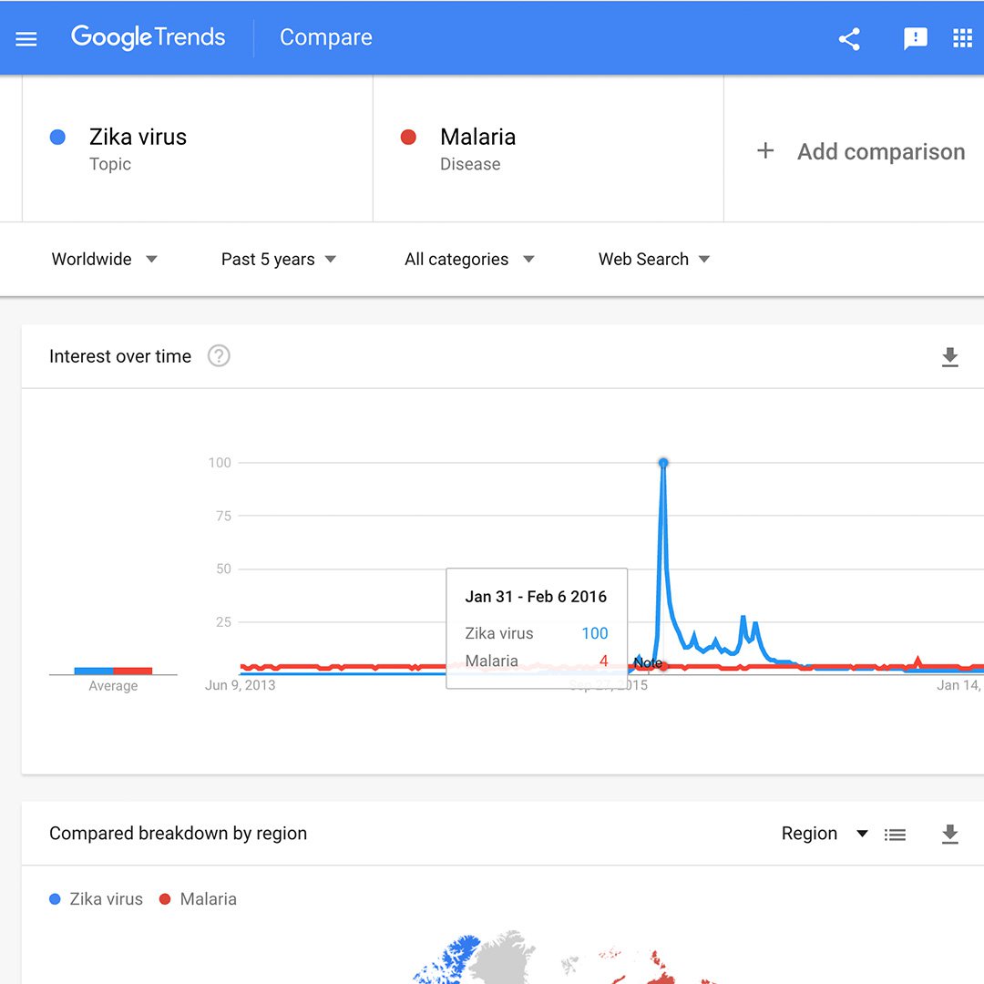
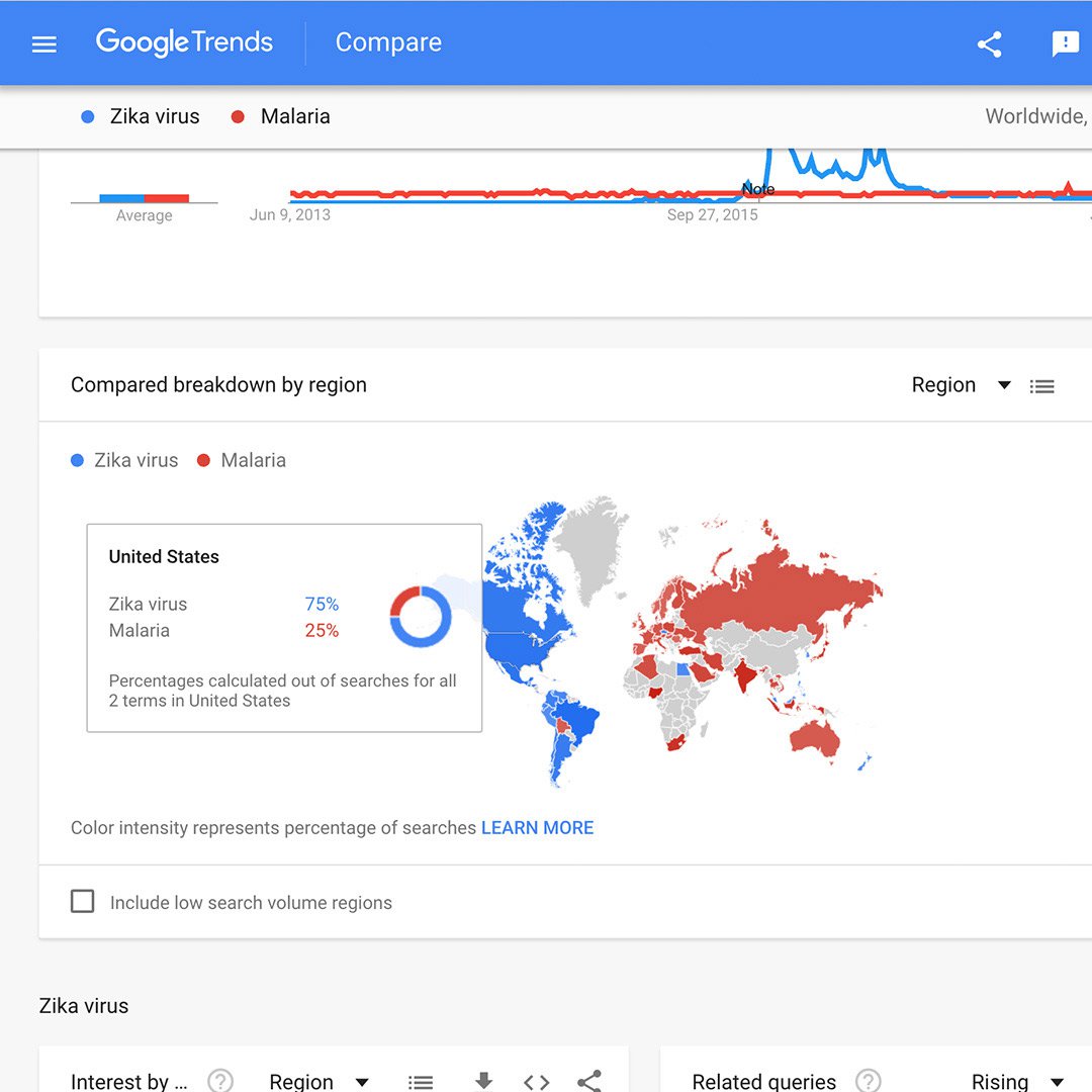
Interest over time comparison. Let’s compare the search terms Zika virus and malaria. You’ll find that over time, malaria experiences a steady query rate while Zika was barely searched for until a huge spike in January 2016.
Compared breakdown by subregion: The colour intensity of each region represents the percentage of searches of the leading search term in that region. This example shows that Zika virus was a more popular search term in the Americas while malaria was relatively more popular in Asia.
Rising data.
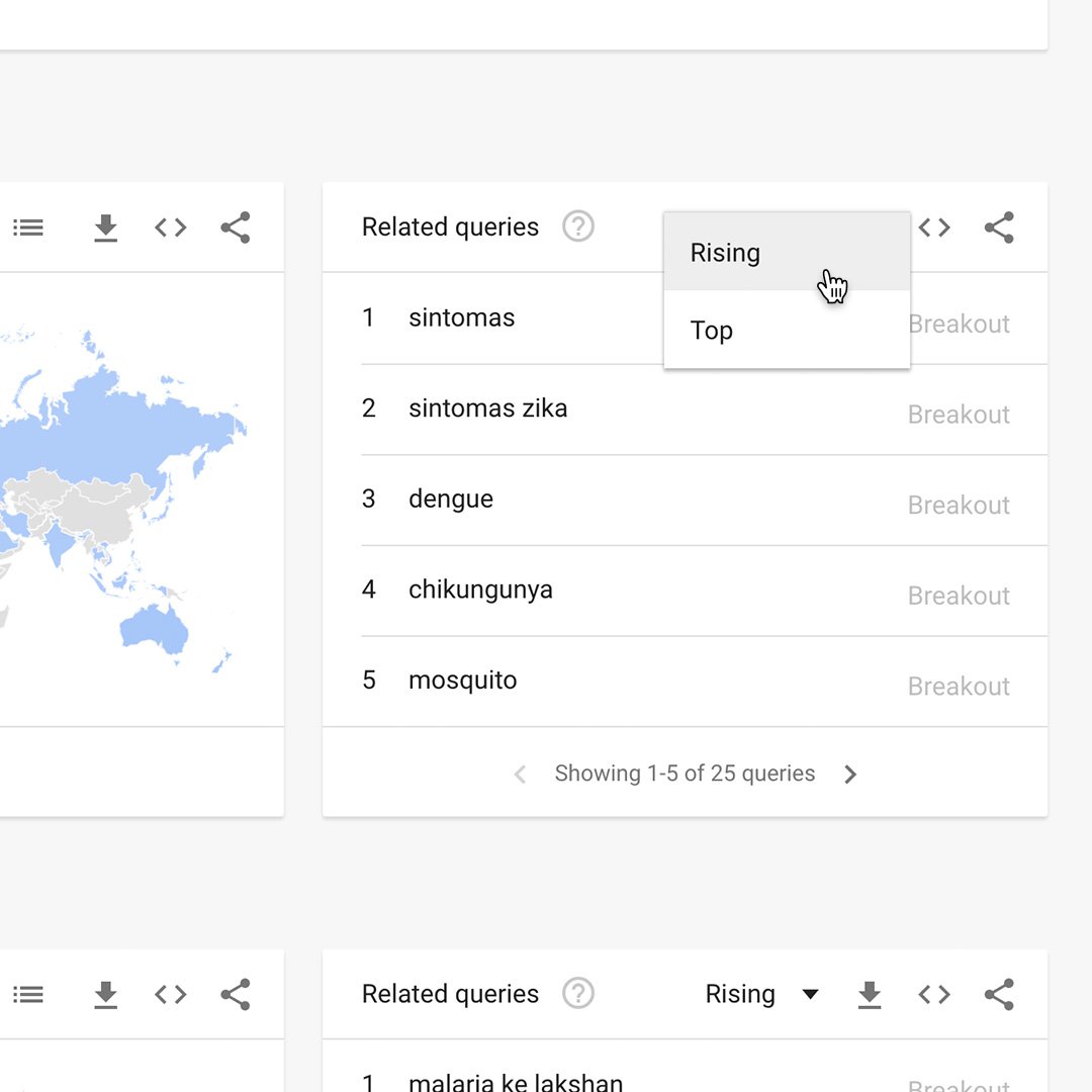
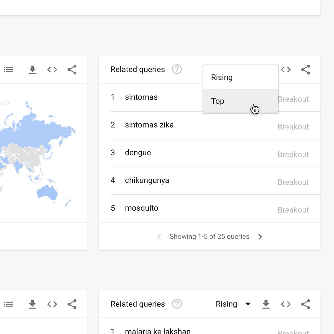
At the bottom of your results page, the Related queries chart can show you the Top and Rising terms associated with any topic or trending story.
The Rising tab represents terms that were searched for with the term you entered and had the most significant growth in volume over the selected time period. You’ll see a percentage of the Rising term’s growth compared to the previous time period. If you see “Breakout” instead of a percentage, it means that the search term grew by more than 5000%.
The percentages are based on the percent increase in search interest for the selected time frame. If you’re looking at the last 7 days, the benchmark for the rise in searches would be 7 days prior; if it was the last 30 days, the benchmark would be for the 30 days prior. The only exception is when viewing the full history (2004-Present), when the percentages are benchmarked at 2004.
Reading the Related searches chart.
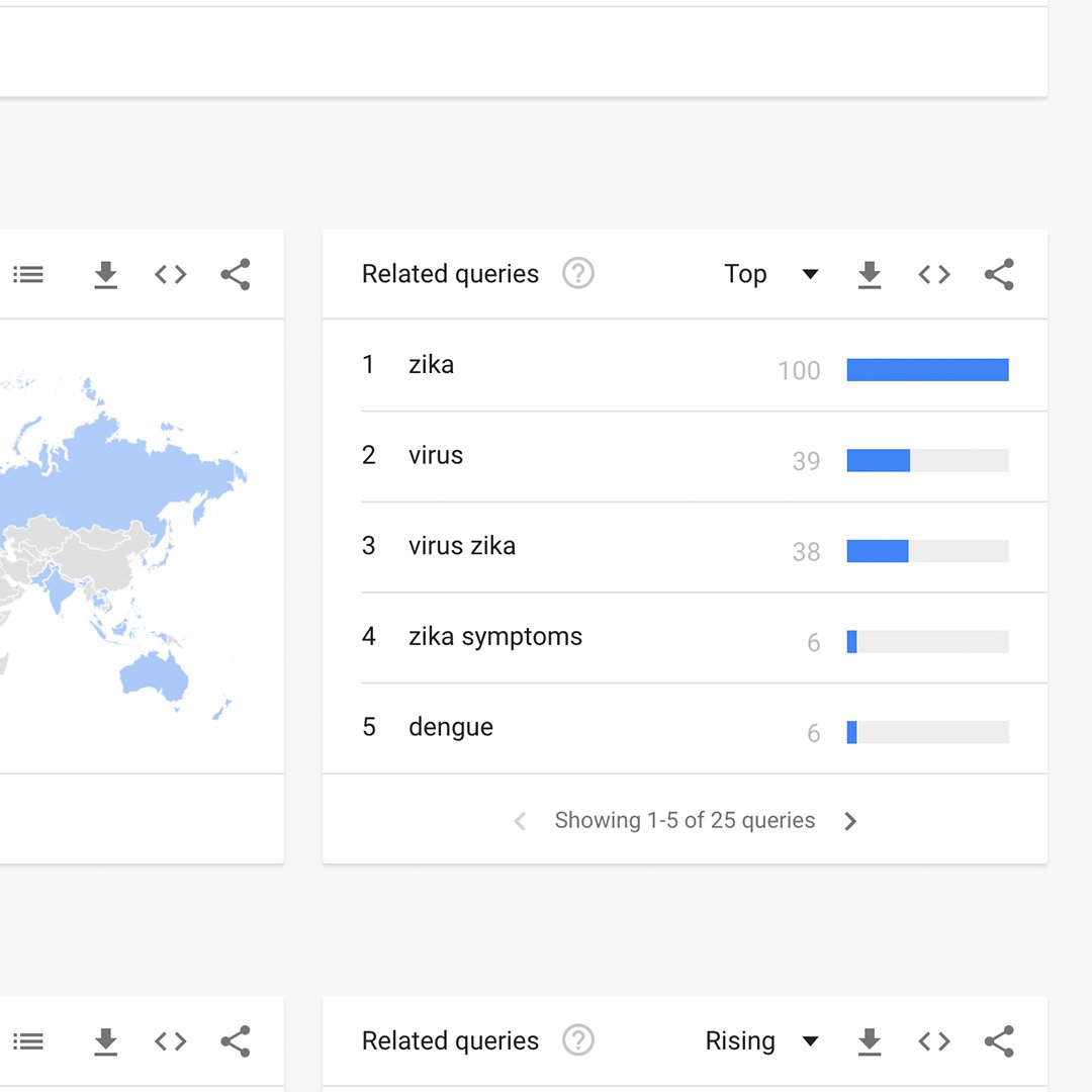
Click the dropdown to see Top terms.
This table shows terms that are most frequently searched with the term you entered, in the same search session, with the same chosen category, country or region. If you didn’t choose a search term (and just chose a category or region), overall searches are displayed.
Data that is excluded.
Trends excludes certain data from your searches:
- Searches made by very few people: Trends only analyses data for popular terms, so search terms with low volume appear as 0 for a given time period.
- Duplicate searches: Trends eliminates repeated searches from the same user over a short period of time for better overall accuracy.
- Special characters: Trends filters out queries with apostrophes and other special characters.
Pairing NCI with Google Trends
News Consumer Insights (NCI), our free of cost Google News Initiative data tool, gives you in-depth data about your audience's behavior on your news website. Google Trends shows you the overall popularity of search terms over time.
Use them together to:
- Validate your findings: See if rising engagement with a topic on your site aligns with growing search interest in that topic overall.
- Identify content opportunities: Discover trending topics that you might not be covering adequately on your site.
- Refine your content strategy: Tailor your content to match the evolving interests of your audience and the broader public.
Essentially, News Consumer Insights (NCI) tells you what's popular on your site, while Google Trends tells you what's popular in the world. Combining them gives you a powerful toolkit for understanding audience behavior and optimizing your content
Access News Consumer Insights here.
-
How to make them using WordPress
LessonWordPress is the standard for so many content makers, and now the ability to create Web Stories is built right into the platform. -
-
![gni_business_lesson_play_1]()