


Visualizing Data: Flourish templates.
A simple tool to help newsrooms create beautiful graphics.
Free data visualization templates for newsrooms.
With its journalism roots, Flourish is designed to help newsrooms increase the quality and quantity of their data stories. Built by London data studio Kiln, Flourish offers beautifully designed data visualization templates. Google News Initiative partners with Flourish to offer the tool for free editorial use in newsrooms. You can customise many aspects of the templates with no coding experience. Or, your developers can use Flourish tools to create and share templates with other publications.
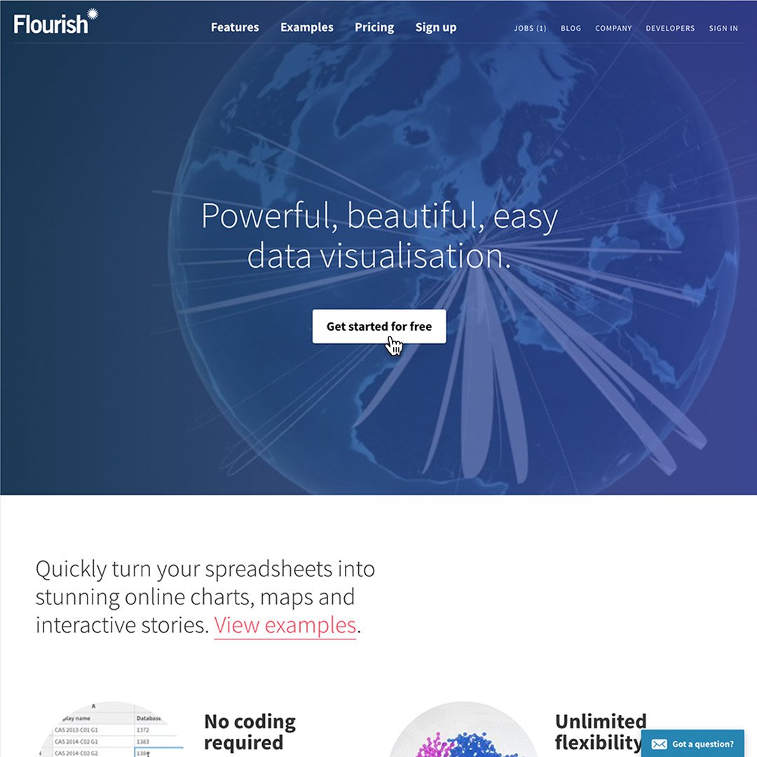
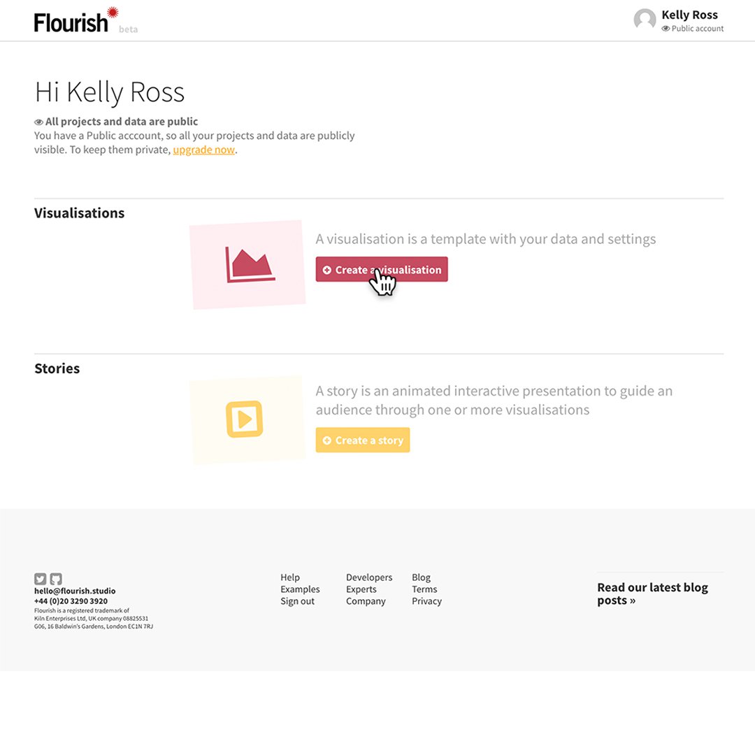
To begin, click Get started for free.
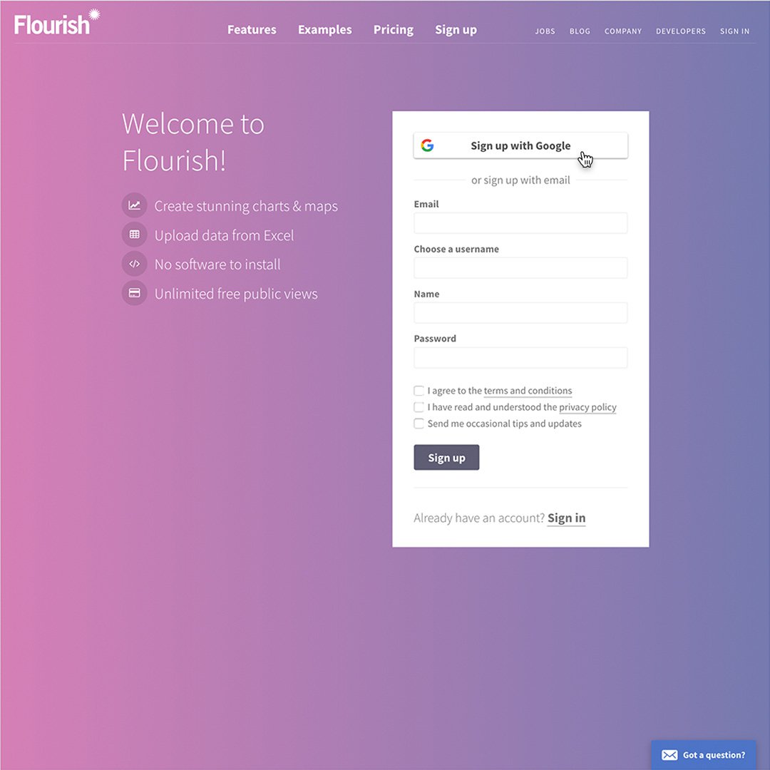
Click Sign up with Google or enter your name and email to create an account.
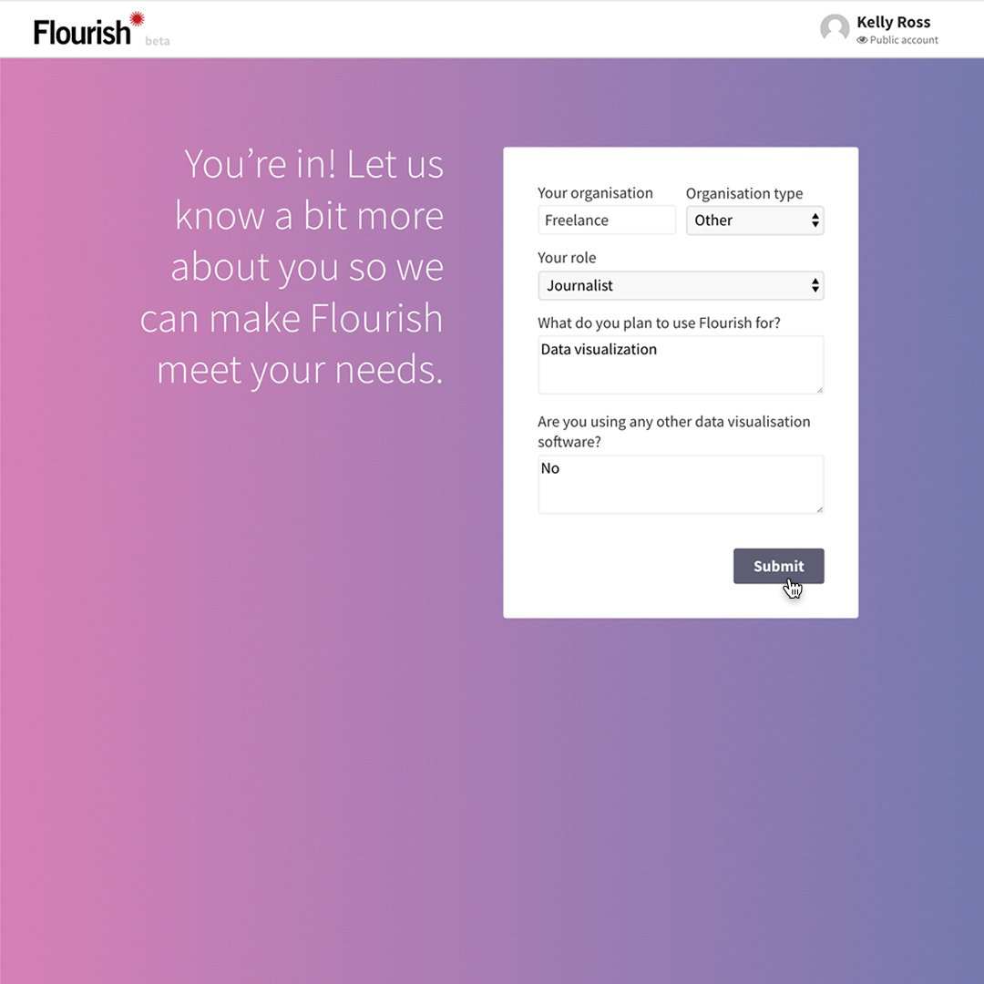
Answer a few simple questions and click Submit.
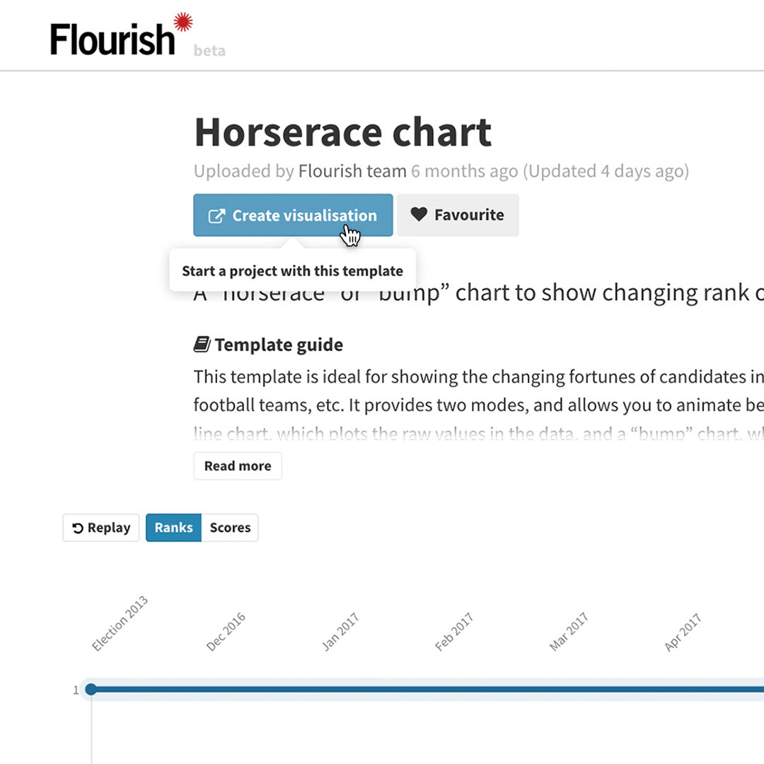
Get acquainted with Flourish.
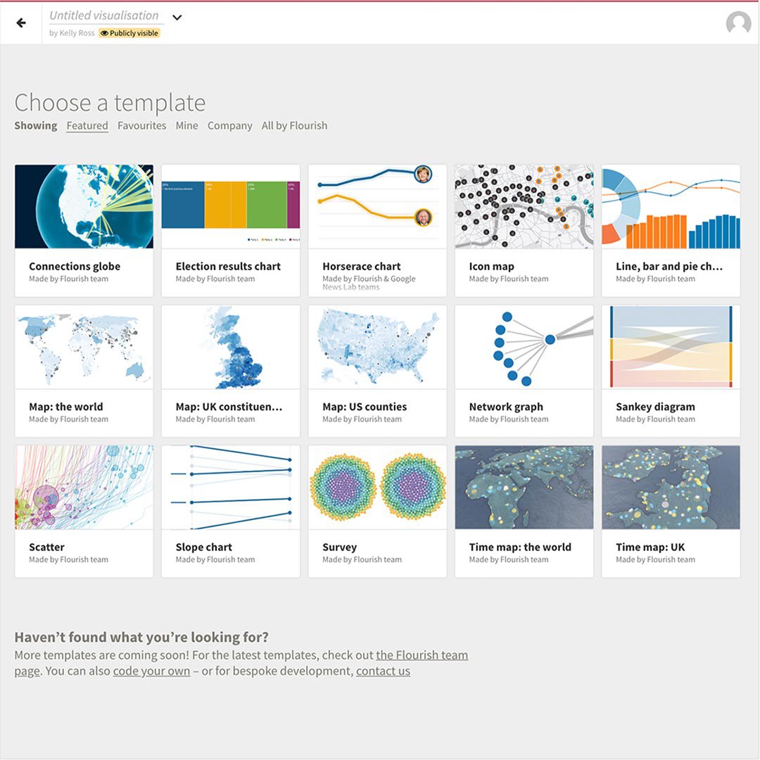
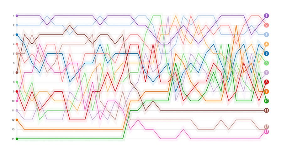
There are several different types of templates currently available, with more being added all the time. From “horse race” visuals that compare multiple data points over time to renderings of the globe that show relational data, you can choose the right type of visual to tell your story.
To get started, click Create a visualization.
Find the best template for your story in a growing collection.
Prepare your dataset.
Flourish works with Google Sheets, Excel spreadsheets and Comma Separated Value (CSV) files. Before beginning any visualization project, make sure your data set is organised and free of errors.
To learn more about a template and whether it’s right for the type of data you want to visualize, click Need help with this template?
The Template Guide is filled with details about best uses, data requirements and tips.
Once you choose a template, click on Create Visualization.
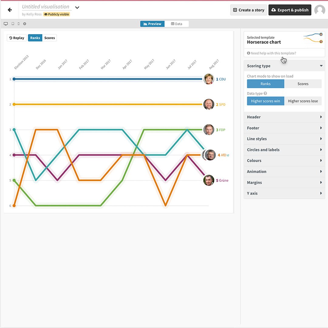
Then click Data to see how to format your CSV properly.
Starting your project.
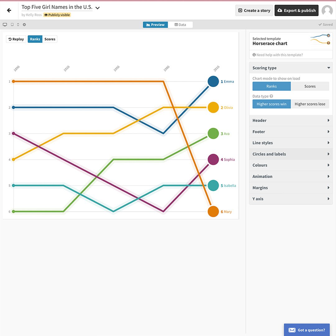
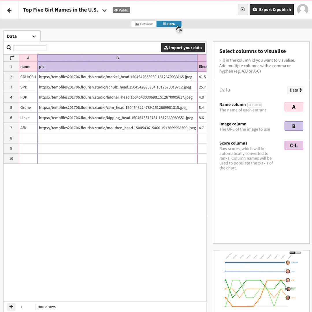
Let’s say you’re writing a trend piece analyzing U.S. baby girls’ names over time and you want to use a “horse race” template.
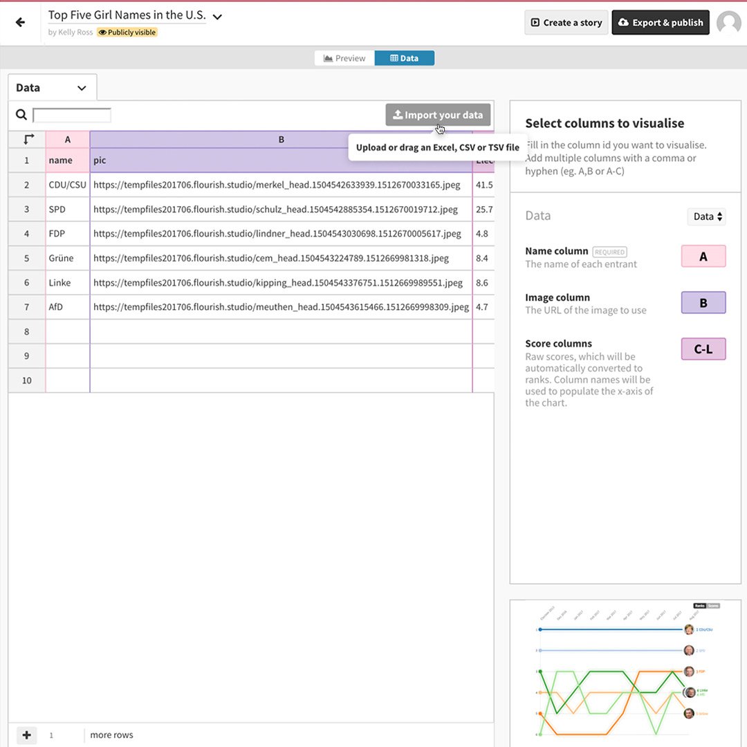
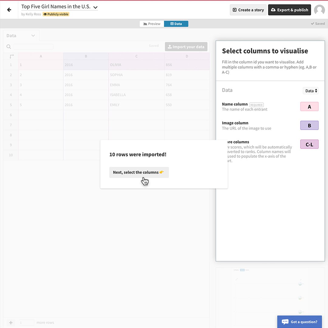
Select Import your data and be sure to name your data sheet.
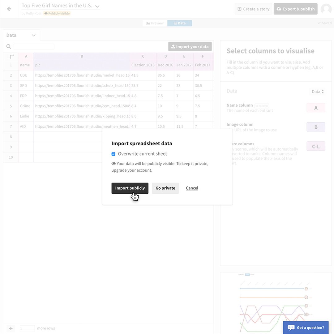
Make sure that Overwrite current sheet is selected, then click Import publicly.
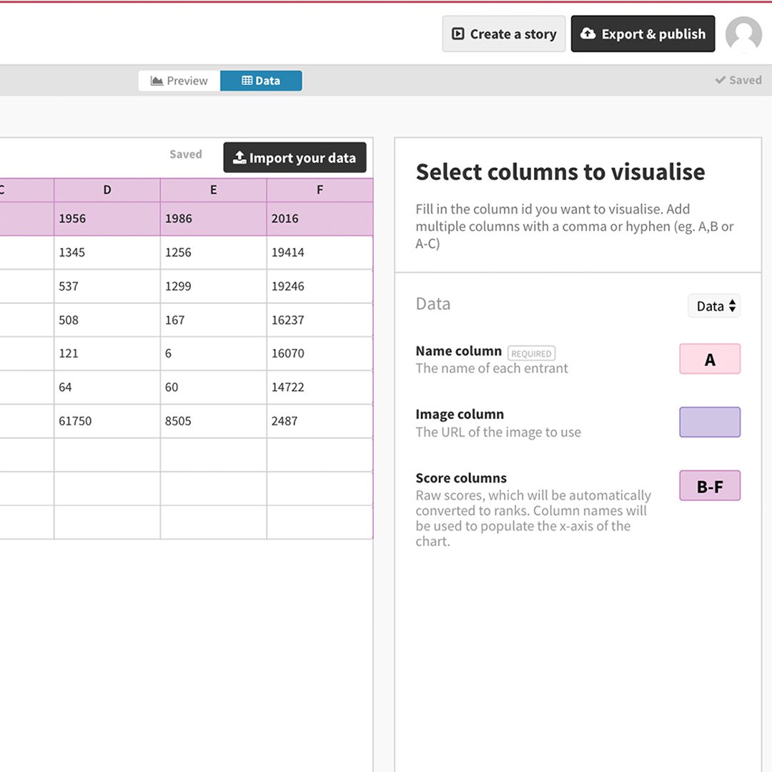
Click Next, select the columns.
Then label the columns you want to visualize. If there is an image you want to associate with the data and the template you chose allows it, click on the Image column field and enter the header letter of the column that contains your image URLs. If there’s no image, leave the Image column field blank.
To see your data visualized, click Preview.
Customise your visualization.
Each Flourish template has multiple design elements you can customize to make your project unique. From colors and shading to font sizes and curve shapes, there are dozens of choices, all created by skilled designers, so no matter what you choose, your visualization will look attractive and professional.
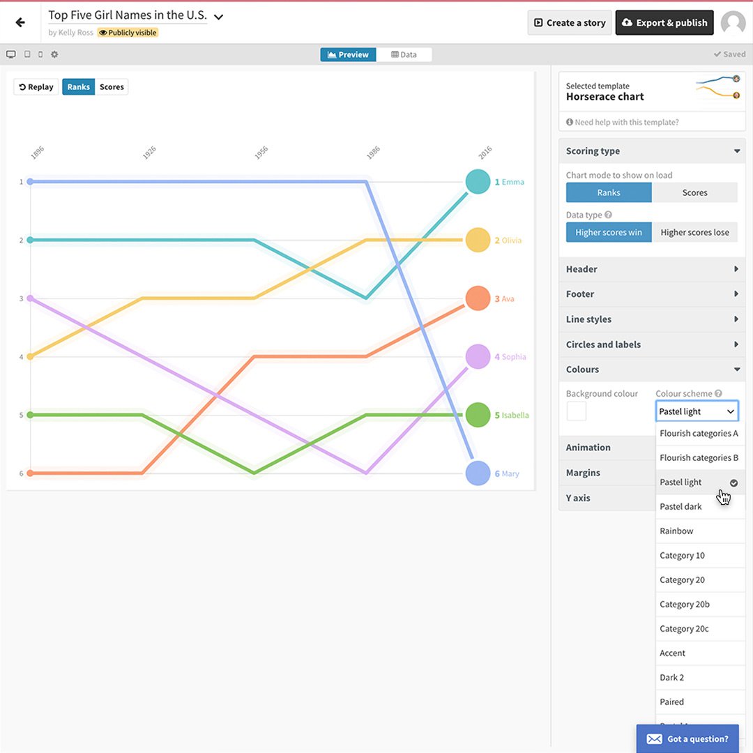
Let’s say you like the shape of your graphic but you want to change the colours. In the Colours module you can choose from a designer selection of colour palettes. Just click the dropdown under Colour Scheme. We’ll select Pastel Light.
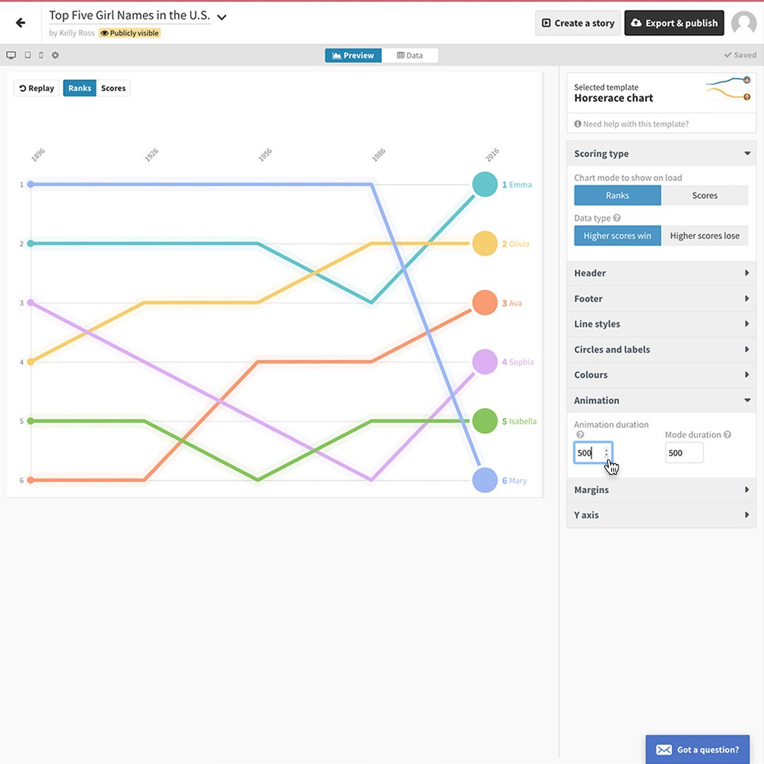
To change the speed that the graphic populates, click on Animation and adjust the millisecond settings. Then click Replay to preview the motion.
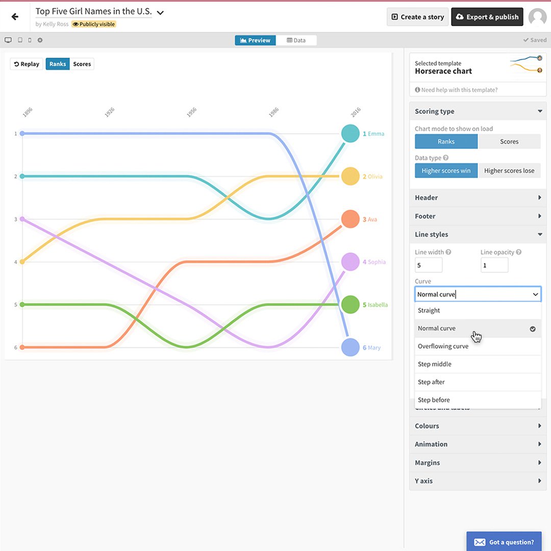
Altering the shape of the lines is also easy. Simply click on Curve under the Line Styles menu item and scroll through until you see one you like.
Preview your project on multiple screens.
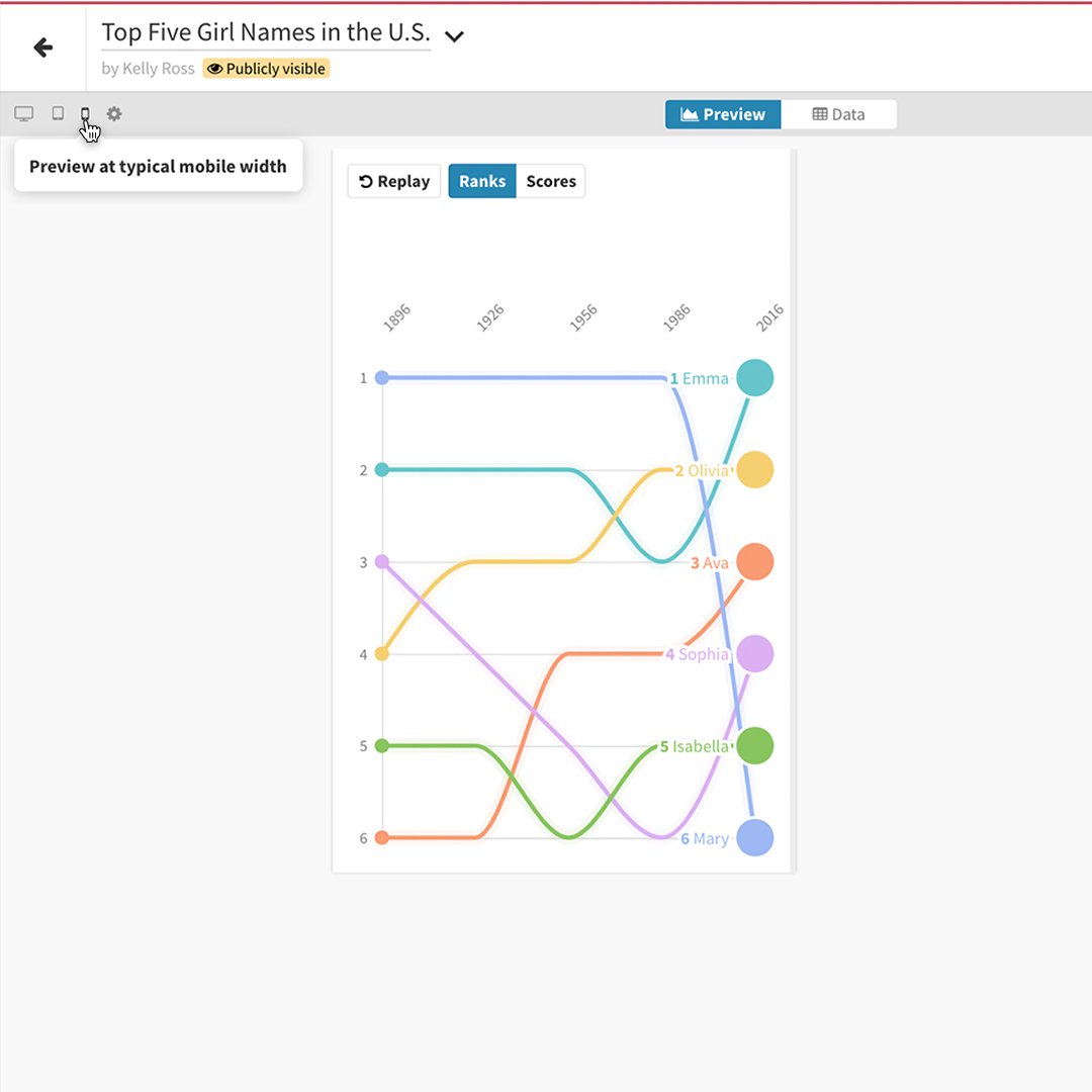
With more and more readers using mobile devices today, it’s very important to preview your data visualization on different screen sizes. A font size that looks great on a desktop may be unreadable on a mobile phone. A graphic that looks beautiful on a phone may look sparse on a full-size screen. Flourish makes it easy to see just how your visualization will appear.
To preview your project on each screen size, click the icons in the upper-left corner.
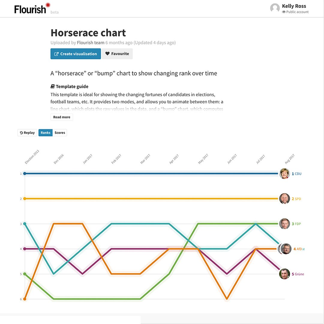
Publish your visualization.
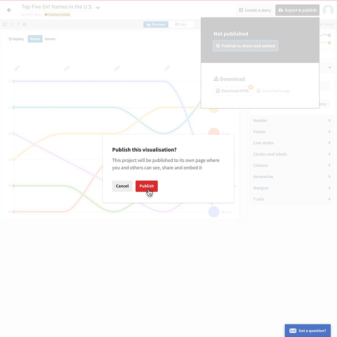
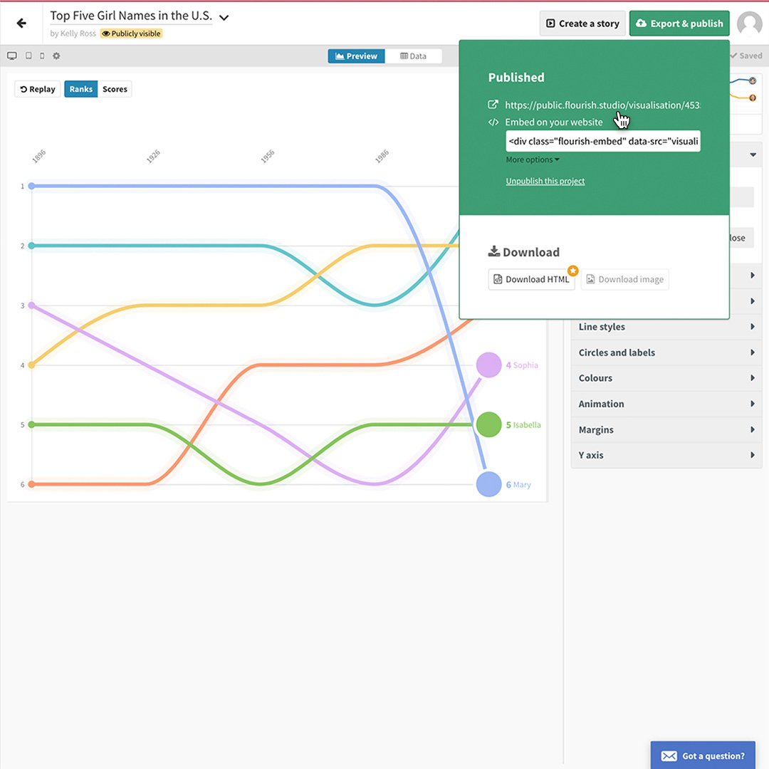
When you’re satisfied with your creation, click on the Publish button to save it and embed it to your site. Flourish outputs can be published from your own server and will work forever.
If you’re using the free version of this program, your visualization will appear with Flourish branding. Publishers using the full, paid version can download the HTML file and embed it without Flourish branding.
Click Export & publish, Publish to share and embed and then confirm by selecting Publish.
To view your published animation, click the URL.
-
How to make a good Web Story
LessonCreating a strong, compelling Web Story is as easy as creating an article or a video, and the interactive nature of Web Stories plays to the rapidly shifting desires and demands of online audiences. -
-
![Gen Ai Web Card_Business Teams_231214_1600x900]()
Introduction to AI for News Business Teams
LessonLearn about Google's approach to AI and how our products can support news business teams.