

Visualizing Data: Introduction to Tilegrams.
A new way to map data.
A free data visualization tool.
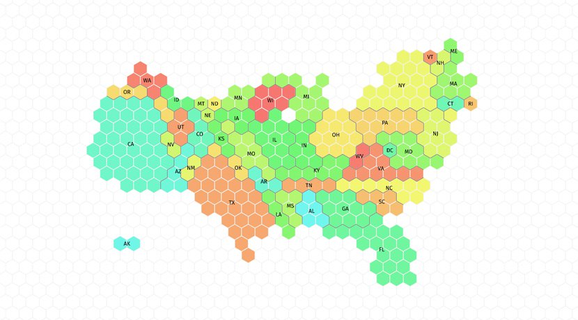
Short for “tiled cartogram,” a Tilegram is a map made of tiles where regions are proportional to a data set. Tilegrams can represent demographic data more accurately than traditional geographic maps, but still retain a familiar shape. For example, this Tilegram of the United States shows population and better illustrates how many people inhabit each region—yet the U.S. land form is still recognizable. Tilegrams is not just for population-related data; you can use it to visualise almost any type of proportional comparison in a geographic region. Check out the tool, here:
Access our existing Tilegrams.
Developed by Pitch Interactive, Tilegrams are free for everyone to use.
If possible, we recommend that you start with an existing Tilegram and alter it as necessary. However, if you want to make a Tilegram for a new location, you’ll need to take both this introductory lesson and our Advanced Tilegrams lesson.
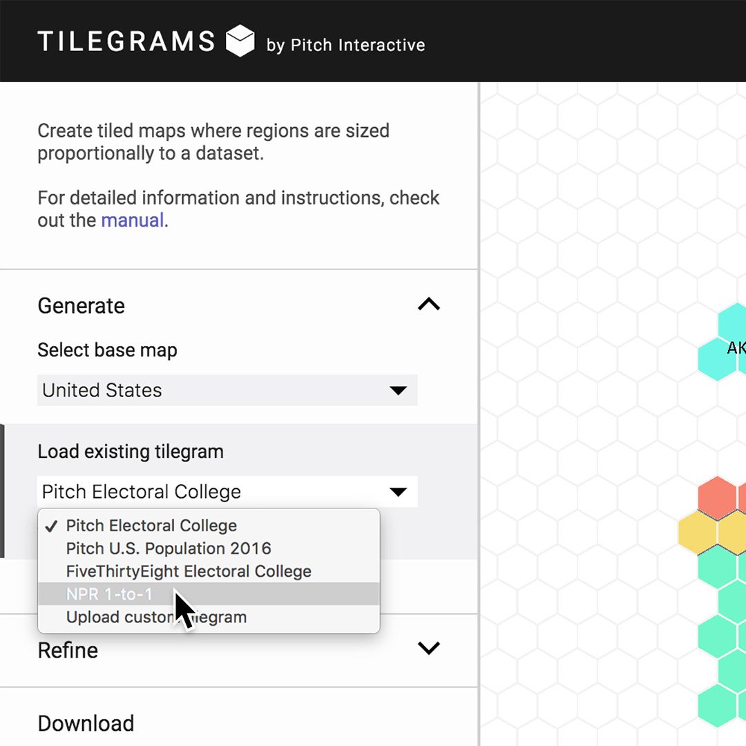
You can browse the existing selection of Tilegrams, which includes maps of the U.S. from Pitch, NPR and FiveThirtyEight.
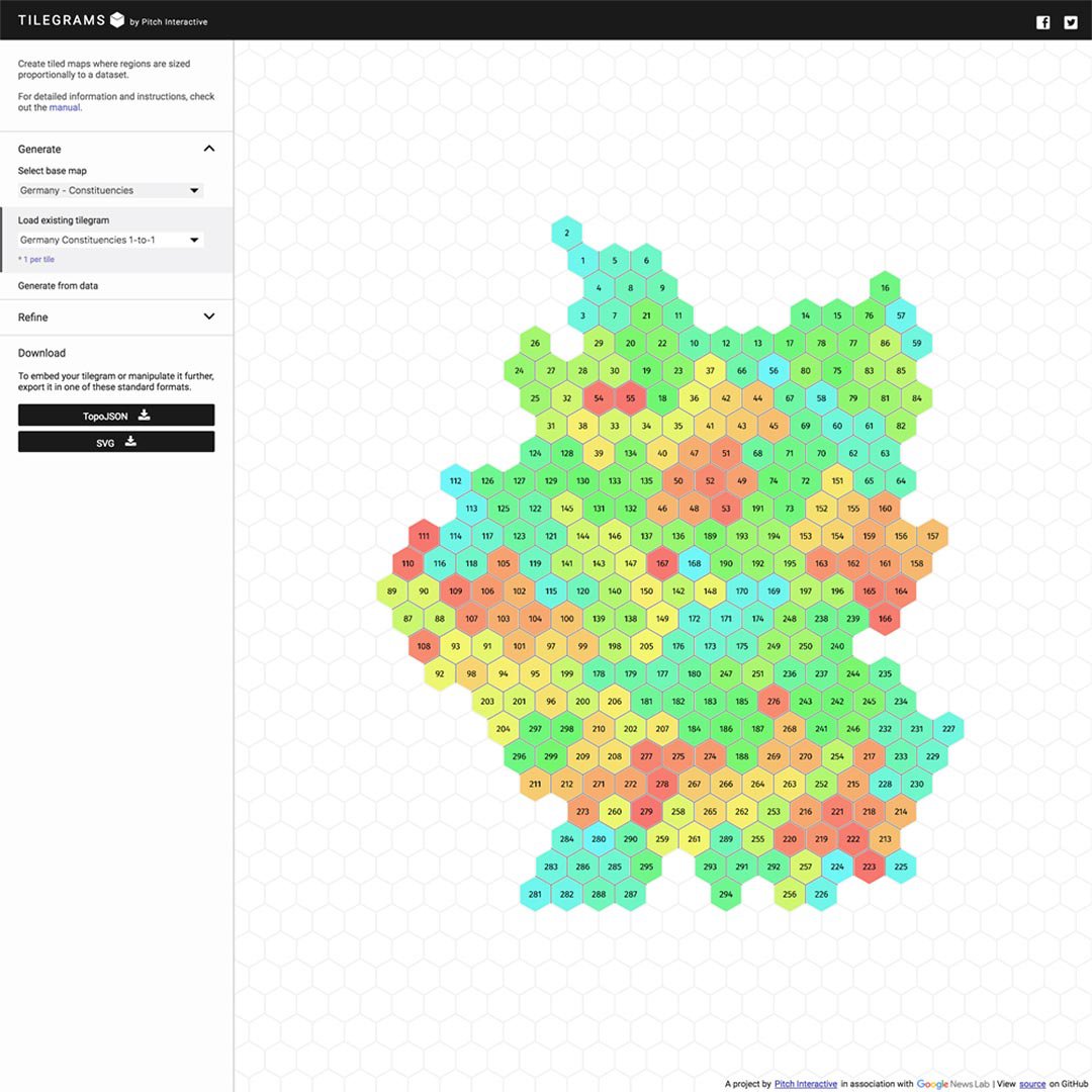
There are also maps for Germany and France and a growing list of countries.
Refining an existing Tilegram.

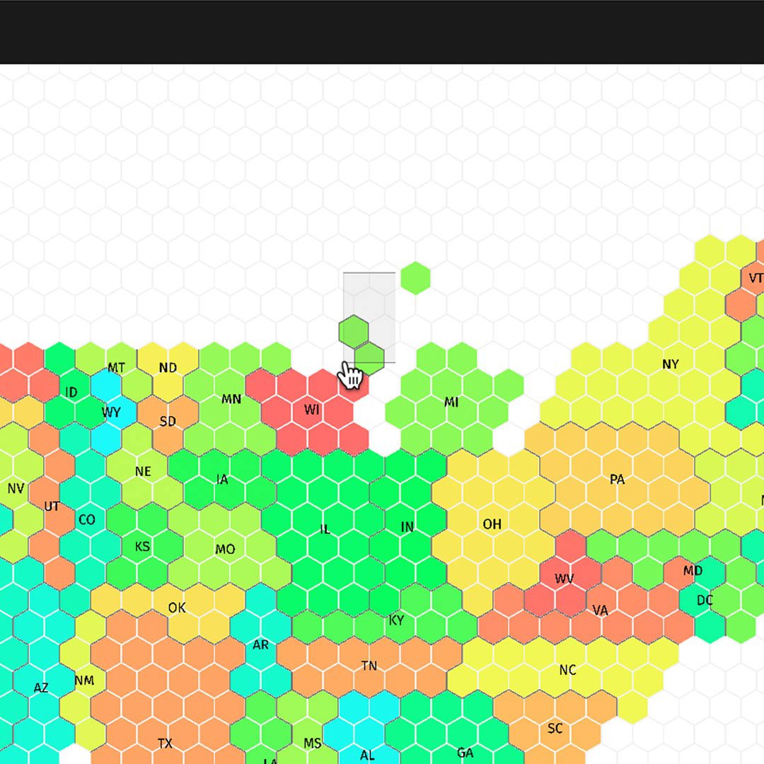
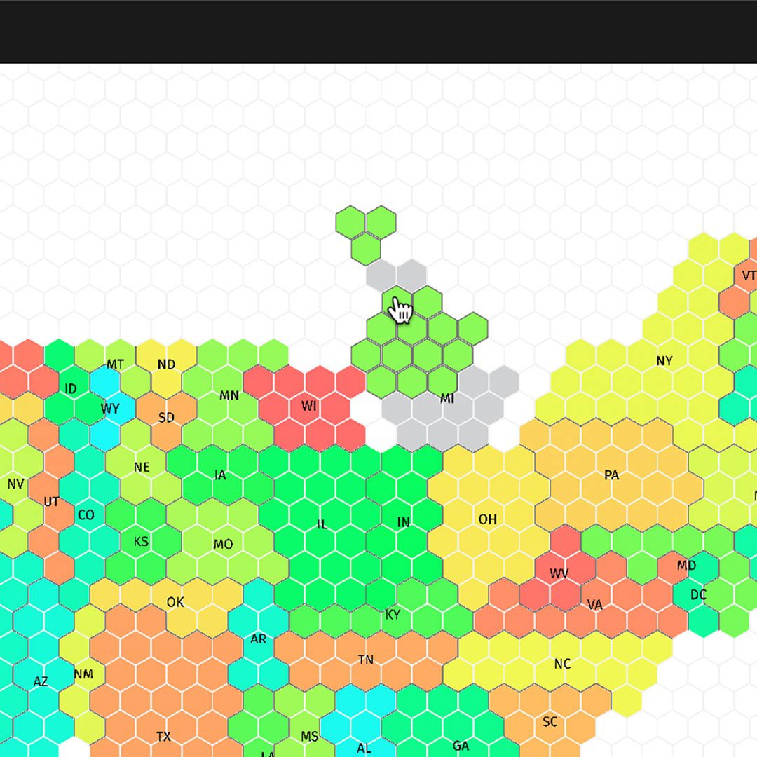
Tilegrams use algorithms to compile visuals, so it’s inevitable that they may display visual inaccuracies. To tell a complete and accurate story, there are many ways you can modify your Tilegram. If you’ve loaded one, there are many ways you can modify it.
Click and drag any tile to move it around.
To move multiple tiles, click and drag a rectangular marquee around them and then drag them around.
To move a specific region, double click any tile in it to select them all and then drag the whole region.
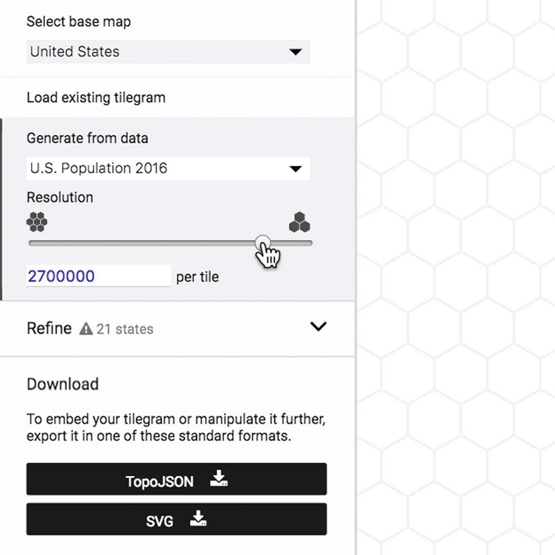
To adjust the resolution, click Generate from data and use the slider.
Ensuring statistical accuracy.
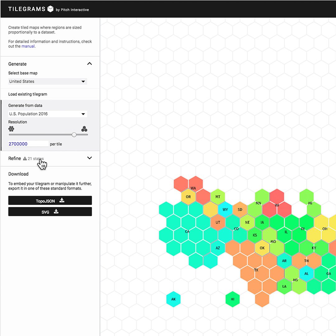
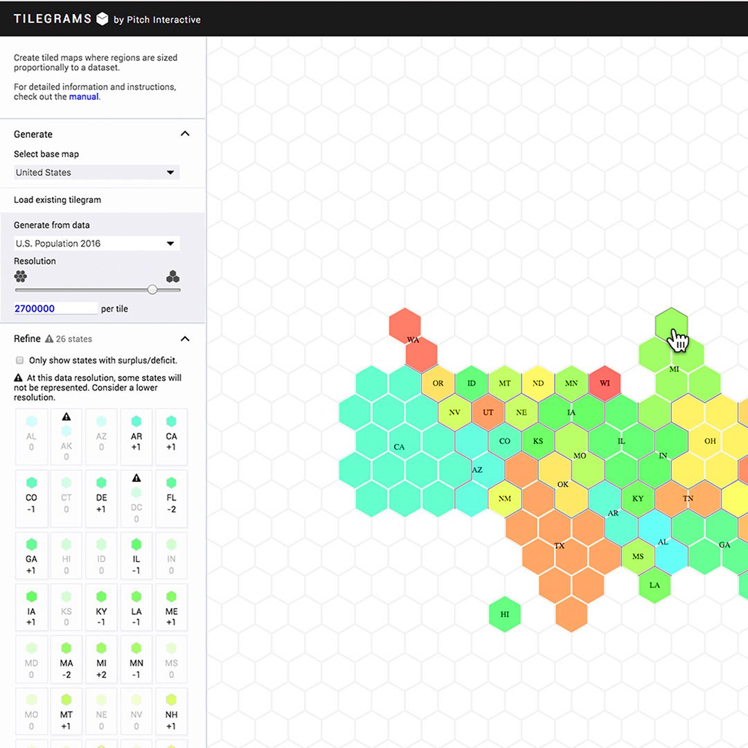
As you make refinements to your data, the map will change and may reveal some inaccuracies. This a normal occurrence in Tilegrams because it is difficult to produce both accurate and recognizable results. As you begin to make your own, you’ll experience the trade-offs involved.
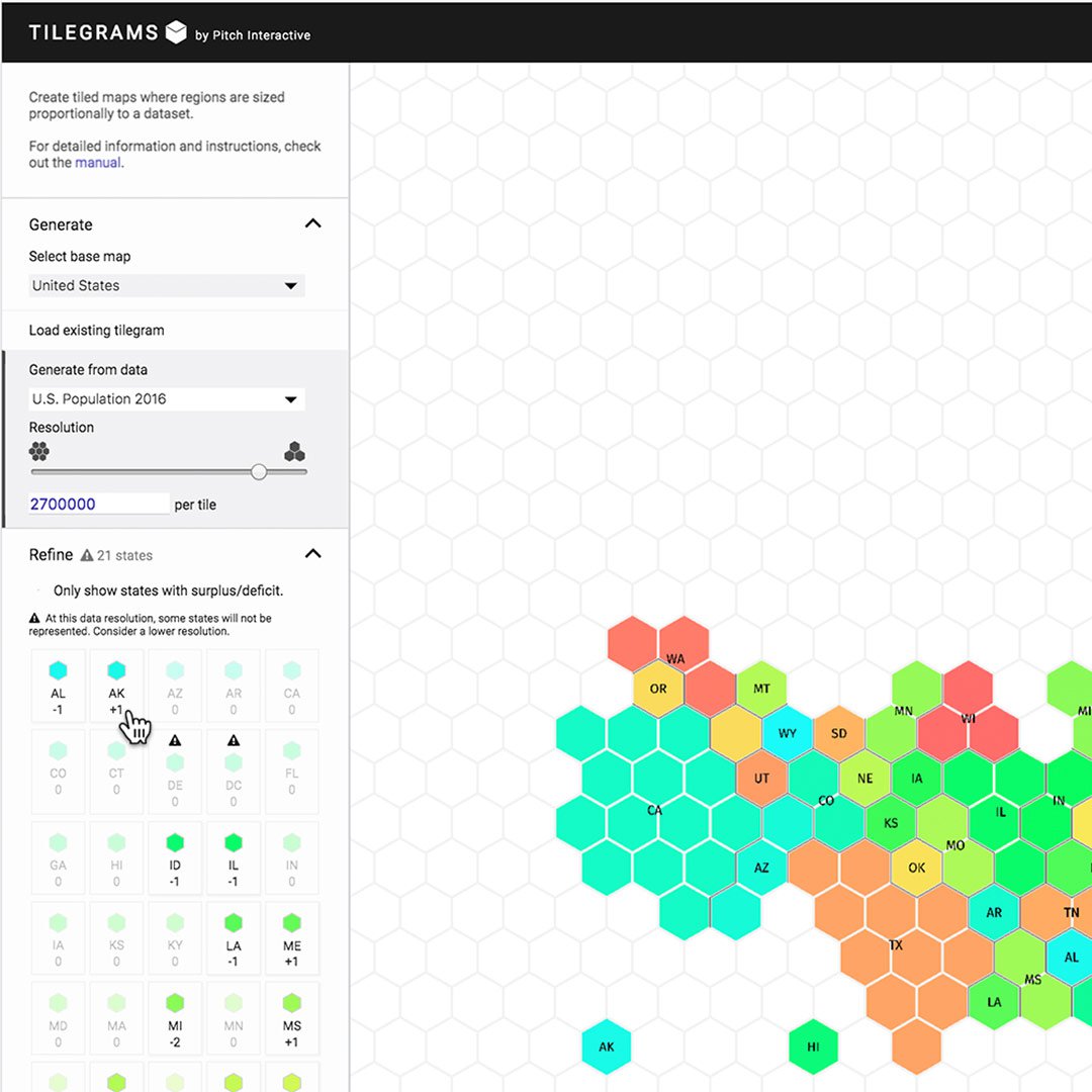
Click Refine.
Under “State Tiles” you’ll see a list of each state with a number and a hexagon. The number indicates the difference between the number of tiles that region currently has on the map and how many it should have, based on the dataset. If the number is positive, that region has too many tiles on the map. If it’s negative, it doesn’t have enough. If there’s a warning sign, then the region doesn’t have enough data for even a single tile on the map at the chosen resolutions.
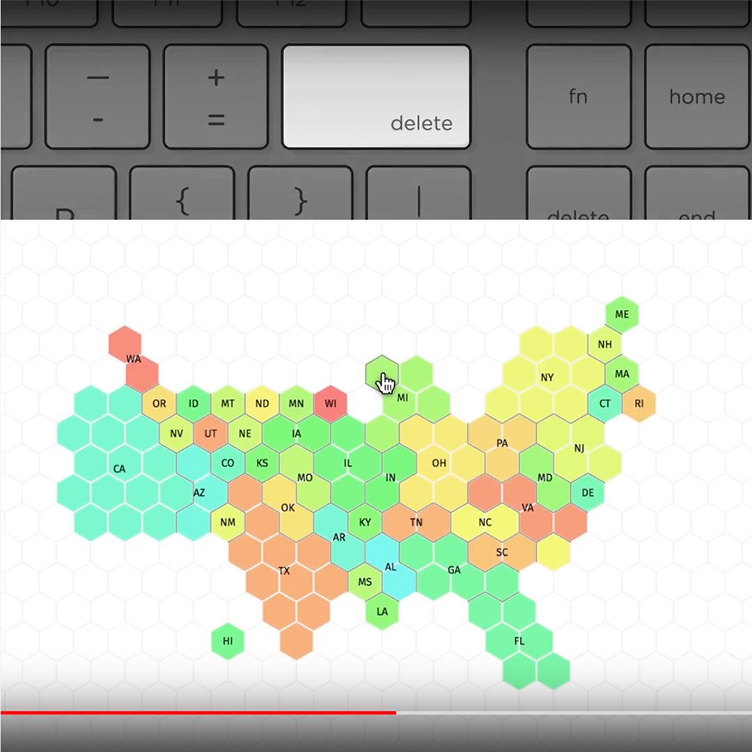
To remove a tile from the map, click it and hit Delete on your keyboard.
To add a tile, select Refine, click on a hexagon from the left sidebar and drag it onto the map.
Exporting existing Tilegrams.
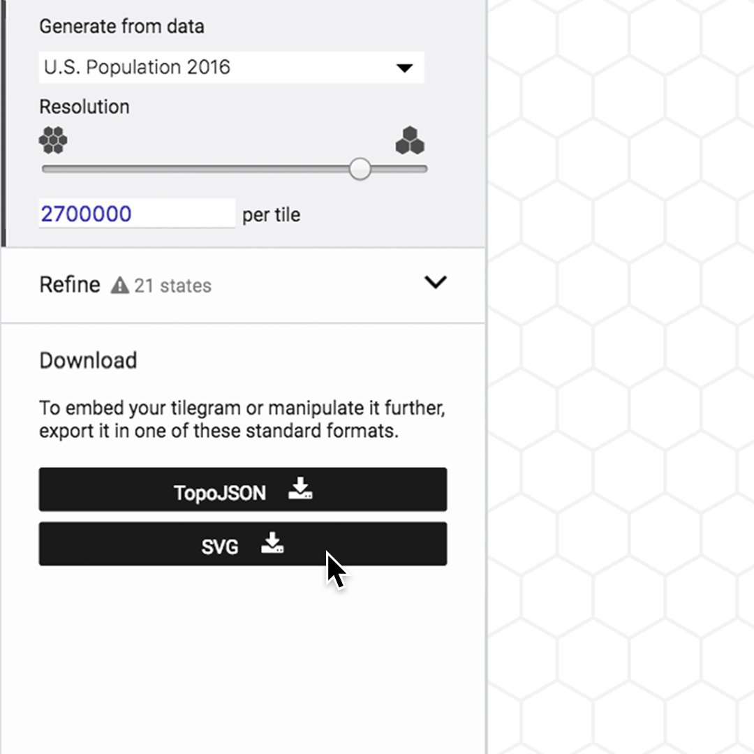
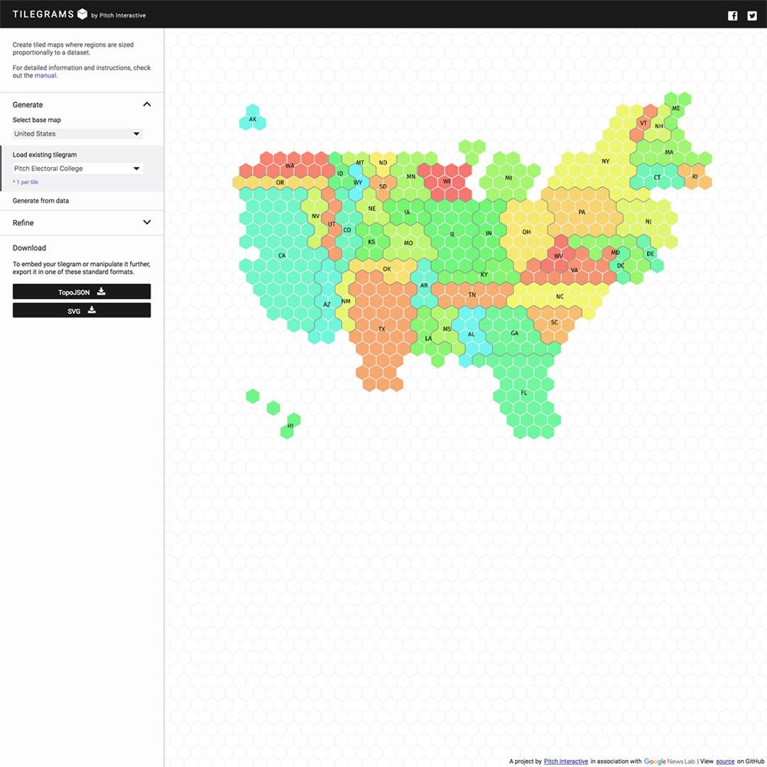
When you are happy with your Tilegram, you can export it. For use in design software, choose the file type SVG using the buttons at lower left. Developers should select TopoJSON to export it into their web applications.
For more on Tilegram basics, see the tool and read our post on Medium.
-
![GO801_GNI_GlobalForestWatchTitle-Card.jpg]()
-
![gni_business_lesson_play_18]()
Grow your revenue with Google's ads products
LessonDetermine if AdSense, AdMob, or Ad Manager is right for you -
![GoogleFinance_ResearchCompanyPerformance]()
Google Finance: Research company performance
LessonGoogle Finance allows you to track companies across 53 exchanges on five continents.